


- Document Solutions for Excel .NET Overview
- Key Features
- Getting Started
-
Features
- Worksheet
- Workbook
- Comments
- Hyperlinks
- Sort
- Filter
- Group
- Conditional Formatting
- Data Validations
- Data Binding
- Import Data
- Digital Signatures
- Formulas
- Custom Functions
- Shapes
- Document Properties
- Styles
- Form Controls
- Barcodes
- Themes and Colors
- Chart
- Table
- Pivot Table
- Pivot Chart
- Sparkline
- Slicer
- Logging
- Defined Names
- AI Assistant
- Templates
- Formula Reference
- File Operations
- Tutorials
- Document Solutions Data Viewer
- API Reference
- Release Notes
Pie Chart
Pie charts, the most common tools used for data visualization, are circular graphs that display the proportionate contribution of each category, which is represented by a pie or a slice. The magnitude of the dependent variable is proportional to the angle of the slice. These charts can be used for plotting just one series with non-zero and positive values.
DsExcel supports the following types of pie charts.
Chart Type | Chart Snapshot | Use Case |
|---|---|---|
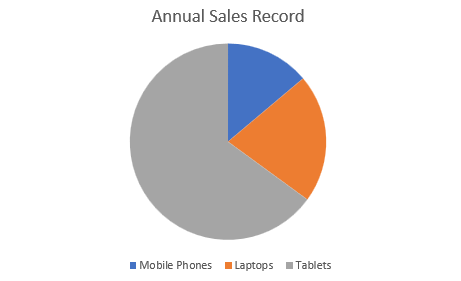
Pie |
| Pie chart is used to display a single data series in a circle-type structure, with each sector representing a different category. |
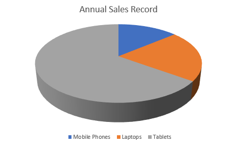
Pie3D |
| Pie3D chart is used to display the chart demonstration in 3D which is a modification of 2DPie chart in terms of appearance. |
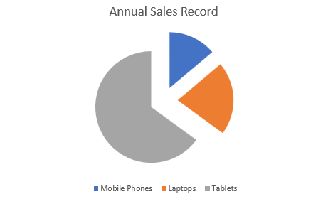
PieExploded |
| PieExploded chart is used to pull all of the slices out of a pie chart and view the sectors separately in pieces. |
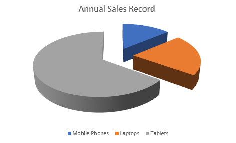
PieExploded3D |
| PieExploded 3D chart is used display the chart demonstration in 3D which is a modification of 2DPieExploded chart. |
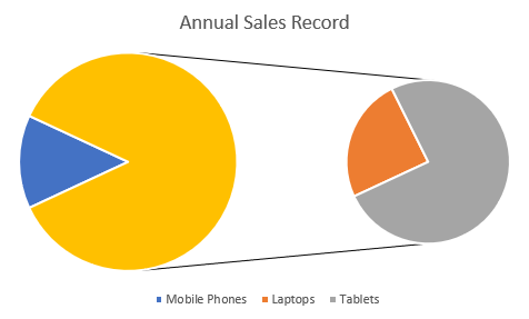
PieOfPie |
| PieofPie chart is used to separate the slices from the main pie chart and display them in an additional pie chart. |
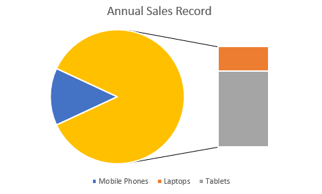
BarOfPie |
| BarofPie chart is used to separate the slices from the main pie chart and display them in an additional stacked bar chart. |
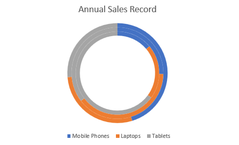
Doughnut |
| Doughnut chart is used to display multiple data series concurrently, with each ring depicting a single data series. |
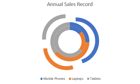
DoughnutExploded |
| DoughnutExploded is used to pull all slices out of a DoughnutExploded chart and view the sectors separately in pieces. |
Using Code
Refer to the following code to add Doughnut Exploded chart:
public void PieCharts()
{
      // Initialize workbook
      Workbook workbook = new Workbook();
      // Fetch default worksheet
      IWorksheet worksheet = workbook.Worksheets[0];

      // Prepare data for chart
      worksheet.Range["A1:D4"].Value = new object[,]
      {
           {null, "Q1", "Q2", "Q3"},
           {"Mobile Phones", 1330, 2345, 3493},
           {"Laptops", 2032, 3632, 2197},
           {"Tablets", 6233, 3270, 2030}
      };
      worksheet.Range["A:D"].Columns.AutoFit();
      // Add Pie Chart
      IShape pieChartshape = worksheet.Shapes.AddChart(ChartType.DoughnutExploded, 250, 20, 360, 230);

      // Adding series to SeriesCollection
      pieChartshape.Chart.SeriesCollection.Add(worksheet.Range["A1:D4"], RowCol.Columns, true, true);

      // Configure Chart Title
      pieChartshape.Chart.ChartTitle.TextFrame.TextRange.Paragraphs.Add("Annual Sales Record");

      // Saving workbook to Xlsx
      workbook.Save(@"22-PieChart.xlsx", SaveFileFormat.Xlsx);
  }