
RadialGauge Quick Start
This section describes how to add a RadialGauge control to your portable or shared app and set its value. For information on how to add Xamarin components in C# or XAML, see Adding Xamarin Components using C# or Adding Xamarin Components using XAML.
This topic comprises of two steps:
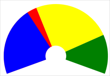
The following image shows how the RadialGauge appears, after completing the steps above:
Step 1: Add a RadialGauge control
The Value property denotes the value of the gauge. Multiple ranges can be added to a single Gauge and the position of the range is defined by the Min and Max properties of the range. If you set the IsReadOnly property to false, then the user can edit the value by tapping on the gauge.
The StartAngle property specifies the RadialGauge's starting angle and the SweepAngle property specifies an angle representing the length of the RadialGauge's arc. These properties can be used to specify the start and end points of the radial gauge arc. The angle for both properties are measured clockwise, starting at the 9 o'clock position. When the SweepAngle is negative, the gauge is formed in counter clockwise direction.
The control also provides the AutoScale property. When this property is set to true, the RadialGauge is automatically scaled to fill its containing element.
type=note
Note: The C1RadialGauge.Origin property can be used to change the origin of the RadialGauge pointer. By default, the Origin is set to 0.
Complete the following steps to initialize a RadialGauge control in C# or XAML.
In Code
Add a new class (for example QuickStart.cs) to your Portable or Shared project and include the following references.
using Xamarin.Forms;
using C1.Xamarin.Forms.Gauge;
Instantiate a RadialGauge control in a new method GetRadialGauge().
public static C1RadialGauge GetRadialGauge()
{
    //Instantiate RadialGauge and set its properties
    C1RadialGauge gauge = new C1RadialGauge();
    gauge.Value = 35;
    gauge.Min = 0;
    gauge.Max = 100;
    gauge.StartAngle = -20;
    gauge.SweepAngle = 220;
    gauge.AutoScale = true;
    gauge.ShowText = GaugeShowText.None;
    gauge.PointerColor = Xamarin.Forms.Color.Blue;
    gauge.ShowRanges = true;
    //Create Ranges
    GaugeRange low = new GaugeRange();
    GaugeRange med = new GaugeRange();
    GaugeRange high = new GaugeRange();
    //Customize Ranges
    low.Color = Xamarin.Forms.Color.Red;
    low.Min = 0;
    low.Max = 40;
    med.Color = Xamarin.Forms.Color.Yellow;
    med.Min = 40;
    med.Max = 80;
    high.Color = Xamarin.Forms.Color.Green;
    high.Min = 80;
    high.Max = 100;
    //Add Ranges to RadialGauge
    gauge.Ranges.Add(low);
    gauge.Ranges.Add(med);
    gauge.Ranges.Add(high);
    return gauge;
}
In XAML
Add a new Content Page (for example QuickStart.xaml) to your Portable or Shared project and modify the <ContentPage> tag to include the following references:
<ContentPage xmlns="http://xamarin.com/schemas/2014/forms"
xmlns:x="http://schemas.microsoft.com/winfx/2009/xaml"
x:Class="Appl.QuickStart"
xmlns:c1="clr-namespace:C1.Xamarin.Forms.Gauge;assembly=C1.Xamarin.Forms.Gauge">
Initialize a RadialGauge control by adding the markup for the control between the <ContentPage></ContentPage>tags and inside the <StackLayout></StackLayout>tags as shown below:
<StackLayout>
<c1:C1RadialGauge Value="35" Min="0" Max="100"  ShowText="None" StartAngle = "-20"
        SweepAngle = "220" AutoScale = "true" PointerColor="Blue" ShowRanges="True">
            <c1:C1RadialGauge.Ranges>
                <c1:GaugeRange Min="0" Max="40" Color="Red"/>
                <c1:GaugeRange Min="40" Max="80" Color="Yellow"/>
                <c1:GaugeRange Min="80" Max="100" Color="Green"/>
            </c1:C1RadialGauge.Ranges>
        </c1:C1RadialGauge>
    </StackLayout>
Step 2: Run the Project
In the Solution Explorer, double click App.cs to open it.
Complete the following steps to display the RadialGauge control.
To return a C# class: In the class constructor App( ), set a new ContentPage as the MainPage and assign the control to the ContentPage's Content by invoking the method GetRadialGauge( ) defined in the previous procedure, Step 1: Add a RadialGauge Control.
The following code shows the class constructor App
()after completing steps above.public App() { // The root page of your application MainPage = new ContentPage { Content = QuickStart.GetRadialGauge() }; }To return a Content Page: In the class constructor App( ), set the Content Page QuickStart as the MainPage.
The following code shows the class constructor App( ), after completing this step.
public App()
{
    // The root page of your application
    MainPage = new QuickStart();
}
Some additional steps are required to run the iOS and UWP apps:
iOS App:
In the Solution Explorer, double click AppDelegate.cs inside YourAppName.iOS project, to open it.
Add the following code to the FinishedLaunching( ) method.
C1.Xamarin.Forms.Gauge.Platform.iOS.C1GaugeRenderer.Init();
UWP App:
In the Solution Explorer, expand MainPage.xaml.
Double click MainPage.xaml.cs to open it.
Add the following code to the class constructor.
C1.Xamarin.Forms.Gauge.Platform.UWP.C1GaugeRenderer.Init();(Optional) In case you compile your UWP application in Release mode, you need to explicitly add the following code to the OnLaunched method in your App.xaml.cs to include the correct assemblies with your application.
var assembliesToInclude = new List<Assembly>();
assembliesToInclude.Add(typeof(C1.Xamarin.Forms.Gauge.Platform.UWP.C1GaugeRenderer)
.GetTypeInfo().Assembly);
assembliesToInclude.Add(typeof(C1.UWP.Gauge.C1GaugeRenderer).GetTypeInfo().Assembly);
Xamarin.Forms.Forms.Init(e, assembliesToInclude);
Press F5 to run the project.