
- Toolbar for WPF and Silverlight Overview
- Key Features
- C1Toolbar Quick Start
- Simplified Ribbon
- Toolbar Elements
- Toolbar Elements Styling
- C1Toolbar Layout and Appearance
- C1Toolbar Samples
- C1Toolbar Task-Based Help
- Commanding with C1Toolbar (WPF Tutorial)
- Commanding with C1Toolbar (Silverlight Tutorial)
Toolbar ToggleButton
The C1ToolbarToggleButton represents a toggle button on the C1ToolbarToolStrip. It is a stateful button that enables users to toggle between on and off states. When clicking on the toggle button it remains activated, or pressed, until it is clicked again.
Toggle buttons display graphic or text like command buttons, but when it is pressed or activated the state appears in an on state. To indicate an on state you can set a color for the C1ToolbarToggleButton.PressedBrush property.
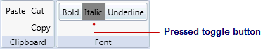
The following image illustrates three C1ToolbarToggleButtons with the Italic toggle button pressed. The second toggle button, Italic, has the PressedBrush set to Gray.
C1ToolbarToggleButtons can be added to the C1ToolbarStrip via the Items collection editor, programmatically, or through XAML.
EX: Three C1TolbarToggleButtons with one of them having an on state
<c1:C1Toolbar Grid.Row="1" Name="c1Toolbar1">
  <c1:C1ToolbarGroup Header="Clipboard">
    <c1:C1ToolbarButton LabelTitle="Paste" />
    <c1:C1ToolbarButton LabelTitle="Cut" />
    <c1:C1ToolbarButton LabelTitle="Copy" />
  </c1:C1ToolbarGroup>
  <c1:C1ToolbarGroup Header="Font">
  <c1:C1ToolbarStrip>
     <c1:C1ToolbarToggleButton LabelTitle="Bold" />
     <c1:C1ToolbarToggleButton PressedBrush ="Gray" LabelTitle="Italic" />
     <c1:C1ToolbarToggleButton LabelTitle="Underline" />
     </c1:C1ToolbarStrip>
  </c1:C1ToolbarGroup>
</c1:C1Toolbar>
The C1ToolBarToggleButton includes the following properties:
| Property | Definition |
|---|---|
| GroupName | Gets or sets the name that specifies which C1ToolbarToggleButton controls are mutually exclusive. |
| LabelTitle | Gets or sets the label title of control. |
| LargeImageSource | Gets or sets the large image source of the control. |
| MouseOverBrush | Gets or sets the Brush used to highlight the control when it has the mouse over. |
| PressedBrush | Gets or sets the Brush used to paint a button when it is pressed. |
| SmallImageSource | Gets or sets the small image source of the control. |