
- Toolbar for WPF and Silverlight Overview
- Key Features
- C1Toolbar Quick Start
- Simplified Ribbon
- Toolbar Elements
- Toolbar Elements Styling
- C1Toolbar Layout and Appearance
- C1Toolbar Samples
- C1Toolbar Task-Based Help
- Commanding with C1Toolbar (WPF Tutorial)
- Commanding with C1Toolbar (Silverlight Tutorial)
Toolbar DropDown
The C1ToolbarDropDown control represents a drop-down button on the C1ToolbarStrip. When clicking it displays popup panel with Content property or context menu set by Menu property. A drop-down button provides users with a list of options. When you click on a C1ToolBarDropDown button the Click event always fires and the drop down list appears.
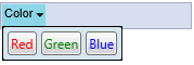
Example 1: Drop-down with popup stack panel with buttons
<c1:C1ToolbarDropDown Padding="2" Header="Color">
   <c1:C1ToolbarDropDown.Content>
     <StackPanel Margin="2" Orientation="Horizontal">
       <Button Margin="2" Content="Red" Foreground="Red" />
       <Button Margin="2" Content="Green" Foreground="Green" />
       <Button Margin="2" Content="Blue" Foreground="Blue" />
     </StackPanel>
   </c1:C1ToolbarDropDown.Content>
</c1:C1ToolbarDropDown>
Example 2: Dropdown with popup menu
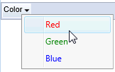
<c1:C1Toolbar Name="c1Toolbar1" Margin="0,127,0,160">
   <c1:C1ToolbarDropDown Padding="2" Header="Color">
     <c1:C1ToolbarDropDown.ContextMenu>
        <ContextMenu>
          <MenuItem Foreground="Red" Header="Red" IsCheckable="True" />
          <MenuItem Foreground="Green" Header="Green" IsCheckable="True" />
          <MenuItem Foreground="Blue" Header="Blue" IsCheckable="True" />
         </ContextMenu>
     </c1:C1ToolbarDropDown.ContextMenu>
   </c1:C1ToolbarDropDown>
</c1:C1Toolbar></c1:C1ToolbarDropDown>
The C1ToolBarDropDown includes the following unique properties:
| Property | Definition |
|---|---|
| ContentBackground | Gets or sets the content background. |
| Menu | Gets or sets the context menu which is displayed when the control is clicked. |
| MouseOverBrush | Gets or sets the Brush used to highlight the control when it has the mouse over. |
| PressedBrush | Gets or sets the Brush used to paint a button when it is pressed. |