
- Toolbar for WPF and Silverlight Overview
- Key Features
- C1Toolbar Quick Start
- Simplified Ribbon
- Toolbar Elements
- Toolbar Elements Styling
- C1Toolbar Layout and Appearance
- C1Toolbar Samples
- C1Toolbar Task-Based Help
- Commanding with C1Toolbar (WPF Tutorial)
- Commanding with C1Toolbar (Silverlight Tutorial)
Toolbar Tab Item
The C1ToolbarTablItem represents a tab item on the C1Toolbar. The C1ToolbarTabItems are beneficial to use when you have substantial amounts of information to display on minimum window space.
The C1ToolbarTabItem divides the controls onto a separate page and shows one tab at a time.
A C1ToolbarTabItem can hold a collection of C1ToolbarGroups which can contain C1ToolbarButtons, C1ToolbarToggleButtons, C1ToolbarDropDowns, and C1ToolbarSplitButtons.
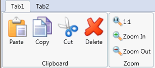
The following image displays two C1ToolbarTabItems:
A C1ToolbarTabItem can be added to C1Toolbar via the ToolbarItems collection editor, through XAML, or programatically.
To add a C1ToolbarTabItem using the designer, complete the following:
- Add a C1Toolbar control to your page.
- Select the C1Toolbar control and click on the ellipsis button next to the ToolbarItems property in the C1Toolbar properties window. The ToolbarItems collection editor appears.
- Select the C1ToolbarTabItem from the select item dropdown list and click Add. The C1ToolbarTabItem is added to the C1Toolbar control.
- Set the Header property to Tab 1.
To add a C1ToolbarTabItem using XAML code, add the following:
<c1:C1Toolbar Grid.Row="1" Name="c1Toolbar1">
            <c1:C1ToolbarTabItem Header="Tab 1">
                <c1:C1ToolbarTabItem.Content>
                    <c1:C1ToolbarPanel />
                </c1:C1ToolbarTabItem.Content>
            </c1:C1ToolbarTabItem>
</c1:C1Toolbar>
C1ToolBarGroups can be added to the C1ToolbarTabItem via the Groups collection editor, through XAML, or programatically using the C1ToolbarTabItem.Groups property.
To add a C1ToolbarGroup to the C1ToolbarTabItem using the designer, complete the following:
- Add a C1Toolbar control to your page.
- Right-click on the C1ToolbarTabItem and select Properties. Click on the ellipsis button next to the Groups property in the C1ToolbarTabItem properties window. The Groups collection editor appears.
- Click Add to add a C1ToolbarGroup to the C1ToolbarTabItem. The C1ToolbarGroup is added to the C1ToolbarTabItem.
- Set the Header property to Tab 1.
To add a C1ToolbarGroup to a C1ToolbarTabItem using XAML code, add the following:
<c1:C1Toolbar Grid.Row="1" Name="c1Toolbar1">
            <c1:C1ToolbarTabItem Header="Tab 1">
                <c1:C1ToolbarTabItem.Content>
                    <c1:C1ToolbarPanel />
                </c1:C1ToolbarTabItem.Content>
                <c1:C1ToolbarGroup/>
            </c1:C1ToolbarTabItem>
</c1:C1Toolbar>
The C1ToolBarTabItem includes the following unique property:
| Property | Definition |
|---|---|
| Groups | Gets the collection of toolbar groups. |