
- Toolbar for WPF and Silverlight Overview
- Key Features
- C1Toolbar Quick Start
- Simplified Ribbon
- Toolbar Elements
- Toolbar Elements Styling
- C1Toolbar Layout and Appearance
- C1Toolbar Samples
- C1Toolbar Task-Based Help
- Commanding with C1Toolbar (WPF Tutorial)
- Commanding with C1Toolbar (Silverlight Tutorial)
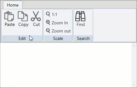
Toolbar Elements Styling
Toolbar for WPF allows you to style Toolbar elements to customize their appearance. You can use the following properties to change the foreground and background color of the elements:
- MouseOverForegroundBrush - It defines the foreground color to be applied to the toolbar element on mouse hover.
- PressedForegroundBrush - It defines the foreground color to be applied to the toolbar element on mouse left click.
- MouseOverBrush - It defines the background color to be applied to the toolbar element on mouse hover.
- PressedBrush - It defines the background color to be applied to the toolbar element on mouse left click.
The following GIF displays the styling applied on the toolbar elements to change their appearance.
The following code shows the implementation of the properties that can be used to change the appearance of the toolbar elements:
<Style TargetType="c1:C1ToolbarItem">
            <Setter Property="Foreground" Value="#333333"/>
            <Setter Property="MouseOverForegroundBrush" Value="DarkGreen"/>
            <Setter Property="PressedForegroundBrush" Value="Yellow"/>
            <Setter Property="MouseOverBrush" Value="LightGreen"/>
            <Setter Property="PressedBrush" Value="Green"/>
</Style>