
Sparkline Overview
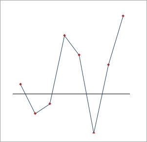
Sparkline is a lightweight data visualization control for depicting trends and variations. Designed as an inline chart, Sparkline plots data in a highly condensed way. Unlike standard charts, Sparkline is drawn without basic chart elements like coordinates, axes, legend, and title. These miniature charts are very informative and can visualize data more effectively than any usual charts as they are positioned near the data points. Moreover, it supports different chart types such as Line, Column, and WinLoss which makes it easier for the users to plot data in different forms without taking too much space.
You can bind the Sparkline with any enumerable collection through code, or can easily configure their bindings in XAML. Additionally, Sparkline can be used as a standalone control or as a nested control in other container controls such as dashboards or grids.
Release Notes | Product Samples |
|---|---|
See the version-wise updates for all controls here. | Product samples are located at Documents\ComponentOne Samples\WPF\vx.x\CS\Sparkline or Documents\ComponentOne Samples\WPF\vx.x.x\C1.WPF.Sparkline\CS on your system, if you have installed the samples while installing WPF Edition using ComponentOneControlPanel.exe. |
Documentation | Blogs |
Demo Samples | |
Note: ComponentOne Sparkline for WPF is compatible with .NET and .NET Framework.
API References | |
|---|---|