Style and Appearance
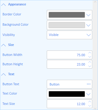
PropertyGrid provides various options to style the UI of the control to change its look and feel. For example, it lets you customize its background color, foreground color, border color and font styles as displayed in the following image.

The following code demonstrates styling the PropertyGrid control.
<c1:C1PropertyGrid Margin="130,12,30,12" x:Name="propertyGrid" AutoGenerateProperties="False" SelectedObject="{Binding ElementName=TextButton, Mode=OneWay}"
                   Background="AliceBlue" BorderBrush="LightBlue"  FontFamily="Calibri" Foreground="CornflowerBlue">
    <c1:C1PropertyGrid.PropertyAttributes>
        <c1:PropertyAttribute Category="Appearance" DisplayName="Background Color" MemberName="Background"/>
        <c1:PropertyAttribute Category="Appearance" DisplayName="Border Color" MemberName="BorderBrush"/>
        <c1:PropertyAttribute Category="Appearance" DisplayName="Visibility" MemberName="Visibility"/>
        <c1:PropertyAttribute Category="Size" DisplayName="Button Height" MemberName="Height"/>
        <c1:PropertyAttribute Category="Size" DisplayName="Button Width" MemberName="Width"/>
        <c1:PropertyAttribute Category="Text" DisplayName="Button Text" MemberName="Content"/>
        <c1:PropertyAttribute Category="Text" DisplayName="Text Color" MemberName="Foreground"/>
        <c1:PropertyAttribute Category="Text" DisplayName="Text Size" MemberName="FontSize"/>
    </c1:C1PropertyGrid.PropertyAttributes>
</c1:C1PropertyGrid>
The PropertyGrid control also provides several style properties that you can use to change the appearance of the control. Some of the included styles are described in the table below:
| Style | Description |
|---|---|
| CategoryStyle | Sets the Style applied to all the generated categories. |
| DescriptionAreaStyle | Sets the Style applied to the description area. |
| LabelStyle | Sets the Style applied to all the generated labels for the SelectedObject's properties. |
| ScrollBarStyle | Sets the Style applied to the scrollbars. |


