
Property Definition
Property definitions constitute the properties of a bound object and define their appearance in the property grid. These properties are automatically generated when you bind the PropertyGrid control with an object. However, you can customize them as well. Let us explore more about the auto generated properties and methods and how to customize them in the following sections.
Auto Generated Property Definitions
By default when you set the SelectedObject property of PropertyGrid to bind to an object, the members listed in the PropertyGrid control get automatically generated. This is because the AutoGenerateProperties property is set to True by default. However, you can set the AutoGenerateProperties property to False if you do not want properties to be generated automatically. You might do so if you want only a few properties to be editable or you want to customize the way properties appear in the PropertyGrid window.
Add and Remove Property Items from PropertyGrid
You can add or remove items from the PropertyGrid at design time and runtime. At design time, you can add or remove a property using the PropertyAttributes Collection Editor available under Data category in the Properties window.
The following GIF shows adding and removing properties from the PropertyGrid at runtime.
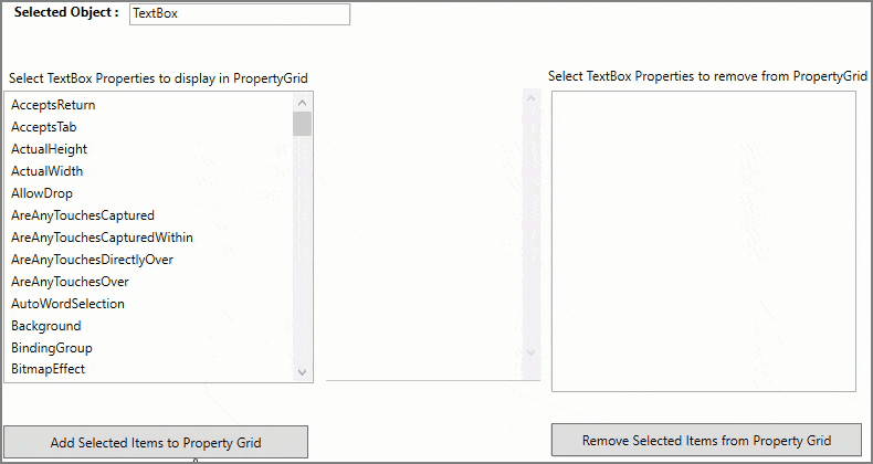
The following steps demonstrates how to add and remove properties from the PropertyGrid at runtime.
In XAML view, add the following code inside <Grid></Grid> tag to create a UI displaying a TextBlock, a TextBox, two Labels, two ListBox controls (one to display textbox properties and the other to display the textbox properties shown in the PropertyGrid), a PropertyGrid control bound to the TextBox, and two button controls (one to add properties and other to remove properties from the PropertyGrid at runtime).
<Grid>
    <Grid.RowDefinitions>
        <RowDefinition Height="60"/>
        <RowDefinition Height="400" />
    </Grid.RowDefinitions>
    <StackPanel  Orientation="Horizontal">
        <TextBlock Margin="5" FontWeight="Bold" Height="18">Selected Object :</TextBlock>
        <TextBox x:Name="_txtBox" Margin="5" Width="200" Height="20" Text="TextBox"></TextBox>
    </StackPanel>
    <Grid Grid.Row="1">
        <Grid.ColumnDefinitions>
            <ColumnDefinition/>
            <ColumnDefinition Width="350"/>
            <ColumnDefinition/>
        </Grid.ColumnDefinitions>
        <StackPanel>
            <Label Content="Select TextBox Properties to display in PropertyGrid" Height="28" Width="293"></Label>
            <ListBox x:Name="_propertyListBox" SelectedIndex="-1" SelectionMode="Extended"  Grid.RowSpan="2" Height="320"/>
            <Button x:Name="btnAdd" Grid.Row="1" Height="30" Click="AddItemsToPropertyGrid" ToolTip="Adds selected items to PropertyGrid" Cursor="Hand" Margin="0,5,0,5" Content="Add Selected Items to Property Grid"></Button>
        </StackPanel>
        <c1:C1PropertyGrid  x:Name="_propertyGrid" ShowDescription="True" VerticalAlignment="Top" Margin="0,28,0,0" SelectedObject="{Binding ElementName=_txtBox}" AutoGenerateProperties="False" FontSize="15"  ShowResetButton="True"  Height="390" Grid.Column="1"/>
        <StackPanel Grid.Column="2">
            <Label Content="Select TextBox Properties to remove from PropertyGrid" />
            <ListBox x:Name="_addedPropertyListBox" SelectedIndex="-1" DisplayMemberPath="Name" SelectionMode="Extended" Grid.Row="1" Height="320"/>
            <Button x:Name="btnRemove" Grid.Row="1" Height="30" Click="RemoveItemsFromPropertyGrid" ToolTip="Remove selected items from PropertyGrid" Cursor="Hand" Margin="0,5,0,5" Content="Remove Selected Items from Property Grid"/>
        </StackPanel>
    </Grid>
</Grid>
Switch to the Code view, add the following code to display the TextBox properties in the ListBox control.
public PropertyDefinition()
{
    InitializeComponent();
    InitPropertiesListBox();
}
private void InitPropertiesListBox()
{
    // Displaying TextBox properties inside ListBox
    var properties = _txtBox.GetType().GetProperties().OrderBy(x => x.Name);
    _propertyListBox.DisplayMemberPath = "Name";
    _propertyListBox.ItemsSource = properties;
}
Add the following code to add the selected properties from the ListBox to the PropertyGrid on button click and remove the selected properties from the PropertyGrid at runtime.
private void AddItemsToPropertyGrid(object sender, RoutedEventArgs e)
{
    foreach (PropertyInfo property in _propertyListBox.SelectedItems)
    {
        if (_propertyGrid.PropertyAttributes.Any(x => x.MemberName == property.Name))
            continue;
        var category = property.GetCustomAttribute<CategoryAttribute>(); // gets the category of the property

        var propertyAttribute = new PropertyAttribute()
        {
            MemberName = property.Name,
            Category = category != null ? category.Category : null
        };
        // Adds to property Grid
        _propertyGrid.PropertyAttributes.Add(propertyAttribute);
        // Adding item to listbox used for showing added items
        _addedPropertyListBox.Items.Add(property);
    }
}
private void RemoveItemsFromPropertyGrid(object sender, RoutedEventArgs e)
{
    foreach (var property in _addedPropertyListBox.SelectedItems.Cast<PropertyInfo>().ToList())
    {
        var propertyAttribute = _propertyGrid.PropertyAttributes.FirstOrDefault(x => x.MemberName == property.Name);
        if (propertyAttribute != null)
        {
            // Removes from property Grid
            _propertyGrid.PropertyAttributes.Remove(propertyAttribute);
            _addedPropertyListBox.Items.Remove(property);
        }
    }
}
Customize Property Definitions
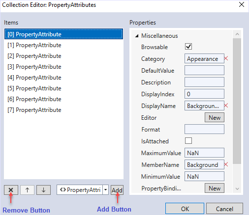
PropertyGrid allows you to customize the property definitions of any object bound to it. It allows you to define, add, remove or customize the properties easily at design time using the PropertyAttributes Collection Editor. The following image shows the PropertyAttributes Collection Editor with property attributes.
PropertyGrid provides you several attributes that can be used to customize the display properties and content of items that are displayed in the property grid. These attributes are listed below:
- Display.Name: Sets the text label displayed for each property.
- Display.Index: Specifies the index for the properties to be displayed in the mentioned order.
- Display.Description: Sets a description for the property which is shown at the bottom of the PropertyGrid when the property that is being edited gets the focus.
- DefaultValue: Sets a default value for the property which is applied when the property has no other value (either it is not initialized or has a null value) or when the Reset button is pressed.
- Editor: Sets a custom editor for the current property (override the editor assigned by default).
- MaximumValue: Sets a maximum value for a property, the PropertyAttribute.MaximumValue will be taken into consideration only for those editors where it makes sense (the numeric editor, for example).
- MinimumValue: Sets a minimum value for a property, the PropertyAttribute.MinimumValue will be taken into consideration only for those editors where it makes sense (the numeric editor, for example).
- Browsable: If set to false, the property will not be shown in the PropertyGrid.
- Category: Sets the category in which the property will be shown.
- PropertyBinding: Overrides the default binding between the property and its editor; for example, if you want to set your own converter or if you don’t want the default validation for properties.
- DisplayFormat: Specifies a format to show the property value, the DisplayFormat is taken into consideration only for those editors where it makes sense (the numeric editor, for example).
- ReadOnly: If set to True, the property is shown in the PropertyGrid but it won’t be possible to change its value.
To set custom property items manually, you need to set the AutoGenerateProperties property to False and set the custom definition of property items through code. In the following example, we set the property definitions for the Button items bound to the PropertyGrid.
<!--Used as C1PropertyGrid SelectedObject-->
<Button x:Name="btnDemo" Height="30" Width="100" Margin="5" HorizontalAlignment="Left" Content="Sample Button"></Button>
<!-- C1PropertyGrid's AutoGenerateProperties property needs to be set as false before manually setting custom propety items-->
<c1:C1PropertyGrid x:Name="_propertyGrid" ShowDescription="True"
    SelectedObject="{Binding ElementName=btnDemo}"
    AutoGenerateProperties="False" Grid.Row="1" Margin="5">
    <c1:C1PropertyGrid.PropertyAttributes>
    <!-- Custom Definition of property items-->
        <!--Button Content Property Definition-->
        <c1:PropertyAttribute Browsable="True" MemberName="Content" Category="Appearance"></c1:PropertyAttribute>
        <!--Button Background Property Definition-->
        <c1:PropertyAttribute Browsable="True" MemberName="Background" Category="Appearance"></c1:PropertyAttribute>
        <!--Button Foreground Property Definition-->
        <c1:PropertyAttribute Browsable="True" MemberName="Foreground" Category="Appearance"></c1:PropertyAttribute>
        <!--Button BorderBrush Property Definition-->
        <c1:PropertyAttribute Browsable="True" MemberName="BorderBrush" Category="Appearance"></c1:PropertyAttribute>
        <!--Button BorderThickness Property Definition-->
        <c1:PropertyAttribute Browsable="True" MemberName="BorderThickness" Category="Appearance"></c1:PropertyAttribute>
        <!--Button Visibility Property Definition-->
        <c1:PropertyAttribute Browsable="True" MemberName="Visibility" Category="Appearance"></c1:PropertyAttribute>
        <!--Button ClickMode Property Definition-->
        <c1:PropertyAttribute Browsable="True" MemberName="ClickMode" Category="Interaction"></c1:PropertyAttribute>
        <!--Button IsEnabled Property Definition-->
        <c1:PropertyAttribute Browsable="True" MemberName="IsEnabled" Category="Interaction"></c1:PropertyAttribute>
        <!--Button ClickMode Property Definition-->
        <c1:PropertyAttribute Browsable="True" MemberName="Height" Category="Layout"></c1:PropertyAttribute>
        <!--Button IsEnabled Property Definition-->
        <c1:PropertyAttribute Browsable="True" MemberName="Width" Category="Layout"></c1:PropertyAttribute>
   </c1:C1PropertyGrid.PropertyAttributes>
</c1:C1PropertyGrid>