- Extended Library for WPF and Silverlight Overview
- Accordion
- Book
- ColorPicker
- CoverFlow (Silverlight Only)
- Expander
- HtmlHost (Silverlight Only)
- PropertyGrid
- Rating (WPF Only)
- Reflector (Silverlight Only)
Expander Header
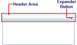
By default, the header element of the C1Expander control appears at the top of the control and the expander button appears on the right side of the header. When the C1Expander control is first placed on the page, the header element contains no text.
The following image labels the header area of the C1Expander control.

To add text to the header element, simply set the Header property to a string. Once the text is added, you can style it using several font properties (see Text Properties|document=Documents\SilverlightAccordion.doc;topic=Text Properties You can also add Silverlight controls to the header. For task-based help about adding content to the header, see Adding Content to the Header Element.
The placement of the header element and expander button will change depending on the expand direction of the control. For more information on expand directions, see the Expand Direction|document=Documents\SilverlightAccordion.doc;topic=Expand Direction topic.
Attribute Syntax versus Property Element Syntax
When you want to add something simple to the C1Expander header, such as an unformatted string, you can simply use the common XML attributes in your XAML markup, such as in the following:
<c1ext:C1Expander Header="Hello World"/>
However, there may be times where you want to add more complex elements, such as grids or panels, to the content area. In this case you would use property element syntax, such as in the following:
<c1ext:C1Expander ExpandDirection="Down" Width="150" Height="55" Name="C1Expander1">
            <c1ext:C1Expander.Header>
         <Grid HorizontalAlignment="Stretch">
                  <Grid.ColumnDefinitions>
                     <ColumnDefinition Width="Auto" />
                     <ColumnDefinition Width="*" />
                  </Grid.ColumnDefinitions>
                     <TextBlock Text="C1Expander Header" />
               </Grid>
            </c1ext:C1Expander.Header>
</c1ext:C1Expander>


