
Silverlight Expander Themes
Silverlight themes are a collection of image settings that define the look of a control or controls. The benefit of using themes is that you can apply the theme across several controls in the application, thus providing consistency without having to repeat styling tasks.
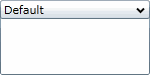
When you add the C1Expander control your project, it appears with the default blue theme:
You can also theme the C1Expander control with one of our six included Silverlight themes: BureauBlack, ExpressionDark, ExpressionLight, RainierOrange, ShinyBlue, and WhistlerBlue. The table below provides a sample of each theme.
| Full Theme Name | Appearance |
|---|---|
| C1ThemeBureauBlack | 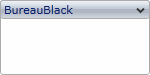 |
| C1ThemeExpressionDark | 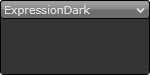 |
| C1ThemeExpressionLight | 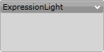 |
| C1ThemeRainierOrange | 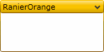 |
| C1ThemeShinyBlue | 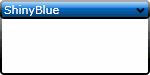 |
| C1ThemeWhistlerBlue | 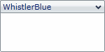 |
You can add any of these themes to a C1Expander control by declaring the theme around the control in markup.