
DockControl ClearStyle Properties
DockControl for WPF supports ComponentOne's ClearStyle technology, which allows you to easily change control colors without having to change control templates. By setting a few color properties, you can quickly style the C1DockControl elements. The supported properties for C1DockControl are listed in the following table:
| Property | Description |
|---|---|
| Background | Gets or sets the background used to fill the C1DockControl. |
| MouseOverBrush | Gets or sets the brush used to highlight the control when the mouse is hovering over it. |
| TabControlBackground | Gets or sets the background color of the C1DockTabControl. |
| TabControlForeground | Gets or sets the foreground color, or the color of the text, in the C1DockTabControl. |
| TabStripBackground | Gets or sets the background color of the C1DockTabItem. |
| TabStripForeground | Gets or sets the foreground color, or the color of the text, in the C1DockTabItem. |
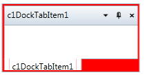
You can completely change the appearance of the C1DockControl by setting these properties. For example, if you set the C1DockControl.Background property to Red so the XAML markup appears similar to the following:
<my:C1DockControl Height="100" Background="Red" HorizontalAlignment="Left" Margin="176,100,0,0" Name="c1DockControl1" VerticalAlignment="Top" Width="200">
            <my:C1DockTabControl Height="100" HorizontalAlignment="Left" Name="c1DockTabControl1" VerticalAlignment="Top" Width="200">
                <my:C1DockTabItem Header="c1DockTabItem1" HorizontalAlignment="Left" Name="c1DockTabItem1" VerticalAlignment="Top" />
            </my:C1DockTabControl>
        </my:C1DockControl>
The C1DockControl will look similar to the following:
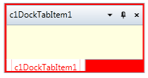
Experiment with the other properties to quickly change the look of the C1DockControl elements. For example, the following XAML sets the Background, TabStripForeground, and TabControlBackground properties:
<my:C1DockControl Height="100" Background="Red" TabStripForeground="Red" TabControlBackground="LightYellow" HorizontalAlignment="Left" Margin="176,100,0,0" Name="c1DockControl1" VerticalAlignment="Top" Width="200">
            <my:C1DockTabControl Height="100" HorizontalAlignment="Left" Name="c1DockTabControl1" VerticalAlignment="Top" Width="200">
                <my:C1DockTabItem Header="c1DockTabItem1" HorizontalAlignment="Left" Name="c1DockTabItem1" VerticalAlignment="Top" />
            </my:C1DockTabControl>
        </my:C1DockControl>
The C1DockControl will look similar to the following: