
Theming
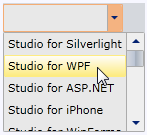
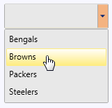
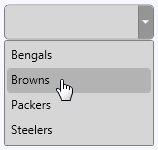
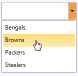
ComboBoxfor WPF and Silverlight incorporates several themes that allow you to customize the appearance of your control. When you first add a C1ComboBox control to the page, it appears similar to the following image:
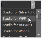
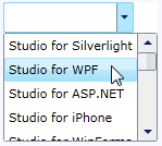
WPF Themes
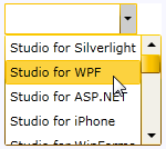
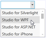
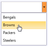
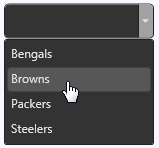
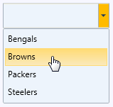
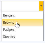
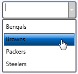
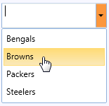
This is the control's default appearance. You can change this appearance by using one of the built-in themes or by creating your own custom theme. All of the built-in themes are based on WPF Toolkit themes. In the tabs below, you can see how to add a theme to your control or to your entire application. The second tab contains images of the available themes; note that a row has been selected to show selected styles:
Adding a Theme
To set an element's theme, use the ApplyTheme method. First add a reference to the theme assembly to your project, and then set the theme in code, like this:
Private Sub Window_Loaded(sender As System.Object, e As System.Windows.RoutedEventArgs) Handles MyBase.Loaded
   Dim theme As New C1ThemeExpressionDark
   'Using ApplyTheme
   C1Theme.ApplyTheme(LayoutRoot, theme)
private void Window_Loaded(object sender, RoutedEventArgs e)
{
C1ThemeExpressionDark theme = new C1ThemeExpressionDark();
//Using ApplyTheme
C1Theme.ApplyTheme(LayoutRoot, theme);
}To apply a theme to the entire application, use the System.Windows.ResourceDictionary.MergedDictionaries property. First add a reference to the theme assembly to your project, and then set the theme in code, like this:
Private Sub Window_Loaded(sender As System.Object, e As System.Windows.RoutedEventArgs) Handles MyBase.Loaded
   Dim theme As New C1ThemeExpressionDark
   'Using Merged Dictionaries
Application.Current.Resources.MergedDictionaries.Add(C1Theme.GetCurrentThemeResources(theme))
End Sub
private void Window_Loaded(object sender, RoutedEventArgs e)
{
C1ThemeExpressionDark theme = new C1ThemeExpressionDark();
//Using Merged Dictionaries
Application.Current.Resources.MergedDictionaries.Add(C1Theme.GetCurrentThemeResources(theme));
}Note that this method works only when you apply a theme for the first time. If you want to switch to another ComponentOne theme, first remove the previous theme from Application.Current.Resources.MergedDictionaries.
Available Themes
Theme Name | Theme Preview | Theme Name | Theme Preview |
|---|---|---|---|
C1ThemeBureauBlack |
| C1ThemeOffice2007Silver |
|
C1ThemeExpressionDark |
| C1ThemeOffice2010Black |
|
C1ThemeExpressionLight |
| C1ThemeOffice2010Blue |
|
C1Blue |
| C1ThemeOffice2010Silver |
|
C1ThemeOffice2007Black |
| C1ThemeShinyBlue |
|
C1ThemeOffice2007Blue |
| C1ThemeWhistlerBlue |
|
Silverlight Themes
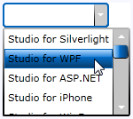
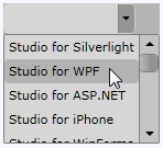
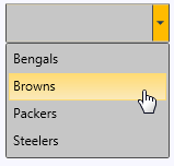
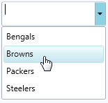
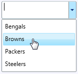
You can also theme the C1ComboBox control with one of our included Silverlight themes. In the tabs below, you can see how to add a theme to your control or to your entire application. The second tab contains images of the available themes; note that a row has been selected to show selected styles:
Adding a Theme
You can add any of these themes to a C1ComboBox control by declaring it around the control in markup. The theme will appear in your Visual Studio Toolbox as an icon.
Open the .xaml page in Visual Studio.
Place your cursor between the <Grid></Grid> tags.
In the Toolbox, double-click the C1ThemeRainierOrange icon to declare the theme. Its tags will appear as follows:
<my:C1ThemeRainierOrange></my:C1ThemeRainierOrange>Place your cursor between the <my:C1ThemeRainierOrange> and </my:C1ThemeRainierOrange> tags.
In the Tools panel, double-click the C1ComboBox icon to add the control to the project. Its tags will appear as children of the <my:C1ThemeRainierOrange> tags, causing the markup to resemble the following:
<my:C1ThemeRainierOrange>
    <c1:C1ComboBox></c1:C1ComboBox>
</my:C1ThemeRainierOrange>
Run your project.
Available Themes
Theme Name | Theme Preview | Theme Name | Theme Preview |
|---|---|---|---|
C1ThemeBureauBlack |
| C1ThemeRanierOrange |
|
C1ThemeCosmopolitan |
| C1ThemeShinyBlue |
|
C1ThemeExpressionDark |
| C1ThemeWhistlerBlue |
|
C1ThemeExpressionLight |
|