
Elements
The Expander control comprises three elements – the header, the expand icon and the content area. Let us get into the visual and descriptive overview of the elements that comprise the complete Expander control.
The Expander control looks similar to the image below:
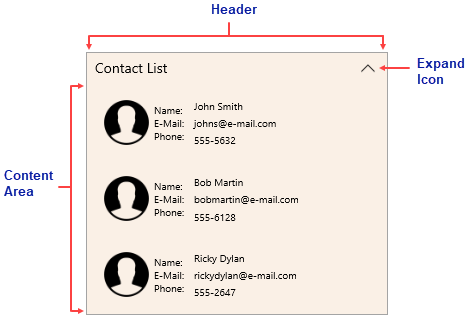
The description of these elements is as follows:
- Header - The header element appears at the top of the Expander control.
- Expand Icon - The expand icon appears on the right side of the header, by default.
- Content Area - The content area is an empty area where you can add grids, text, images, and arbitrary controls.