
Navigation Buttons Node
Through the Navigation Buttons node of the Visual Style dialog box, you can set properties for the navigation buttons.
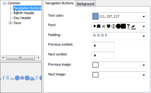
The following properties are available through the Navigation Buttons node:
Tab | Property | Description |
|---|---|---|
Navigation Buttons | Text color | Sets the symbol color for the Previous and Next buttons. |
Font | Sets the font for the Previous and Next buttons. | |
Padding | Sets the padding around the Previous and Next buttons. | |
Previous symbol | Sets the symbol to appear for the Previous button, based on the Font for the navigation buttons. | |
Next symbol | Sets the symbol to appear for the Next button, based on the Font for the navigation buttons. | |
Previous image | Sets the image to appear for the Previous button. | |
Next image | Sets the image to appear for the Next button. | |
Border | Sets the border width for the navigation buttons. | |
Border color | Sets the border color for the navigation buttons. | |
Background | Background color | Sets the background color for the Previous and Next buttons. |
Gradient color | Sets the background gradient color. | |
Gradient | Sets the background gradient mode. | |
Gamma correction | Applies gamma correction to the background gradient when checked. | |
Gradient center | Sets the center of the gradient background. | |
Gradient blend | Sets the Drawing.Drawing2D.Blend used to paint the background gradient. | |
Image | Sets the background image. |