
- Input for WinForms Overview
- Key Features
- Design-Time Support
-
Using the C1Input Controls
- C1Input Controls
- Data Binding
- Value and Text: Displaying, Validating, and Updating Values
- Formatting Data
- Parsing (Updating) Data
- Culture (Regional) Settings
- Edit Mask
- Placeholder
- Validating Data
- Editing Date and Time Values
- Editing Numeric Values
- Drop-Down and Increment Buttons
- Custom Drop-Down
- Programmatic Formatting, Parsing, and Validation
- Error Handling
- Handling NULL and Empty Values
- Customizing C1Input's Appearance
- Input for WinForms Task-Based Help
- Input for WinForms Samples
- Input for WinForms Tutorials
Thumb Style
You can manage the appearance of C1RangeSlider control through various Thumb Style options.
Back Color
Back color of C1RangeSlider thumbs can be changed at design time or through code
To change the back color in design time complete the following:
- Right-click the C1RangeSlider control and select Properties option.
- In Properties pane expand the Styles node.
- Select BackColor property from ThumbStyle collection.
- In the drop-down menu corresponding to BackColor property, select Tan.
To change the Back Color at run-time, add the following code in FormLoad event:
To write code in Visual Basic
Me.C1RangeSlider1.Styles.ThumbStyle.BackColor = System.Drawing.Color.Tan
To write code in C#
this.c1RangeSlider1.Styles.ThumbStyle.BackColor = System.Drawing.Color.Tan;
Border Color
Border color of C1RangeSlider thumbs can be changed at design time or through code
To change the back color in design time complete the following:
- Right-click the C1RangeSlider control and select Properties option.
- In Properties pane expand the Styles node.
- Select BorderColor property from ThumbStyle collection.
- In the drop-down menu corresponding to BorderColor property, select ActiveCaptionText.
To change the Border Color at run-time, add the following code in FormLoad event:
To write code in Visual Basic
Me.C1RangeSlider1.Styles.ThumbStyle.BorderColor = System.Drawing.SystemColors.ActiveCaptionText
To write code in C#
this.c1RangeSlider1.Styles.ThumbStyle.BorderColor = System.Drawing.SystemColors.ActiveCaptionText;
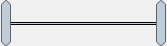
Corner Radius
CorneRadius property enables you to customize the appearance of thumbs of C1RangeSlider control. Thumbs with CornerRadius set to 0 will be rectangular. To add curvature to the thumbs, you can increase their corner radius.
Corner Radius of C1RangeSlider thumbs can be changed at design time or through code
To change CornerRadius of thumbs in design time complete the following:
- Right-click the C1RangeSlider control and select Properties option.
- In Properties pane expand the Styles node.
- Select CornerRadius property from ThumbStyle collection.
- Set CornerRadius to 4.
To change the Corner Radius at run-time, add the following code in FormLoad event:
To write code in Visual Basic
Me.C1RangeSlider1.Styles.ThumbStyle.CornerRadius = 4
To write code in C#
this.c1RangeSlider1.Styles.ThumbStyle.CornerRadius = 4;
The following image shows customized thumb styles of C1RangeSlider control with corner radius 4.

Disabled Back Color
DisabledBackColor property enables you to set the background color of thumb, which will be visible when the C1RangeSlider control is disabled.
DisabledBackColor of C1RangeSlider thumbs can be changed at design time or through code
To change the DisabledBackColor in design time complete the following:
- Right-click the C1RangeSlider control and select Properties option.
- In Properties pane expand the Styles node.
- Select DisabledBackColor property from ThumbStyle collection.
- In the drop-down menu corresponding to DisabledBackColor property, select InactiveCaption.
To change the DisabledBackColor at run-time, add the following code in FormLoad event:
To write code in Visual Basic
Me.C1RangeSlider1.Styles.ThumbStyle.DisabledBackColor = System.Drawing.SystemColors.InactiveCaption
To write code in C#
this.c1RangeSlider1.Styles.ThumbStyle.DisabledBackColor = System.Drawing.SystemColors.InactiveCaption;
Disabled Border Color
DisabledBorderColor property enables you to set the border color of thumbs, which will be visible when the C1RangeSlider control is disabled.
DisabledBorderColor of C1RangeSlider thumbs can be changed at design time or through code.
To change the DisabledBorderColor in design time complete the following:
- Right-click the C1RangeSlider control and select Properties option.
- In Properties pane expand the Styles node.
- Select DisabledBorderColor property from ThumbStyle collection.
- In the drop-down menu corresponding to DisabledBorderColor property, select WindowFrame.
To change the DisabledBorderColor at run-time, add the following code in FormLoad event:
To write code in Visual Basic
Me.C1RangeSlider1.Styles.ThumbStyle.DisabledBorderColor = System.Drawing.SystemColors.WindowFrame
To write code in C#
this.c1RangeSlider1.Styles.ThumbStyle.DisabledBorderColor = System.Drawing.SystemColors.WindowFrame;
The following image shows customised thumb styles in disabled C1RangeSlider control.
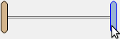
Hovered Back Color
HoveredBackColor property enables you to set the back color of thumbs, which will be visible when mouse is over it.
HoveredBackColor of C1RangeSlider thumbs can be changed at design time or through code
To change the HoveredBackColor in design time complete the following:
- Right-click the C1RangeSlider control and select Properties option.
- In Properties pane expand the Styles node.
- Select HoveredBackColor property from ThumbStyle collection.
- In the drop-down menu corresponding to HoveredBackColor property, select ActiveCaption.
To change the HoveredBackColor at run-time, add the following code in FormLoad event:
To write code in Visual Basic
Me.C1RangeSlider1.Styles.ThumbStyle.HoveredBackColor = System.Drawing.SystemColors.ActiveCaption
To write code in C#
this.c1RangeSlider1.Styles.ThumbStyle.HoveredBackColor = System.Drawing.SystemColors.ActiveCaption;
Hovered Border Color
HoveredBorderColor property enables you to set the border color of thumbs, which will be visible when mouse is over it.
HoveredBackColor of C1RangeSlider thumbs can be changed at design time or through code
To change the HoveredBorderColor in design time complete the following:
- Right-click the C1RangeSlider control and select Properties option.
- In Properties pane expand the Styles node.
- Select HoveredBorderColor property from ThumbStyle collection.
- In the drop-down menu corresponding to HoveredBorderColor property, select Blue.
To change the HoveredBorderColor at run-time, add the following code in FormLoad event:
To write code in Visual Basic
Me.C1RangeSlider1.Styles.ThumbStyle.HoveredBorderColor = System.Drawing.Color.Blue
To write code in C#
this.c1RangeSlider1.Styles.ThumbStyle.HoveredBorderColor = System.Drawing.Color.Blue;
The following image shows customized thumb styles of C1RangeSlider control on mouse over.
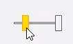
Pressed Back Color
PressedBackColor property enables you to set the back color of thumbs, which will be visible when mouse-click is performed over it.
PressedBackColor of C1RangeSlider thumbs can be changed at design time or through code
To change the PressedBackColor in design time complete the following:
- Right-click the C1RangeSlider control and select Properties option.
- In Properties pane expand the Styles node.
- Select PressedBackColor property from ThumbStyle collection.
- In the drop-down menu corresponding to PressedBackColor property, select Gold.
To change the PressedBackColor at run-time, add the following code in FormLoad event:
To write code in Visual Basic
Me.C1RangeSlider1.Styles.ThumbStyle.PressedBackColor = System.Drawing.Color.Gold
To write code in C#
this.c1RangeSlider1.Styles.ThumbStyle.PressedBackColor = System.Drawing.Color.Gold;
Pressed Border Color
PressedBorderColor property enables you to set the border color of thumbs, which will be visible when mouse-click is performed over it.
PressedBorderColor of C1RangeSlider thumbs can be changed at design time or through code
To change the PressedBorderColor in design time complete the following:
- Right-click the C1RangeSlider control and select Properties option.
- In Properties pane expand the Styles node.
- Select PressedBorderColor property from ThumbStyle collection.
- In the drop-down menu corresponding to PressedBorderColor property, select Orange.
To change the PressedBorderColor at run-time, add the following code in FormLoad event:
To write code in Visual Basic
Me.C1RangeSlider1.Styles.ThumbStyle.PressedBorderColor = System.Drawing.Color.Orange
To write code in C#
this.c1RangeSlider1.Styles.ThumbStyle.PressedBorderColor = System.Drawing.Color.Orange;
The following image shows customized thumb styles of C1RangeSlider control when mouse-click is performed.
See Also
Documents