
Themes
In addition to the Visual Styles you can use the C1ThemeController to apply other themes to the C1Input control. You could also create your own theme using the ThemeDesigner.
To customize the appearance of a C1Input control using Themes, add the C1ThemeController to your component tray and set the Themes property to any of the following predefined styles listed below:
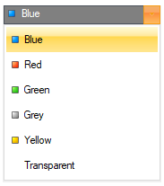
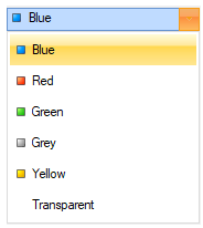
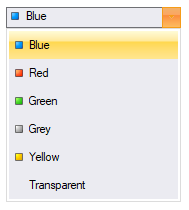
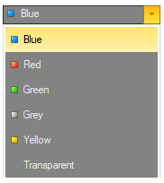
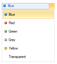
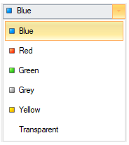
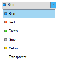
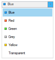
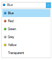
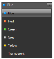
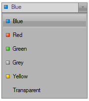
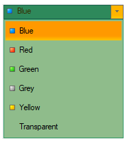
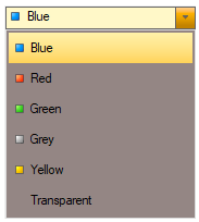
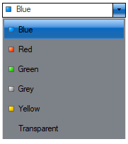
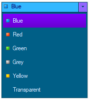
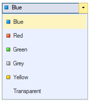
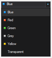
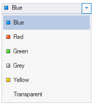
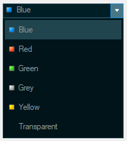
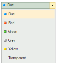
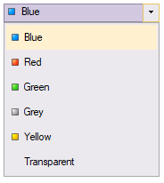
Theme Name | Image |
|---|---|
Office2007Black |
|
Office2007Blue |
|
Office2007Silver |
|
Office2010Black |
|
Office2010Blue |
|
Office2010Silver |
|
Office2013DarkGray |
|
Office2013LightGray |
|
Office2013White |
|
ExpressionDark |
|
ExpressionLight |
|
GreenHouse |
|
RainerOrange |
|
ShinyBlue |
|
Violette |
|
VS2013Blue |
|
VS2013Dark |
|
VS2013Light |
|
VS2013DarkSolar |
|
VS2013Green |
|
VS2013Purple |
|
VS2013Red |
|
VS2013Tan |
|
How to apply themes to the C1Input controls at Design Time
To use the C1ThemeController component with any of the C1Input controls, complete the following:
Add any of the C1Input controls, for example C1ComboBox, on the form at design time.
Add the C1ThemeController component to your component tray. The C1ThemeController dialog box appears.
If you use the C1ThemeController 2.0 component a C1ThemeController dialog box appears. The ThemeController dialog box is used to quickly to apply the theme to all themeable controls in the application, all theme-able controls on the form, or different themes on different controls.
The C1ThemeController dialog box lists all of the components that appears on your form. If you have themeable controls on your form before you add the C1ThemeController the dialog box lists all of the components on your form. Each control/component is initially set to none to prevent unintentional loss of property settings on those controls.
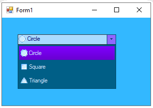
In the C1ThemeController dialog box click on the Theme dropdown button next to Form1 and c1ComboBox1 and select one of the predefined themes, for example, Violette.
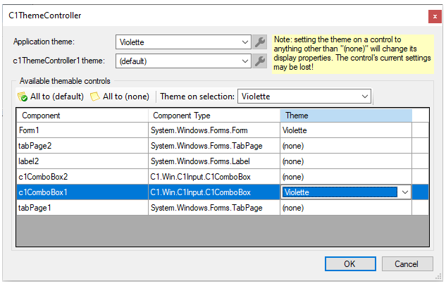
Click OK to save and close the C1ThemeController dialog box.
Run your project and observe that the Violette theme is applied to your Form and C1Combobox.
How to Apply Themes to the C1Input Controls Programatically
The following code shows how to programatically apply the built-in theme using the RegisterTheme and SetTheme methods:
To write code in Visual Basic
'Register the theme file with the C1ThemeController
C1.Win.C1Themes.C1ThemeController.RegisterTheme("C:\Users\Documents\Visual Studio 2010\Projects\ThemesProject\ShinyBlue.c1theme")
'Apply it to a control, use the theme name, not the file name
Me.c1ThemeController1.SetTheme(c1ComboBox1, "ShinyBlue")
To write code in C#
//Register the theme file with the C1ThemeController;

C1.Win.C1Themes.C1ThemeController.RegisterTheme(@"C:\Users\Documents\Visual Studio 2010\Projects\ThemesProject\ShinyBlue.c1theme");

//Apply it to a control and use the theme name
this.c1ThemeController1.SetTheme(c1ComboBox1, "ShinyBlue")
In addition to the predefined themes you can customize your theme using the Themes designer. For more information see the Themes for WinForms documentation.