- FlexReport for WinForms Overview
- Key Features
- FlexReport versus other Reporting Controls
- Core Classes
- Design-Time Support
- Quick Start
- FlexReport Designer
- FlexReportDesigner Control
- Data Binding
- Load Reports
- Create Reports
- Sections of FlexReport
- Fields and Custom Fields
- Modifying the Fields
- Parameters
- VBScripting with ExpressionEditor
- Filtering Data
- Grouping Data
- Sorting Data
- Customize Reports
- Styling the Reports
- Export Reports
- Preview and Print Reports
- Deployment
- FlexViewer
WinForms Chart Types
The Chart Field in FlexReport allows you to insert various types of charts using Chart.Chart2DGroup.ChartType and Chart.Chart3DGroup.ChartType. The chart types that are supported in FlexReport are - Area, Bar (horizontal bars), Column (vertical columns), Doughnut, Scatter (X-Y values), Line, Pie, Step, Stock, Histogram, Radar, Polar, and 3D charts-Cone, Cylinder, and Pyramid. The chart types can be easily selected using the ChartType property in the Properties window of the FlexReportDesigner.
WinForms Area Chart
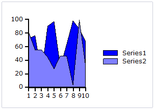
An Area chart draws each series as connected points of data, filled below the points. Each series is drawn on top of the preceding series.
WinForms Bar and Column Charts
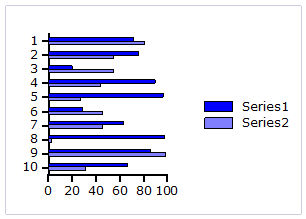
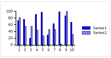
A Bar chart or a Column chart represents each series in the form of bars of the same color and width, whose length is determined by its value. Each new series is plotted in the form of bars next to the bars of the preceding series. A Bar or Column chart draws each series as a bar in a cluster. The number of clusters is the number of points in the data. Each cluster displays the nth data point in each series. When the bars are arranged horizontally, the chart is called a bar chart and when the bars are arranged vertically, the chart is called column chart.
The following image represents a Bar chart:
The following image represents a Column chart:
WinForms Bubble Chart
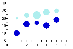
A Bubble chart combines two independent values to supply both the point y value and the point sizes. Bubble charts are used to represent an additional data value at each point by changing its size. The Y array elements determine the Cartesian position (as in a XY-Plot chart), and the Y1 element values determine the size of the bubble at each point. The size of the points can be encoded according to area or diameter.
WinForms Scatter Chart
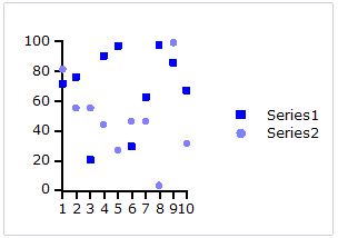
A Scatter chart uses two values to represent each data point. This type of chart is often used to support statistical techniques that quantify the relationship between the variables (typically Linear Regression Analysis).
WinForms Pie Chart
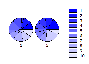
A Pie chart draws each series as a slice in a pie. The number of pies is the number of points in the data. Each pie displays the nth data point in each series. You can also customize Pie charts for displaying legends and labels.
WinForms Doughnut Chart
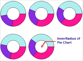
A doughnut chart is a pie chart with a non-zero radius and is identical in function to a pie chart, but can be used to increase aesthetic appeal, particularly when shown with 3D effects. As with all pie charts, each doughnut shows each series as a fraction of the whole at each data point. If multiple data points are specified, then multiple doughnuts appear in the chart.
A doughnut chart can be created by setting the InnerRadius property of a pie chart to a non-zero value. The InnerRadius value represents the percentage of the full pie radius. The InnerRadius property can be accessed in the pie object of each Chart group.
WinForms Radar Chart
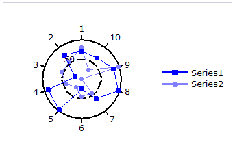
A Radar chart draws the y value in each data set along a radar line (the x value is ignored except for labels). If the data has n unique points, then the chart plane is divided into n equal angle segments, and a radar line is drawn (representing each point) at n/360 degree increments. By default, the radar line representing the first point is drawn vertically (at 90 degrees). Radar charts can be further customized.
WinForms Step Chart
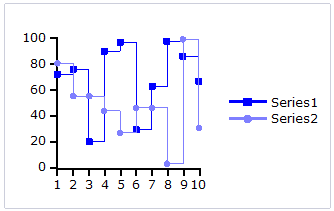
A Step chart is a form of XY plot chart that draws series as connected points of data. These charts are often used when Y values change by discrete amounts, at specific values of X with a sudden change of value. A simple, everyday example would be a plot of a checkbook balance with time. As each deposit is made, and each check is written, the balance (Y value) of the check register changes suddenly, rather than gradually, as time passes (X value). During the time that no deposits are made, or checks written, the balance (Y value) remains constant as time passes.
WinForms Line Chart
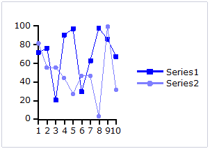
A Line chart draws each series as connected points of data. It is the most effective way of denoting changes in values between different groups of data. These charts are commonly used to show trends and performance over time.
WinForms Stock Chart
Stock charts used in financial applications to show the opening, closing, high and low prices of a given stock. The types of stock charts are as follows:
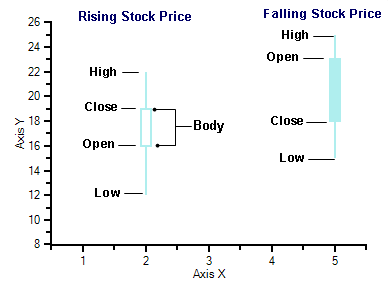
Candle: A Candle chart is a special type of HiLoOpenClose chart that is used to show the relationship between the open and close as well as the high and low. Like, HiLoOpenClose charts, Candle charts use the same price data (high, low, open, and close values) except they include a thick candle-like body that uses the color and size of the body to reveal additional information about the relationship between the open and close values. For example, long transparent candles show buying pressure and long filled candles show selling pressure.
The Candle chart is made up of the following elements: candle, wick, and tail. The candle or the body (the solid bar between the opening and closing values) represents the change in stock price from opening to closing. The thin lines, wick and tail, above and below the candle depict the high/low range. A hollow candle or transparent candle indicates a rising stock price (close was higher than open). In a hollow candle, the bottom of the body represents the opening price and the top of the body represents the closing price. A filled candle indicates a falling stock price (open was higher than close). In a filled candle the top of the body represents the opening price and the bottom of the body represents the closing price.
C1Chart creates the Candle chart with using the Y value for the High, Y1 for the low, Y2 for the open, and Y3 for the close. C1Chart automatically fills the falling candle with the value of the line color.
HiLo: A HiLo chart combines two independent values to supply high and low data for each point in a series. HiLo charts are used primarily in financial applications to show the high and low price for a given stock. The elements of the Y and Y1 arrays in each series of a HiLo chart represent the "high" value, and the "low" value.
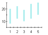
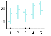
HiLoOpenClose: HiLoOpenClose charts are similar to HiLo charts except that they combine four independent values to supply high, low, open, and close data for a point in a series. In addition to showing the high and low value of a stock, the Y2 and Y3 array elements represent the stock's opening and closing price, respectively.
WinForms Histogram Chart
A Histogram chart takes a collection of raw data values and plots the frequency distribution. It is frequently used with grouped data, which is generated by measuring a collection of raw data and plotting the number of data values that fall within defined intervals. Note that raw values are not used to generate data for a histogram, but are used to generate a frequency instead. While showing similarities to bar charts, it is important to note that histograms are used with quantitative variables whereas bar charts are commonly used with qualitative variables.
While the histogram and bar charts' appearances relate, their functionality does not. A bar chart is created from data points whereas a Histogram is created from the frequency distribution of the data. The charts following illustrate the difference between a bar chart and a histogram chart. Both of the charts use exactly the same Y data. The bar chart (top) shows each average mean temperature for each year in which it occurred. The histogram chart (bottom) using the same input temperature data automatically tabulates the number of temperatures that fall within each interval and draws the resulting histogram. For convenience, chart labels with the count in each interval have been added at the top of each interval.
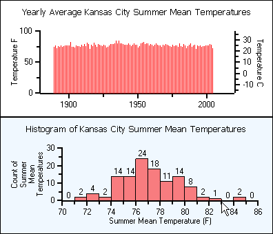
A histogram is beneficial for pinpointing prominent features of the distribution of data for a quantitative variable. The important features for a quantitative variable include the following:
- It reveals the typical average value.
- The data yields a general shape. The data values can be distributed symmetrically around the middle or they can be skewed.
- If there are distant values from the group of data it shows them as outlier values.
- The data values can be near or far to the typical value.
- The distribution may result in a single peak or multiple peaks and valleys.
To select the chart type as Histogram, go to ChartGroups|Group0 and set the ChartType to Histogram.
WinForms Polar Chart
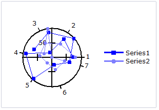
A Polar chart draws the x and y coordinates in each series as (theta,r), where theta is amount of rotation from the origin and r is the distance from the origin. Theta may be specified in either degrees (default) or radians. Since the X-axis is a circle, the X-axis maximum and minimum values are fixed. The series can be drawn independently, or stacked.
WinForms 3D Chart
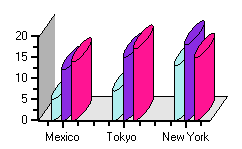
- Cylinder chart: A Cylinder chart is a variation of the Bar and Column charts. It represents the bars or columns as cylinders. The Cylinder chart creates long circular boxes of the same base on both ends. Like all bar and column charts, the Cylinder bar chart is appropriate for comparing individual items or groups of items.
- Cone chart: A Cone chart is a variation of the 3D Bar and Column charts. It represents the bars or columns as cones. The cone chart essentially is a rotated triangle. It has a flat circular base and one curved side topped by a higher point.
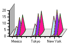
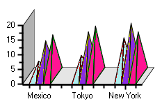
- Pyramid chart: A Pyramid chart is a variation the 3D-Bar and Column charts. It represents the bars or columns as pyramids. The Pyramid chart is similar to the cone chart except for their base. Pyramid charts are often used for geographical purposes.
