
- FlexPivot for WinForms Overview
- Introduction to FlexPivot
- Key Features
- FlexPivot Architecture
- Upgrading from Old PivotPage to New PivotPage
- Adding Data to FlexPivot Application
- Design Time Support through Smart Tag
- Quick Start: FlexPivot for WinForms
- Using FlexPivotPage ToolStrip
- Data Blending Features
- FlexPivot Cube
- Export
- Task-Based Help
- Walkthrough
- DataEngine Overview
- FlexPivotSlicer Overview
Chart Menu
From the Chart menu, you can determine: the chart type, the palette, whether to show the chart title above the chart, whether to show a stacked chart, whether to show chart gridlines, and whether to show totals only.
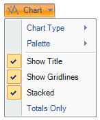
The following table illustrates the option available in the Chart drop-down menu.
| Chart Type | Click Chart Type to select from five common chart types shown below. |
|---|---|
| Palette | Click Palette to select from 16 palette options that define the colors of the chart and legend items. See the options in the Palette topic below. |
| Show Title | When selected, shows a title above the chart. |
| Stacked | When selected, creates a chart view where the data is stacked. |
| Show Gridlines | When selected, shows gridlines in the chart. |
| Totals Only | When selected, shows only totals as opposed to one series for each column in the data source. |
Chart Types
FlexPivot offers five common chart types that are shown in the table below.
| Bar | 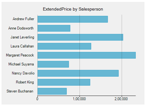 |
|---|---|
| Column | 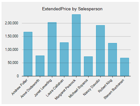 |
| Area | 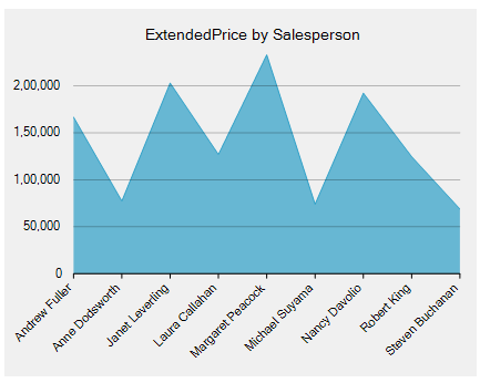 |
| Line | 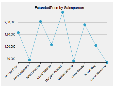 |
| Scatter | 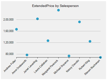 |
Palette
The FlexPivotChart controls comes with 16 pre-defined color palettes to present the data chart more dynamically. Users can choose the from these palettes as per their styling requirements.