
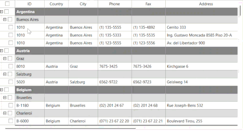
Checkbox Selection
Checkbox selection provides an easier, visual-based method for managing multiple row selections within the FlexGrid. By setting the grid's SelectionMode property, a checkbox is automatically inserted into the first column of each row, allowing users to select or deselect rows individually or in groups without relying on keyboard or mouse shortcuts.
Checkbox Selection Modes
The FlexGrid checkbox feature supports three primary modes of operation, designed to handle individual rows, hierarchical structures, and bulk selection.
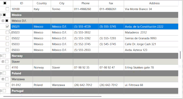
Individual Row Selection
This mode is automatically engaged when the FlexGrid displays hierarchical data.
When a parent node (group row) is selected, all its child nodes are automatically selected. Conversely, changing the state of a child node updates the parent node's checkbox. This feature utilizes a tri-state logic to indicate the parent row's status:
Checked: All child nodes are selected.
Unchecked: No child nodes are selected.
Partially Checked (Tri-State): Only a subset of the child nodes are selected.
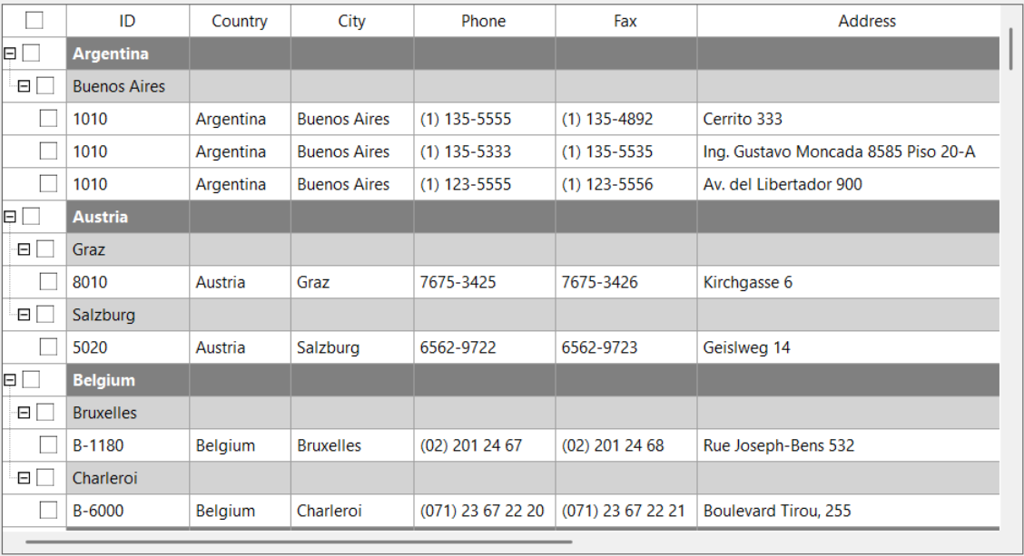
Tree Mode Selection
This mode is automatically engaged when the FlexGrid displays hierarchical data.
When a parent node (group row) is selected, all its child nodes are automatically selected. Conversely, changing the state of a child node updates the parent node's checkbox. This feature utilizes a tri-state logic to indicate the parent row's status:
Checked: All child nodes are selected.
Unchecked: No child nodes are selected.
Partially Checked (Tri-State): Only a subset of the child nodes are selected.
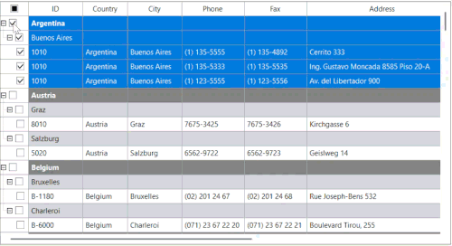
Select All (Fixed Row) Selection
This mode provides a single, convenient control for bulk selection.
FlexGrid automatically inserts an additional checkbox into the first cell of the fixed header row. This checkbox acts as the master select-all control. Toggling this checkbox selects or deselects all visible data rows in the grid at once.
This control also operates in a tri-state manner:
Checked: All data rows are selected.
Unchecked: All data rows are deselected.
Partially Checked (Tri-State): Some but not all data rows are selected.
Sample Usage
The following code demonstrates the minimum required configuration to enable checkbox selection on a FlexGrid control.
using C1.Win.FlexGrid;
public partial class MainForm : Form
{
    public MainForm()
    {
        InitializeComponent();
        flexGrid.SelectionMode = SelectionModeEnum.CheckBox;
    }
}