Complete the steps below to learn how to create a simple application using the FlipCard control.
The following steps are for an application created on Visual Studio 2012. The steps may be differ slightly based on the version of Visual Studio you use.
Complete the following steps to customize the behavior and appearance of the FlipCard control:
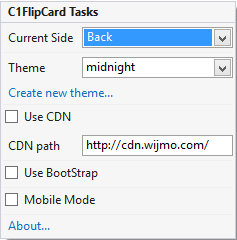
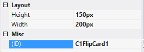
Modify the CurrentSide, Height, Width and Theme property within the <cc1:C1FlipCard> tag, to customize the animation of the Flipcard.
<cc1:C1FlipCardID="C1FlipCard1" runat="server" CurrentSide="Back" Height="150px" Width="200px" Theme="midnight">
Add the following code to the Page_Load event, to customize animation in the FlipCard control.
To write code in C#
C1FlipCard1.CurrentSide = C1.Web.Wijmo.Controls.C1FlipCard.FlipCardSide.Back;
C1FlipCard1.Theme = "midnight";
C1FlipCard1.Height=150;
C1FlipCard1.Width = 200;
To write code in Visual Basic
C1FlipCard1.CurrentSide = C1.Web.Wijmo.Controls.C1FlipCard.FlipCardSide.Back
C1FlipCard1.Theme = "midnight"
C1FlipCard1.Height=150
C1FlipCard1.Width = 200
When you run the project, FlipCard appears as shown in the image below.

Complete the following steps to add content on the front and back side of the FlipCard control. These steps assume that the image is already included in your Visual Studio project.
Modify the FrontSide and BackSide property in the <cc1:C1FlipCard> tag, to customize the animation.
<cc1:C1FlipCard ID="C1FlipCard1" runat="server" Height="500px"
Width="500px" BackPanel-Font-Bold="true" >
<FrontSide>
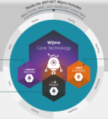
<img src="wijmo-technology.png" height="500" width="500" />
</FrontSide>
            <BackSide>
<h2> The Ultimate UI Control Collection for ASP.NET </h2>

 Studio for ASP.NET Web Forms delivers a complete development toolkit
 for creating and styling modern Web applications that work in any
 browser. The Web Forms controls, MVC scaffolding, and HTML5/JavaScript
 widgets included will help you add fast and flexible grids,
 data visualization (charts, gauges, reports), and scheduling with
 just a few lines of code. Since it is based on our popular Wijmo
 JavaScript core technology, you get a unified set of client and
 server-side tools built with HTML5, jQuery, jQuery Mobile, CSS3, and SVG.
         </BackSide>
FRONT SIDE

BACK SIDE