
- ASP.NET MVC
- Getting Started
- Configuring your MVC Application
- Adding NuGet Packages to your App
- Adding Controls
- Client-Side Support
- Globalization
-
Working with Controls
- Accordion
- Barcode
- CollectionView
- DashboardLayout
- Excel
- File Manager
- Financial Charts
- FlexChart
- FlexGrid
- Transposed Grid
- FlexMap
- FlexPie
- FlexRadar
- FlexReport
- FlexSheet
- FlexViewer
- Gauge
- Input Controls
- MultiRow
- TransposedMultiRow
- OLAP
- Sunburst Chart
- TabPanel
- TreeMap
- TreeView
- Styling
- ASP.NET MVC Samples
- Release History
Elements
InputDateRange control is a simple control with a clean and interactive interface which looks similar to the following image:
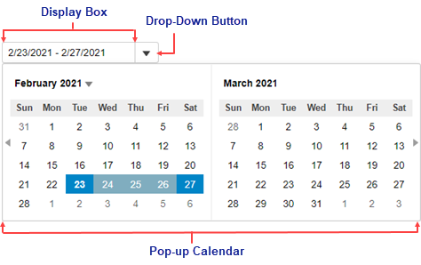
The InputDateRange control consists of the following elements:
- Display Box
The display box shows the selected date range. You can set the date range by entering numeric values or by selecting a date from the pop-up calendar at runtime. - Drop-Down Button
The drop-down button opens a calendar from where you can select a date range to display in the display box. - Pop-up Calendar
The pop-up calendar displays a two month calendar, by default, and allows you to select a date range to be displayed in the display box. It appears when you click the drop-down button.