
- Getting Started
- Configuring your MVC Application
- Adding NuGet Packages to your App
- Adding Controls
- Client-Side Support
-
Working with Controls
- Accordion
- Barcode
- CollectionView
- DashboardLayout
- File Manager
- Financial Charts
- FlexChart
-
FlexGrid
- Key Features
- Quick Start
-
Work with FlexGrid
- Columns
- Custom Cell Template
- Custom Editors
- CSV Export
- Data Binding
- Data Map
- Detail Row
- Disable Server Reading
- Editing
- Excel Import and Export
- Excel RTL Export
- Exclusive Value Search
- Filtering
- FlexGrid Selector
- Full Text Search
- Case-sensitive Search
- Grouping
- Header Focusability
- Keyboard Handling
- Merging
- Paging
- PDF Export
- Right To Left Rendering
- Selection Modes
- Star Sizing
- Styling and CSS
- TreeGrid
- Unbound FlexGrid
- Unobtrusive Validation
- Virtual Scrolling
- FlexGrid ASP.NET Core Tags
- Transposed Grid
- FlexMap
- Flex Pie
- Flex Radar
- Flex Report
- Flex Sheet
- Flex Viewer
- Gauge
- Input Controls
- Multi Row
- TransposedMultiRow
- OLAP
- Sunburst Chart
- Tab Panel
- Tree Map
- TreeView
- Globalization
- Styling
- ASP.NET MVC Samples
- ReleaseHistory
Header Tooltip
You can add tooltips to the FlexGrid column headers. FlexGrid can be used in conjunction with Wijmo's Tooltip control to display data when you hover the mouse cursor over column headers in the FlexGrid control.
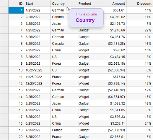
Following example shows how you can bind Tooltips to the column headers of FlexGrid control. The example uses Sale.cs model which was added to the application in the Quick Start topic:
Controller code
public IActionResult Index()
{
    var model = Sale.GetData(20);
    return View(model);
}
View code
@model IEnumerable<Sale>
<style>
    .hdr-tip {
        background: lavender;
        color: mediumvioletred;
        padding: 1em 2em;
        margin: .5em;
        border-radius: 1em;
    }
        .hdr-tip .col-header {
            color: darkviolet;
            font-weight: bold;
            font-size: 150%;
        }
</style>
<script type="text/javascript">
    var hdrTips;
    c1.documentReady(function () {
        // Column header tooltips
        hdrTips = new wijmo.Tooltip({
            position: wijmo.PopupPosition.RightTop,
            showAtMouse: true,
            showDelay: 600,
            cssClass: 'hdr-tip'
        });
    });
    function formatItem(panel, r, c, cell) {
        if (panel.cellType == wijmo.grid.CellType.ColumnHeader) {
            hdrTips.setTooltip(cell, 'This is column<br/>' +
                '<span class="col-header">' + panel.columns[c].header + '</span>');
        }
    }
    function loadingRows() {
        if (hdrTips) {
            hdrTips.dispose();
        }
    }
</script>
<c1-flex-grid auto-generate-columns="false" class="grid"
              is-read-only="true" item-formatter="formatItem" loading-rows="loadingRows">
    <c1-items-source source-collection="@Model"></c1-items-source>
    <c1-flex-grid-column binding="ID"></c1-flex-grid-column>
    <c1-flex-grid-column binding="Start"></c1-flex-grid-column>
    <c1-flex-grid-column binding="Country"></c1-flex-grid-column>
    <c1-flex-grid-column binding="Product"></c1-flex-grid-column>
    <c1-flex-grid-column binding="Amount" format="c"></c1-flex-grid-column>
    <c1-flex-grid-column binding="Discount" format="p0"></c1-flex-grid-column>
</c1-flex-grid>
Sorting
SortOrder feature that allows users to determine how columns are sorted. Sorting also supports ARIA (Accessible Rich Internet Applications).
Property | Type | Values | Description |
|---|---|---|---|
sort-order | SortOrder |
| Defines the sort cycle for a column: • AscDesc: Ascending Descending • DescAsc: Descending Ascending • AscDescNone: Ascending Descending None • DescAscNone: Descending Ascending None |
aria-labelled-by | String | User-defined | Defines an ARIA label reference for screen readers to describe the control. |