Parameters view
General
When creating a parameter, its Data Type specifies the kind of values that the parameter can contain. Any non-hidden parameters can have their values adjusted by a report reader through the Parameters Panel located in the Report Viewer component. Each data type comes with a default editor:
Booleanparameters use radio buttons.DateandDateTimeparameters utilize a calendar control.Integer,String, andFloatparameters use a textbox.
Custom Parameters View
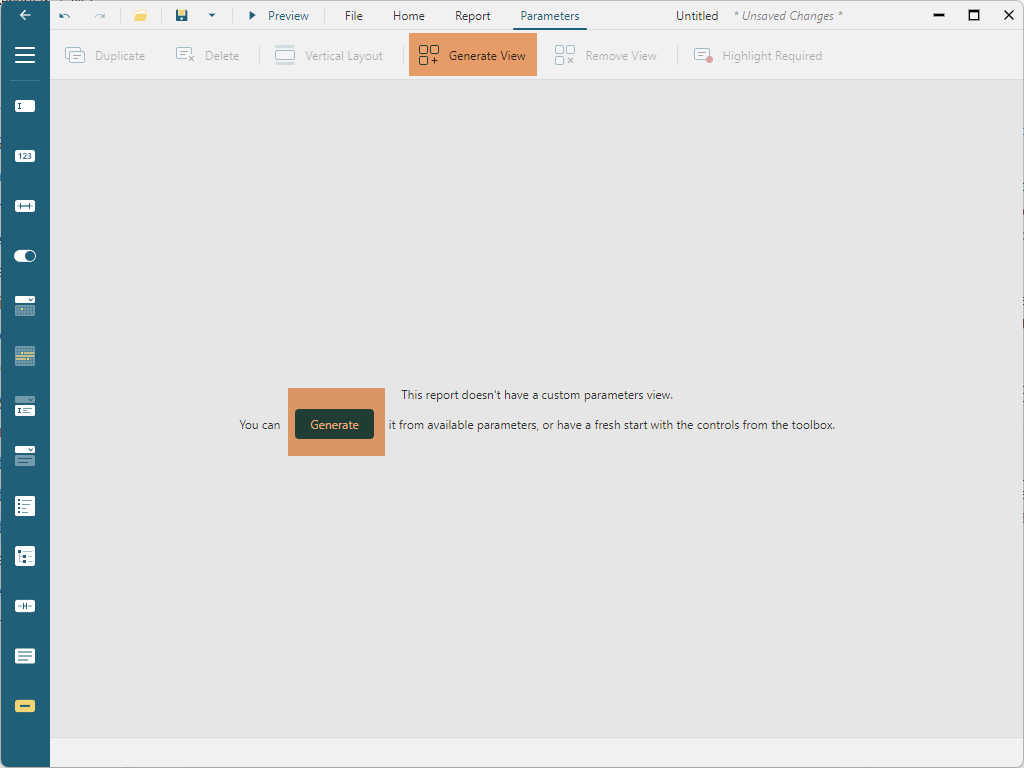
You have the ability to construct a custom parameters view. This will be displayed in the Parameters Panel of the Report Viewer and is managed via the Parameters tab of the Report Designer:

When a report contains parameters, you can begin crafting the parameters view by clicking on the Generate View button situated on the toolbar. Alternatively, you can also use the Generate button found in the prompt:

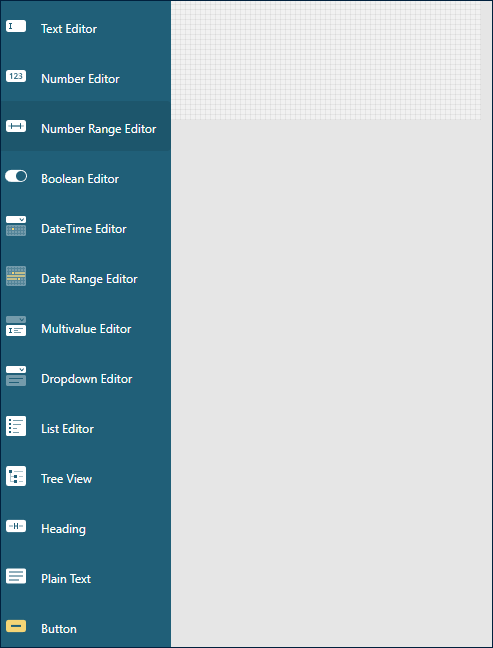
Executing this action will establish default editors for the report parameters along with a Preview button. From here, you're able to configure these automatically generated controls or replace them with new ones by clicking or dragging and dropping items from the sidebar.

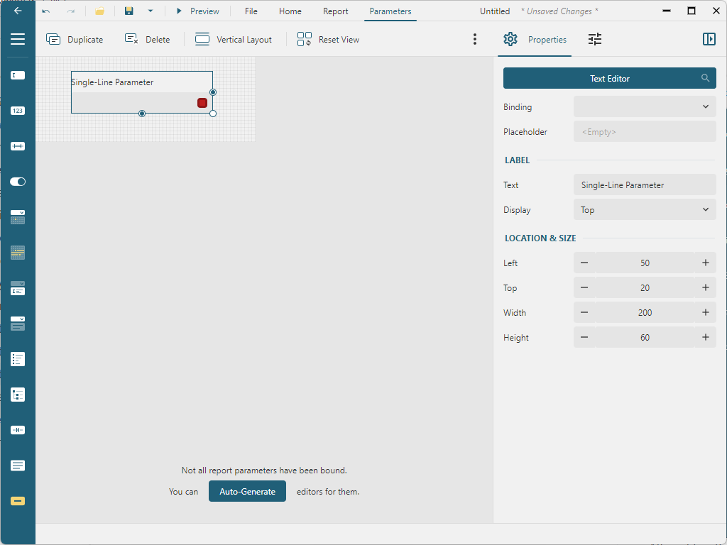
Once these controls are integrated into the parameters view, their properties can be adjusted using the Properties panel found on the designer's right side.

Each control features Location and Size properties that can be altered either by manually moving the control with the mouse or keyboard, or by directly inputting the Left, Top, Width, and Height values in the Properties panel.
Parameters View Layout
There are two types of layouts you can construct using controls:
Free-Form Layout: This layout allows you to manually set the location and size of each control.
Vertical Stack Layout: Controls are automatically arranged from top to bottom and resized. The only variable you can set is the order of the items.
You can set the controls order for the Vertical Stack Layout by clicking the Vertical Layout button, located on the Parameters View toolbar.
The layout type selection depends on the location of the Parameters Panel in the Report Viewer Component:
If the location is set to
toporbottom, the Free-Form Layout will be applied.If the location is set to
defaultorauto, the Vertical Stack Layout will be utilized.
Parameters Views controls
The available controls can be categorized into two groups:
Editorsare linked to parameters and are utilized to set parameter values. All editors have theLabel/Textand theLabel/Displayproperties that determine the content and the position of the prompt that displays alongside the editor. The properties in theBound Parametervalues allows setting theDefault Value,Nullable,Allow Blank(for String parameters only)andMultiline(for String parameters only)properties for the bound parameter. Below you can find the detailed description of available editors and their properties.SupplementalcontrolsHeading,Plain Text, andButtonserve to display additional information and perform actions.
Simple Value Editors
Simple value editors facilitate the modification of parameter values that do not have pre-set Available Values. This allows users to input any values they desire.
Text Editor
The Text Editor provides an input box that is typically used for parameters of the String type. However, by utilizing the Binding property, it can be associated with any type of parameter, as numbers, boolean values, and date values can all be manually inputted. The Placeholder property is used to display a prompt within the input box when it is empty.
Number Editor
The Number Editor can be bound to parameters of Integer and Float types. The Type property defines the editor type, allowing you to choose between an Up-Down editor (default) or a Slider. The Min, Max, and Step properties can be set for both types of editors, defining the minimum value, maximum value, and increment of value when the up/down buttons are clicked or the slider is moved. The Up-Down editor also supports manual value input, and a Placeholder property can be defined to display a prompt within the input box when it's empty. If the Round Input To Step flag is set, any manually entered value will be rounded to the nearest multiple of the step value.
Boolean Editor
The Boolean Editor can be bound to a Boolean type parameter. The Type property determines the editor type, with Toggle, Checkbox, or Radio as options. For the Checkbox, you can define the Text to be displayed next to the checkmark. For both Toggle and Radio, you can set the text for the True and False values. Additionally, the Radio editor's Layout can be set to either Horizontal or Vertical.
Multivalue Editor
The Multivalue Editor enables manual entry of values for multi-value parameters of any type. This editor is specifically applicable for parameters that do not have Available Values configured.
DateTime Editor
The DateTime Editor can be associated with parameters of Date and DateTime types. The only available editor for these types is a calendar.
Range Editors
Range editors enable users to define values for two distinct parameters, which represent the lower and upper boundaries of a range.
Number Range
The Number Range editor takes the form of a slider with two handles. It includes From and To binding properties that can be associated with Integer and Float parameters. The Min, Max, and Step properties allow you to specify the minimum value, maximum value, and the value increment that occurs when adjusting the slider.
Date Range
The Date Range editor is a calendar feature allowing the selection of a Start Date and an End Date. These can be bound to their corresponding parameter values using the From and To properties. Additionally, the Max Range property stipulates the maximum duration of the range, while the View Mode property sets the scale of the range selection, available in days (default), months, or years.
Selection Editors
Selection Editors are elements that present a list of options to the report reader. The reader can select one or multiple values from this list, depending on the Multivalue flag of the bound parameter. Note that these editors are only applicable when the parameter has Available values configured.
List Editor
The List Editor organizes the Available values into a list, which can be arranged either horizontally or vertically. The choice between horizontal and vertical orientation can be made via the Layout property. For horizontal lists, an additional property, Columns, exists that determines how many columns the values will be divided into.
Dropdown Editor
The Dropdown Editor offers a dropdown-style presentation of the Available values.
Supplemental Controls
Supplemental controls include Heading, Plain text, and Button.
The Heading and Plain text controls are used to display static text. These controls allow for the selection of four different color styles: Accent, Error, Warning, or Default. Additionally, the Heading control can include a strikethrough line, and the Plain text control can be configured to display multiple lines.
The Button control serves to facilitate various actions. Preview executes the report with the parameters as currently set. Reset reverts the parameters to their default values. Clear removes all values from the input controls.


