
ColorPicker Overview
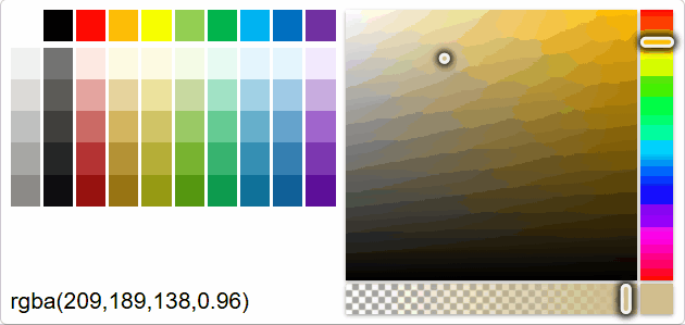
The ColorPicker control lets users select a color by clicking on panels to adjust channels, such as hue, saturation, brightness and alpha. The control can be used as a drop-down for the InputColor control. You can use the value property to get or set the currently selected color.
HTML
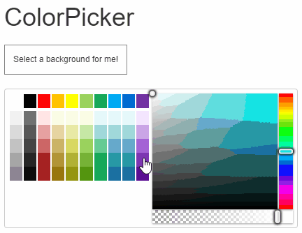
<h1>ColorPicker</h1>
<div id="output">
  Select a background for me!
</div>
<div id="theColorPicker"></div>
CSS
h1{
  margin: 10px;
}

.wj-colorpicker {
  margin: 10px;
}
#output {
  margin: 10px;
  float: left;
  font-size: 12px;
  border: 1px solid grey;
  padding: 12px;
}
Javascript
import * as input from '@mescius/wijmo.input';

function init() {
    // ColorPicker
    let theColorPicker = new input.ColorPicker('#theColorPicker', {
        showAlphaChannel: true,
        showColorString: true,
        valueChanged: (sender) => setBackground(sender.value)
    });

    // show the color that was selected
    function setBackground(color) {
        document.getElementById('output').style.background = color;
        theColorPicker.value = color;
    }
}
Also, you can customize the ColorPicker by changing values of the showAlphaChannel, showColorString, and palette properties. For detailed implementation, see the ColorPicker demo.
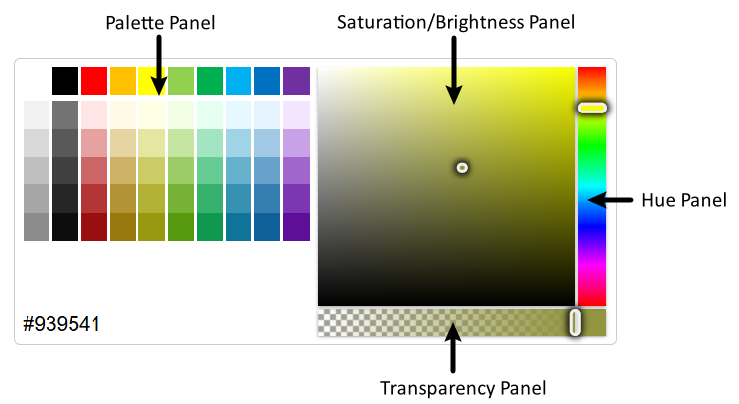
The ColorPicker is divided into 4 panels: Palette Panel, Saturation/Brightness Panel, Hue Panel, and Transparency Panel. Each area supports changing colors via the keyboard Up/Down/Left/Right Arror keys after gaining focus.
By default, the ColorPicker does not support using the Tab key and Shift + Tab key to switch focus between panels. You can enable switching in the following ways:
import * as wjInput from '@mescius/wijmo.input';

new wjInput.ColorPicker('#theColorPicker', {
    keyActionTab: wjInput.ColorPickerTabKeyAction.All
});