AutoComplete Overview
The AutoComplete control is an input control that allows you to select from a dropdown list of suggestions as the user types. From functionality and architecture point of view, it extends the ComboBox control to provide two additional features:
- Autocomplete automatically filters the items in the drop-down list to include only those items that match the current user input.
- Autocomplete populates the drop-down asynchronously based on the current user input and changes the search logic. By default, the ComboBox looks for items that start with the user input, while AutoComplete looks for items that contain the user input.
The AutoComplete control is populated with items using the itemsSource property.

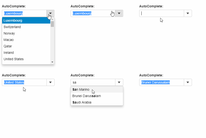
The example below creates an AutoComplete control and populates it using a 'countries' array. As the user types, AutoComplete searches for the country, and narrows down the list according to the current input.
HTML
<label for="theAutoComplete">AutoComplete:</label>
<br/>
<div id="theAutoComplete"></div>
Javascript
import * as input from '@mescius/wijmo.input';
import { getData } from './data';

function init() {
    let theAutoComplete = new input.AutoComplete('#theAutoComplete', {
        displayMemberPath: 'country',
        itemsSource: getData()
    });
}
Add Items Automatically
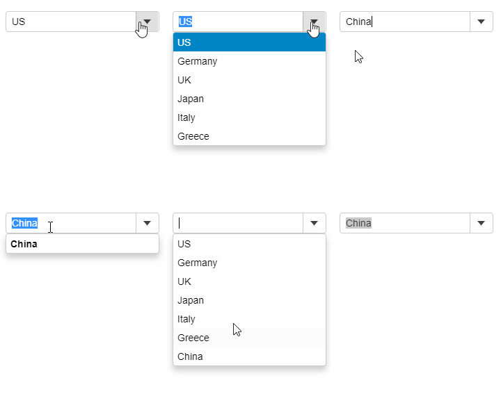
User can dynamically add items to the AutoComplete itemsSource, by setting the isEditable property to True and by handling the lostFocus event. As soon as the user types in a value that does not exist in the itemsSource and moves the focus away from the control, the lostFocus event appends the typed item to the array assigned as the itemsSource of the control.

Javascript
import * as wijmo from '@mescius/wijmo';
import * as input from '@mescius/wijmo.input';

function init() {
    let countries = new wijmo.ObservableArray(['US', 'Germany', 'UK', 'Japan', 'Italy', 'Greece']);

    new input.AutoComplete('#theAutoComplete', {
        itemsSource: countries,
        lostFocus: lostFocus
    });

    // add item to the list when a control loses focus
    function lostFocus(sender) {
        let item = sender.text;
        if (item && countries.indexOf(item) < 0) {
            countries.push(item);
        }
    }
}


