


- Getting Started
-
Topics
- Wijmo
- Chart
- Map
- Cloud
- Gauge
- Grid
- OLAP
- Input
- Nav
- Viewer
- Tutorials
Specifying the Tree Column
In tree or grouped grids, FlexGrid displays hierarchical indicators (expand/collapse buttons and indentation) in the first visible column by default.
Use the treeColumnIndex property to specify which column displays the tree hierarchy.
The following images compare the default behavior and a custom tree column.
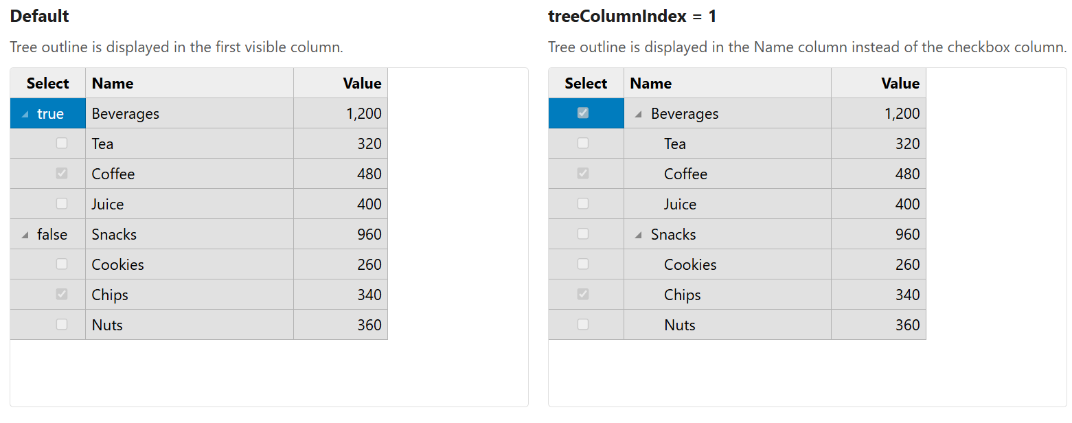
Default Behavior
By default, treeColumnIndex is set to -1.
When the value is negative, the grid displays hierarchical indicators in the first visible column.
Setting the Tree Column
Set treeColumnIndex to a value greater than or equal to zero.
The value represents the index of the column in the grid’s columns collection.
import * as wjGrid from '@mescius/wijmo.grid';

var grid = new wjGrid.FlexGrid('#grid', {
    childItemsPath: 'children',
    treeColumnIndex: 1,
    autoGenerateColumns: false,
    columns: [
        { binding: 'select' },   // checkbox column
        { binding: 'name' },     // tree hierarchy displayed here
        { binding: 'value' }
    ],
    itemsSource: data
});
Hierarchical indicators are rendered in the specified column instead of the first visible column.
Behavior Details
When treeColumnIndex is set:
Expand/collapse buttons, indentation, and grouped line text are rendered in the specified column.
Keyboard navigation and expand/collapse logic use the specified column for tree interaction.
Grid export (XLSX and PDF) renders the tree hierarchy in the same column as the UI.
Hidden Columns
If the column specified by treeColumnIndex is hidden but still exists in the grid’s columns collection, the index value is retained internally.
The grid does not automatically fall back to the first visible column in this case.