
Overlays
In a Grid control, overlay content refers to additional elements or content that are displayed on top of the grid to display contextual information when no data is loaded in the grid.
To display a string message or overlay in the Grid control when it is empty, the noDataOverlayContent property of the FlexGrid class is used to enhance the user experience.
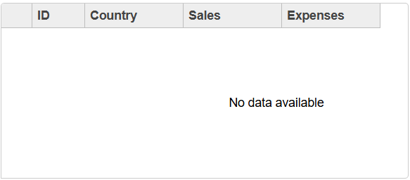
Following code example shows how to display a message when no data is available in the Grid control:
var theGrid = new FlexGrid('#theGrid', {
 autoGenerateColumns: false,
 columns: [
 { binding: 'country', header: 'Country', width: '2*' },
 { binding: 'sales', header: 'Sales', width: '*', format: 'n2' },
 { binding: 'expenses', header: 'Expenses', width: '*', format: 'n2' }
 ],
 itemsSource: [ ]
 });

 // display no data overlay
 theGrid.noDataOverlayContent = "No data available";
Addionally, a new property overlayManager is also available for users to do more customization of overlay content. To use the overlayManager property, users need to define a new class by inheriting from overlayManager class and override the required method(s) to customize its functionality.
type=info
Limitation:
Specific templates are not supported. User needs to use the 'noDataOverlayContent' in interop implementations too.