- Getting Started
-
Topics
- Wijmo
- Chart
- Map
- Cloud
- Gauge
- Grid
- OLAP
- Input
- Nav
- Viewer
- Tutorials
Checkbox-Based Selection in FlexGrid
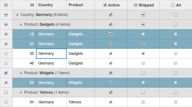
Through the use of the wijmo.grid.selector module, we can allow Checkbox-based selection, both at the single-row level and the grouped data level, within the FlexGrid. We have two different classes within the module that we can use to implement Checkbox-based selection: Selector and BooleanChecker.
Selector: This class customizes a FlexGrid column by adding checkboxes to its cells. The checkboxes show and allow users to toggle the row's isSelected property. If there are any group header rows, their checkboxes show and toggle the selected sate for all items in the group. An additional checkbox is added to the column header to toggle the selection for all of the rows.
BooleanChecker: This class customizes regular data columns bound to Boolean fields by adding additional checkboxes to group rows and the column header. These checkboxes are used to toggle the value of the Boolean property for all items in any group or on the whole grid.
Creating Selectors and BooleanCheckers:
import { Selector, BooleanChecker } from '@mescius/wijmo.grid.selector';
import { FlexGrid } from '@mescius/wijmo.grid';
import { CollectionView, DataType, Aggregate } from '@mescius/wijmo';

window.onload = function () {
    // create the grid
    let theGrid = new FlexGrid('#theGrid', {
        itemsSource: getData()
    });

    // create the Selector on the first row header column
    let selector = new Selector(theGrid);

    // add BooleanCheckers to all bound Boolean columns
    theGrid.columns.forEach(col => {
        if (col.dataType == DataType.Boolean) {

            // set aggregate to show checkboxes on group header rows
            col.aggregate = Aggregate.First;

            // create the BooleanChecker on the column
            new BooleanChecker(col);
        }
    });
}

The Selector constructor takes a FlexGrid or a Column parameter. If you pass it a grid, the Selector attaches to the grid's first row-header column. If you pass it a specific column, it uses that column instead. The BooleanChecker takes a parameter that specifies a column bound to a Boolean field.


