


- Getting Started
-
Topics
- Wijmo
- Chart
- Map
- Cloud
- Gauge
- Grid
- OLAP
- Input
- Nav
- Viewer
- Tutorials
Sticky Group Headers
Use the stickyGroupHeaders property to keep the current group headers visible while users scroll through grouped data.
This feature applies to grouped FlexGrid views and preserves the current grouping context when the original group rows scroll out of view.
Example
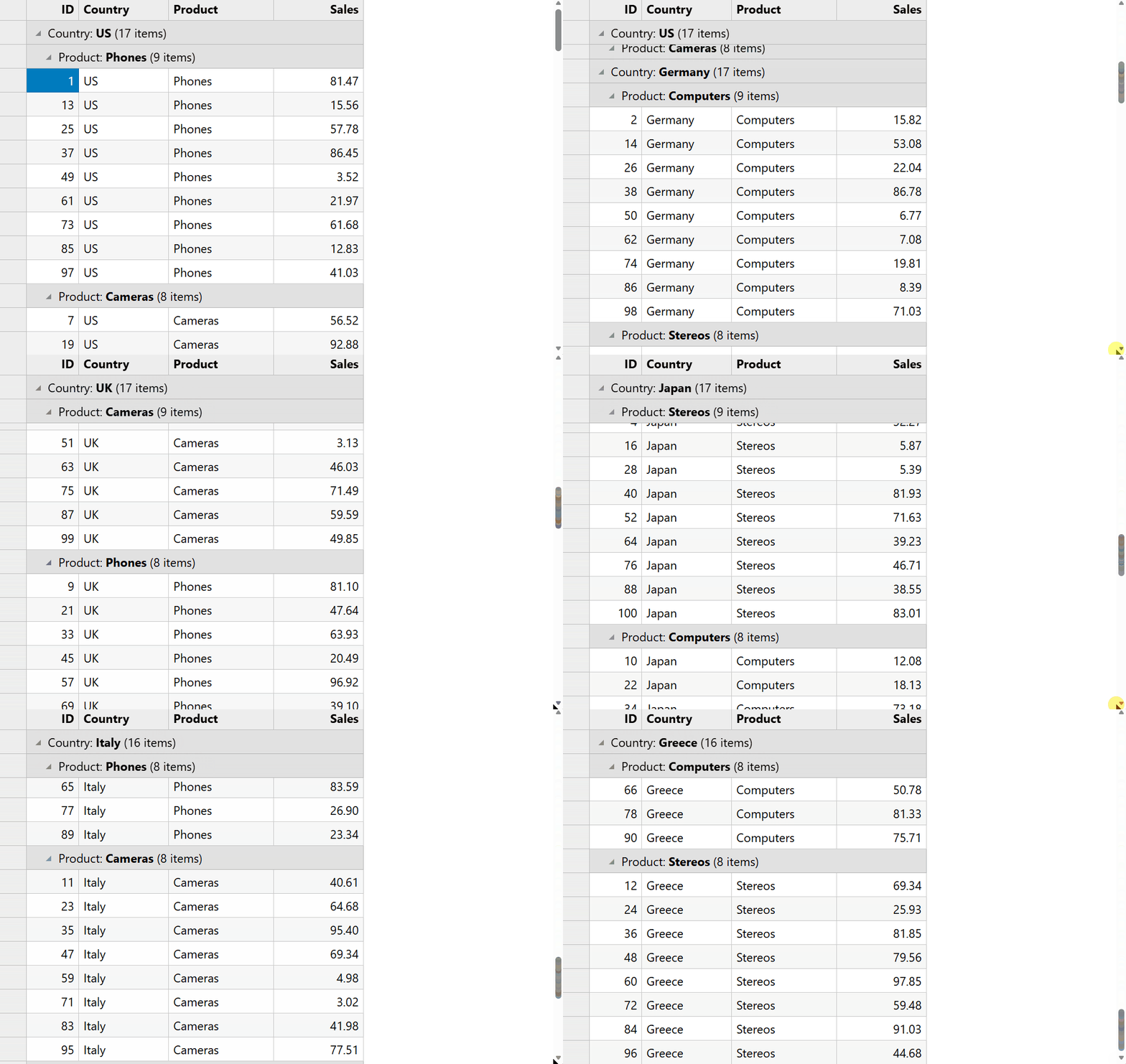
The example below groups data by two fields and enables sticky group headers.
import * as wjCore from '@mescius/wijmo';
import * as wjGrid from '@mescius/wijmo.grid';

const countries = 'US,Germany,UK,Japan,Italy,Greece'.split(',');
const products = 'Phones,Computers,Cameras,Stereos'.split(',');

const data = [];
for (let i = 0; i < 100; i++) {
  data.push({
    id: i + 1,
    country: countries[i % countries.length],
    product: products[i % products.length],
    sales: Math.round(Math.random() * 10000) / 100
  });
}

const view = new wjCore.CollectionView(data, {
  groupDescriptions: [
    new wjCore.PropertyGroupDescription('country'),
    new wjCore.PropertyGroupDescription('product')
  ]
});

const grid = new wjGrid.FlexGrid('#theGrid', {
  autoGenerateColumns: false,
  columns: [
    { binding: 'id', header: 'ID', width: 70 },
    { binding: 'country', header: 'Country', width: 120 },
    { binding: 'product', header: 'Product', width: 140 },
    { binding: 'sales', header: 'Sales', format: 'n2', width: 120 }
  ],
  itemsSource: view,
  stickyGroupHeaders: true
});
Behavior
When stickyGroupHeaders is enabled:
The current visible group header remains pinned at the top of the grid.
Multiple group levels are supported.
One sticky header is displayed for each active group level.
Sticky headers are stacked from parent to child in hierarchy order.
Sticky group headers behave like regular
GroupRowelements.Users can select, collapse, and expand groups while headers are pinned.
If row headers are visible, the row header panel participates in sticky rendering and remains aligned with the cell viewport.
When stickyHeaders is enabled, sticky group headers are displayed below the sticky column header area.
Interaction
Sticky group headers preserve normal keyboard and selection behavior.
Upward navigation continues to move to the previous selectable row.
When the selection approaches the sticky area, the grid scrolls as needed to maintain correct selection behavior.
When the active sticky path changes, selection updates to remain within the corresponding group context.
Limitations
Effective only when grouping is active.
Not supported when using
childItemsPath.Summary group rows are not included in sticky rendering.
Not supported together with
frozenRows,frozenColumns, orfrozenCells.