
- SpreadJS Overview
- Getting Started
- JavaScript Frameworks
- Best Practices
-
Features
- Workbook
- Worksheet
- Rows and Columns
- Headers
- Cells
- Data Binding
- TableSheet
- GanttSheet
- ReportSheet
- Data Charts
- JSON Schema with SpreadJS
- SpreadJS File Format
- Data Validation
- Conditional Formatting
- Sort
- Group
- Formulas
- Serialization
- Keyboard Actions
- Shapes
- Floating Objects
- Barcodes
- Charts
- Sparklines
- Tables
- Pivot Table
- Slicer
- Theme
- Culture
- AI Assistant
- SpreadJS Designer
- Tutorials
- SpreadJS Designer Component
- SpreadJS Collaboration Server
- Touch Support
- Formula Reference
- Import and Export Reference
- Frequently Used Events
- API Documentation
- Release Notes
Header
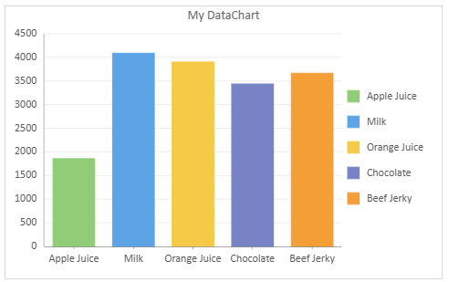
Headers are the text fields that appear on the top of a Data Chart. The header provides overall information or identification for the chart to help users quickly understand the chart's theme and the data being presented.
You can add to and customize a header for your Data Chart by using the properties of the IHeaderOption interface in the GC.Spread.Sheets.DataCharts namespace, such as title, textStyle, etc.
Header Properties
The list below shows the key properties of the IHeaderOption interface.
Property | Description | Sample Preview |
|---|---|---|
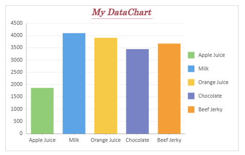
title | Sets the text content displayed on the header area of the Data Chart. |
|
textStyle | Sets styles for the header text, for example font family, font size, font style, font weight, etc. |
|
padding | Sets the padding of the header area. |
|
style | Sets the styles of the header area, e.g. background color, border style, etc. |
|
Using Code
The following code sample shows how to configure a custom header for the Data Chart.
Note that this code sample uses the "salesTable" data mentioned on the Create Data Charts page. Therefore, make sure you have completed the primary steps outlined on that page to set up a data chart. Once done, you can use the following codes to configure the header elements. Additionally, you have the flexibility to customize the data source according to your specific needs.
// Chart header
const sheet = spread.getSheet(0);
sheet.name("Chart Header");
const dataChart = sheet.dataCharts.add('data-chart-1', 10, 10, 480, 300, GC.Spread.Sheets.DataCharts.DataChartType.column);

dataChart.setChartConfig({
    tableName: 'Sales',
    config: {
        // Configure the Header
        header: {             // interface GC.Spread.Sheets.DataCharts.IHeaderOption
            title: "My DataChart",      // string
            textStyle: {          // interface GC.Spread.Sheets.DataCharts.ITextStyleOption
                alignment: GC.Spread.Sheets.DataCharts.HAlign.center,
                color: "#9f3b47",
                fontFamily: "Century",
                fontSize: 18,
                fontStyle: GC.Spread.Sheets.DataCharts.FontStyle.italic,
                fontWeight: "Bold",
                writingMode: GC.Spread.Sheets.DataCharts.Orientation.horizontal,
                textDecoration: { underline: true },
            },
            padding: {       // GC.Spread.Sheets.DataCharts.IPaddingOption
                top: 10,
                bottom: 10
            },
            height: 30,      // number
            style: {         // GC.Spread.Sheets.DataCharts.IStyleOption
                fill: { type: "CssColor", color: "#dfeeea" },
                fillOpacity: 0.7,
                stroke: { type: "CssColor", color: "#aaaaaa" },
                strokeDasharray: "0.5,0.5",
                strokeOpacity: 0.7,
                strokeWidth: 1
            }
        }
    },
    plots: [
        {
            type: GC.Spread.Sheets.DataCharts.DataChartType.column,
            encodings: {
                values: [{ field: 'Sales', aggregate: GC.Spread.Sheets.DataCharts.Aggregate.sum }],
                category: { field: 'Product' },
                color: { field: 'Product' },
            }
        }
    ]
});