- Document Solutions for Excel Java Overview
- Key Features
- Getting Started
-
Features
- Worksheet
- Workbook
- Comments
- Hyperlinks
- Sort
- Filter
- Group
- Conditional Formatting
- Data Validations
- Data Binding
- Import Data
- Digital Signatures
- Formulas
- Custom Functions
- Shapes
- Document Properties
- Styles
- Form Controls
- Barcodes
- Themes and Colors
- Chart
- Table
- Pivot Table
- Pivot Chart
- Sparkline
- Slicer
- Print Settings
- Logging
- Defined Names
- AI Assistant
- Templates
- Formula Reference
- File Operations
- Tutorials
- Use JDK 8 Date Time API
- Document Solutions Data Viewer
- API Reference
- Release Notes
Chart Types
DsExcel supports a wide range of chart types such as Area, Column, Line, Pie, Bar, Combo, Stock, Surface, Scatter, Radar, Statistical and Specialized charts. It also supports new Excel 2016 statistical and specialized chart types like Sunburst, Pareto, Treemap, Histogram, WaterFall, Box and Whisker, and Funnel. The new chart types represent and analyze hierarchical data better than conventional charts.
This topic gives a quick snapshot of all major chart types and their use cases.
Chart Type | Chart Snapshot | Use Case |
|---|---|---|
|
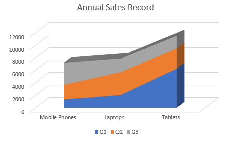
| An Area chart is used to represent data that follows a time-series relationship.This type of chart is ideal when you need to show the plot change over time and depict the total value across a trend by showing the sum of the plotted values. |
|
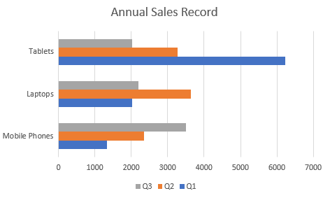
| Bar charts are used for showing patterns and trends across different categories. In these charts, each horizontal bar corresponds to a category and its length corresponds to the value or measure of that category. |
|
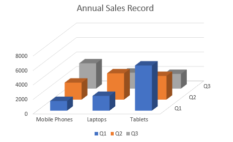
| Unlike bar charts, Column charts use vertical columns/bars for representing data. These charts are generally used to plot data easily on X-axis. |
|
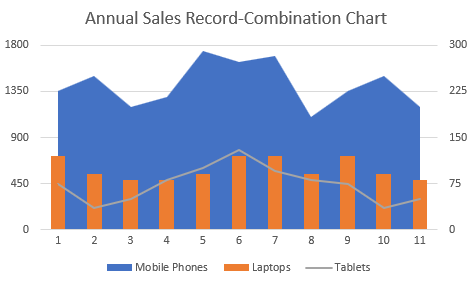
| The combo of two or more different charts can be used in the same plot area to compare the different data sets that are related to each other. |
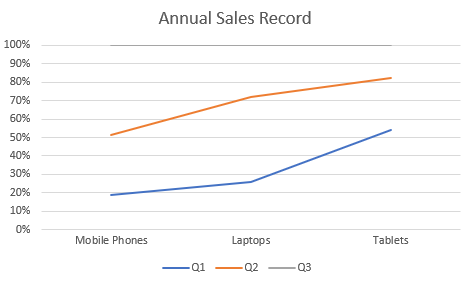
|
| Line charts are used to plot continuously changing data against an interval of time. They can also be used to plot data against other continuous periodic values such as temperature, distance, humidity, share price, earnings per share etc.) |
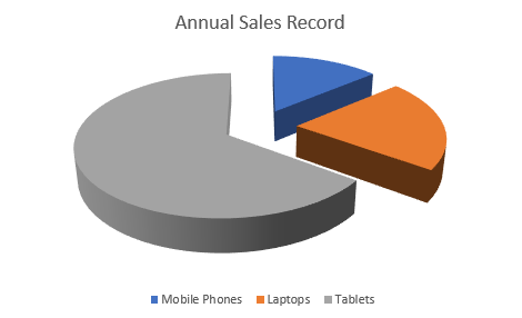
|
| Pie charts are used to represent the relative contribution of various categories.It is one of the most commonly used charts and makes it easy to compare proportions by displaying the contribution of each value (slice) to a total (pie). |
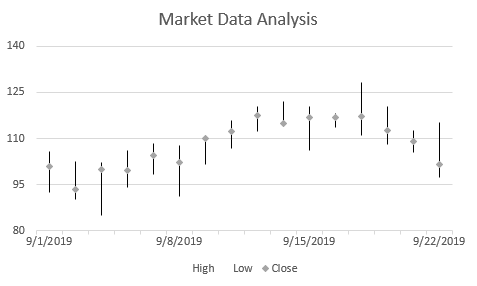
|
| A Stock chart is used to illustrate fluctuations in data. It can represent fluctuations for stock, daily rainfall, or annual temperatures. Typically, this chart is ideal for analyzing financial data and visualizing stock information. |
|
| Surface charts are used to find the optimum combinations between two sets of data. As in a topographic map, the colors and patterns indicate the areas that are in the same range of values. |
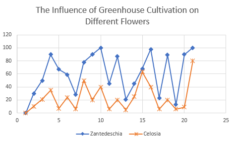
|
| An XY chart (also called scatter diagram) is a two-dimensional chart that shows the relationship between two variables. In a scatter graph, both horizontal and vertical axes are value axes that plot numeric data to show the correlation between two variables. |
|
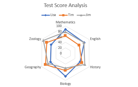
| Radar charts are radial charts that help in visualizing comparison of two or more groups of values against various features or characteristics. These charts represent each variable on a separate axis, which are arranged radially at equal distances from each other. |
|
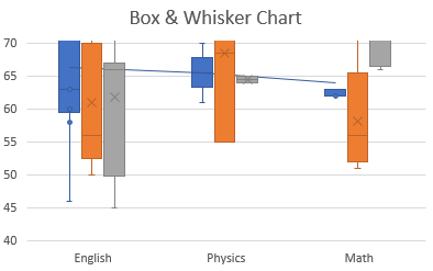
| Statistical charts help summarize and add visual meaning to key characteristics of data, including range, distribution, mean and median. It can also be used to in present and interpret statistical data in graphical format. |
|
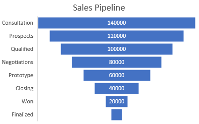
| Specialized chart types provided by DsExcel have unique data representation to show hierarchies and relationships. Such visual comparisons allow users to analyze the data thoroughly. |