- Document Solutions for Excel, Java Edition Overview
- Key Features
- Getting Started
- Features
- Templates
- Formula Reference
- File Operations
- Use JDK 8 Date Time API
- Tutorials
- Document Solutions Data Viewer
- API Reference
- Release Notes
Custom Form Input Types
Along with the support of Standard PDF form fields in DsExcel Templates, it also supports custom form input types in PDF forms which allow you to fill PDF forms easily and conveniently. It supports adding HTML5 custom input types to PDF documents. These custom form input types are not supported by standard PDF specification and hence these can only be opened, viewed and filled in GcDocs Pdf Viewer (not in Acrobat or other PDF viewers). These custom form input types are inherited from "textbox" field and are mentioned below:
text
date
time
tel
email
url
password
month
week
number
search
You can also define validation settings for these custom form input types which provide users with feedback on their form submission before sending it to server. For example, any custom form input type is a required field, password needs to be of minimum 8 characters, email needs to follow a certain pattern etc. If a certain validation is not followed and a validation message is set, the form will display the defined validation message on submission. These validations can be defined in custom form input types by using below validation types:
validationmessage
validateoninput
minlength
maxlength
required
pattern
min
max
A few examples of custom form input types with validations are given below:
{{(form={"type":"url", "autocomplete":"url", "validateoninput": true, "backgroundcolor": "rgb(191, 207, 255)", "border": {"color": "#000000"}})}}
{{(form={"type":"email", "autocomplete":"email", "validateoninput": true, "backgroundcolor": "rgb(191, 207, 255)", "border": {"color": "#000000"}})}}
{{(form={"type":"password", "autocomplete":"off", "validateoninput": true, "placeholder": "4 to 8 characters", "pattern": "^(?=.*\\d).{4,8}$", "validationmessage": "The password must be between 4 and 8 characters.", "backgroundcolor": "rgb(191, 207, 255)", "border": {"color": "#000000"}})}}
These custom form input types are inherited from 'textbox' field, hence they inherit all the 'textbox' field settings which can be referred here. Also, there are some Common Settings which can be applied to all the custom form input types. The settings specific to each field are explained below:
Tel or Password or URL Custom Form Input Type Settings
Property | Value | Example | Description |
|---|---|---|---|
pattern | String | {"type": "tel" , "pattern":"[0-9]{3}-[0-9]{2}-[0-9]{3}"} | Pattern the value must match to be valid |
placeholder | String | {"type": "password" , "placeholder": "4 to 8 characters"} | Sets or returns the value of the placeholder attribute of an tel field |
maxlength | Integer | {"type": "password" , "minlength": 4, "maxlength": 8} | Maximum length (number of characters) of value |
minlength | Integer | {"type": "password" , "minlength": 4, "maxlength": 8} | Minimum length (number of characters) of value |
Email Custom Form Input Type Settings
Property | Value | Example | Description |
|---|---|---|---|
multiple | Boolean | {"type": "email" , "multiple": true} | Sets or returns whether a user is allowed to enter more than one email address in the email field. |
pattern | String | {"type": "email" , "pattern": "\\S+@\\S+\.\\S+"} | Sets or returns the value of the pattern attribute of an email field. |
placeholder | String | {"type": "email" , "placeholder": "example@xxx.com"} | Sets or returns the value of the placeholder attribute of an email field. |
Text Custom Form Input Type Settings
Property | Value | Example | Description |
|---|---|---|---|
maxlength | Integer | {"type": "text" , "minlength": 4, "maxlength": 8} | Maximum length (number of characters) of value |
minlength | Integer | {"type": "text" , "minlength": 4, "maxlength": 8} | Minimum length (number of characters) of value |
pattern | String | {"type": "text" , "pattern": "\\S+@\\S+\.\\S+"} | Sets or returns the value of the pattern attribute of field |
placeholder | String | {"type": "text" , "placeholder": "Input your name!"} | Sets or returns the value of the placeholder attribute of field |
spellcheck | Boolean | {"type": "text" , "spellcheck": true} | Whether the element may be checked for spelling errors |
Search Custom Form Input Type Settings
Property | Value | Example | Description |
|---|---|---|---|
maxlength | Integer | {"type": "search" , "minlength": 4, "maxlength": 8} | Maximum length (number of characters) of value |
minlength | Integer | {"type": "search" , "minlength": 4, "maxlength": 8} | Minimum length (number of characters) of value |
placeholder | String | {"type": "search" , "placeholder": "Search..."} | Sets or returns the value of the placeholder attribute of field |
spellchecker | Boolean | {"type": "search" , "spellcheck": true} | Whether the element may be checked for spelling errors |
Validation Settings
The following table explains the validation settings provided for custom custom form input types.
Property | Value | Description |
|---|---|---|
validateonmessage | String | Localized validation message |
validateoninput | Boolean | Indicates whether validation should be performed immediately during user input |
maxlength | Number | Maximum number of characters to be accepted |
minlength | Number | Minimum number of characters which can be considered valid |
required | Boolean | Indicates whether the form filling is required or not |
pattern | String | Regular expression that must be matched by the entered value to pass constraint validation |
max | Number | Maximum value to accept for this input |
min | Number | Minimum value to accept for this input |
Settings Supported by Custom Form Input Types
The following table provides consolidated information about settings supported by different custom form input types.
Attribute | Input Field Type | Description |
|---|---|---|
autocomplete | All | Input type. |
autofocus | All | Automatically focus the form control when the page is loaded. |
defaultvalue | All | The default value. |
disabled | All | Whether the form control is disabled. |
displayname | All | Text label for the input control. Applicable only if the field appears in the Form Filler dialog box. |
min | number and date | Minimum value to accept for the input. |
max | number and date | Maximum value to accept for the input. |
maxlength | password, search, tel, text and url | Maximum length (number of characters) of value. |
minlength | password, search, tel, text and url | Minimum length (number of characters) of value |
multiline | text | Set this property to true if you want to use the textarea as a user input element. |
multiple | Boolean. Whether to allow multiple values or not. | |
pattern | password, text and tel | Pattern value must match to be valid. |
placeholder | password, search, tel, text and url | Text that appears in the form control when it has no value set. |
readonly | All | Boolean. The value is not editable. |
required | All | Boolean. A value is required or must be check for the form to be submittable. |
spellcheck | search and text | Whether the element may be checked for spelling errors. |
type | All | Type of form control. |
validateonmessage | All | Localized validation message. |
validateoninput | All | Indicates whether validation should be performed immediately during user input. |
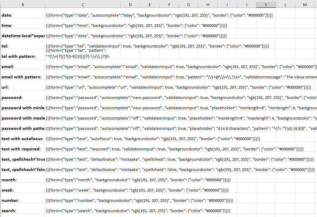
The following Excel template shows various input types and settings supported with DsExcel templates. As can be observed, these fields are very common and makes PDF form filling very convenient. The 'date' and 'time' fields will provide date picker and time picker dropdown UI in the generated PDF form when viewed in Document Solutions PDF Viewer. The 'tel with pattern' field defines a pattern which will be matched with the user input while filling the form. The 'password with minlength' and 'password with maxlength' defines the character limit which can be used while setting a password. The validations applied to custom form input types make the form filling more meaningful and useful.
You can also download the Excel template layout from here.

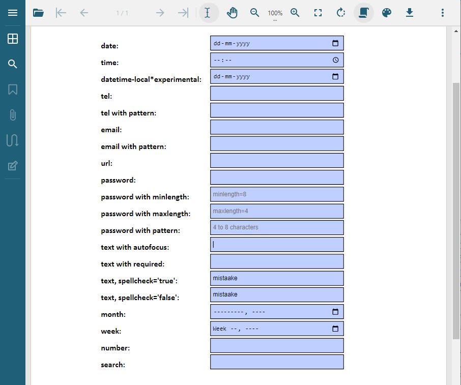
After DsExcel processes the above template and exports it to a PDF document, the PDF form will look like below in Document Solutions PDF Viewer:

Note: The PDF form with custom input fields can only be filled in Document Solutions PDF Viewer. You can also customize the custom form input type settings by using Document Solutions PDF Viewer's Form Filler feature.


