
PDF Form Builder
DsExcel Templates provide the ability to build PDF forms with various form fields using Excel as the designer. The form fields can be defined using the proper syntax while creating template layouts. After the template is processed, the result can be exported to a PDF document that includes the pre-defined form fields.
The "form" property can be used to define a PDF form field. The value of this property is in JSON format and a JSON string can be used to describe all settings of the form field. For example:
{{ds1.Name(form={"type": "textbox", "name": "username", "value": "Input your name!","font":{"size":15, "color": "#ff0000", "bold": true}, "required": true})}}
{{(form={"type": "listbox", "name": "cities", "value": ["Xi'An", "BeiJing"],"font":{"size":11, "color": "#ff00ff", "bold": true}, "required": true})}}
!type=note
Note: The property name and enum values are case insensitive.
The following standard PDF form fields are supported:
Check box
Combo box
List box
Button
Radio button
Signature
Text box
!type=note
Note: The form fields are visible only in PDF documents and not in Excel.
Bound PDF Form
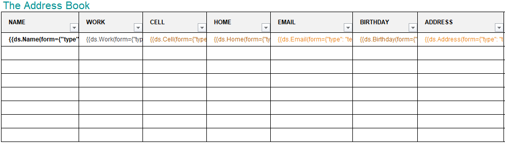
Consider an example for generating a bound PDF form by using DsExcel Templates. In this case, an address book is generated in PDF by defining textbox fields in template cells. The textbox fields are defined in a way that they relate to common details of an address book, like:
Name : {{ds.Name(form={"type": "textbox", "name": "name","font":{"color": "#000000", "bold": true}})}}
Email: {{ds.Email(form={"type": "textbox", "name": "Email","font":{"color": "#EC881D"}})}}
These textbox fields are bound fields, whose data is populated from the data source and is displayed in the PDF form after template processing. You can also download the Excel template layout from here.
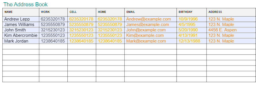
After DsExcel processes the template and exports it to a PDF document, the PDF form will look like below:
Unbound PDF Form
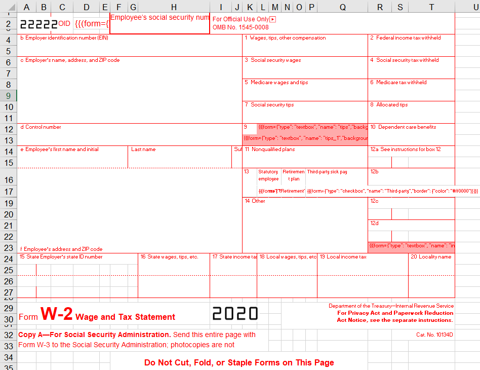
Consider an example for generating an unbound PDF form by using DsExcel Templates. In this case, a wage and tax statement is generated in PDF by defining textbox and checkbox fields in template cells, like:
Textbox field:
{{(form={"type": "textbox", "name": "tips","backgroundcolor": "#ffabab"})}}
Checkbox fields:
{{(form={"type": "checkbox", "name": "Retirement","border": {"color": "#ff0000"}})}}
{{(form={"type": "checkbox", "name": "Statutory","border": {"color": "#ff0000"}})}}
These fields are unbound fields, and their data should be filled directly in the PDF form after template processing. You can also download the Excel template layout from here.
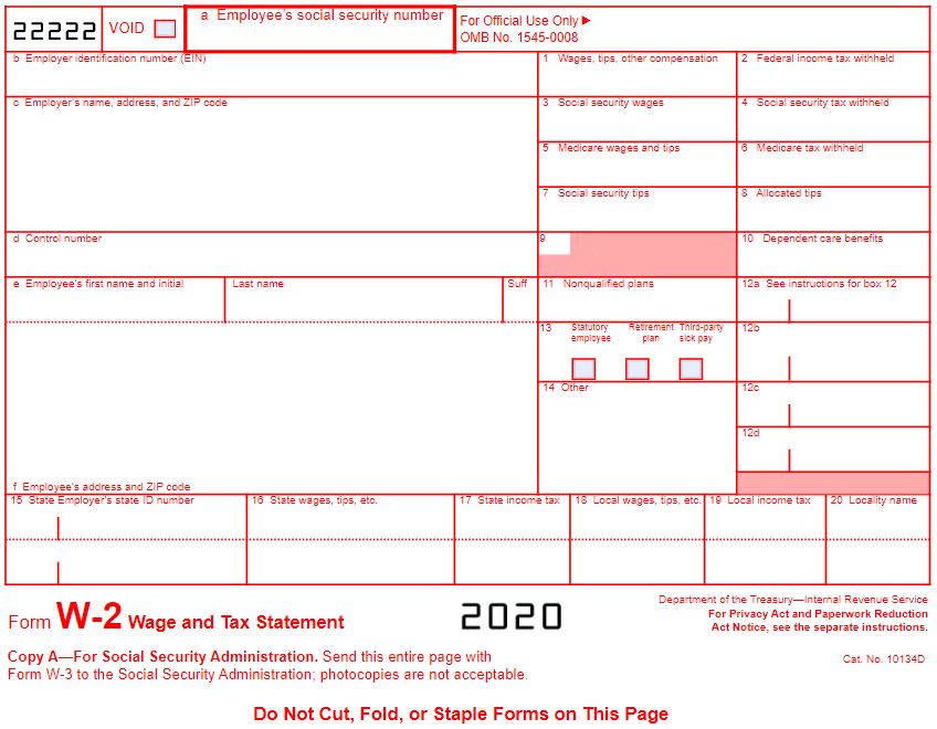
After DsExcel processes the template and exports it to a PDF document, the PDF form will look like below:
Various settings can be applied on form fields to enhance and customize their appearance. These are explained as below:
Common Settings
Name
Value Type
Example
Description
type
Enum string
Standard Form Fields checkbox
textbox
listbox
combobox
radiobutton
pushbutton
signature
text
date
time
tel
email
url
password
month
week
number
search
{"type": "listbox"}
Indicates the type of form field. (Mandatory field)
alternateName
String
{"alternateName": "The alt name"}
Displays text which is helpful for a user while filling in the form field. Tooltips appear when the pointer hovers briefly over the form field.
backgroundcolor
String
{"backgroundcolor": "#ffff00"}
{"backgroundcolor": "rgb(255, 178, 0)"}
{"backgroundcolor": "rgba(188, 100, 0, 255)"}
Indicates background color of the form field.
border
width
Double
{"border":{"width": 120}}
Indicates width, color and style settings of the border for the form field.
color
String
{"border":{"color": "#ffff00"}
{"border": {"color": "rgb(255, 178, 0)"}}
{"border": {"color": "rgba(188, 100, 0, 255)"}}
style
Enum string:
none
solid
dashed
beveled
inset
underline
unknown
{"border": {"style": "dashed"}}
font
size
Double
{"font": {"size": 18}}
Indicates various font settings which can be used in the form field.
color
String
{"font": {"color": "#ffff00"}}
{"font": {"color": "rgb(255, 178, 0)"}}
{"font": {"color": "rgba(188, 100, 0, 255)"}}
name
String
{"font": {"name": "sans-serif"}}
bold
Boolean
{"font": {"bold>": true}}
italic
Boolean
{"font": {"italic": true}}
locked
Boolean
{"locked": true}
Indicates whether the user can change the properties of field or not.
name
String
{"name": "The field name"}
Indicates the unique name of field.
readOnly
Boolean
{"readOnly": true}
Indicates whether the user can change the value of field or not
required
Boolean
{"required": true}
Indicates whether the field must have a value.
printed
Boolean
{"printed":false}
Indicates whether to print the field when page is printed.
hidden
Boolean
{"hidden":true}
Indicates whether to display the field or not.
mouseUp
JsonObject
{"mouseUp":{"script":"fBox1 =
this.getField(\"checkbox\")
;\r\nfBox1.display =
display.hidden", "submit":"http://localhost:80//myscript#FDF"
,"reset":{"fieldNames":
["checkbox", "textbox"]}}}
Indicates the actions to be performed in sequence when the mouse button is released in the active area of the field.
mouseDown
JsonObject
{"mouseDown":{"script":"fBox1
= this.getField(\"checkbox\")
;\r\nfBox1.display =
display.hidden", "submit":"http://localhost:80//myscript#FDF"
,"reset":{"fieldNames": ["checkbox","textbox"]}}}
Indicates the actions to be performed in sequence when the mouse button is pressed in the active area of the field.
mouseEnter
JsonObject
{"mouseEnter":{"script":"fBox1
= this.getField(\"checkbox\")
;\r\nfBox1.display =
display.hidden", "submit":"http://localhost:80//myscript#FDF"
,"reset":{"fieldNames": ["checkbox","textbox"]}}}
Indicates the actions to be performed in sequence when the mouse button enters the field's active area.
mouseExit
JsonObject
{"mouseExit":{"script":"fBox1
= this.getField(\"checkbox\")
;\r\nfBox1.display =
display.hidden", "submit":"http://localhost:80//myscript#FDF"
,"reset":{"fieldNames": ["checkbox","textbox"]}}}
Indicates the actions to be performed in sequence when the mouse button exitsthe field's active area.
onFocus
JsonObject
{"onFocus":{"script":"fBox1 =
this.getField(\"checkbox\")
;\r\nfBox1.display =
display.hidden", "submit":"http://localhost:80//myscript#FDF"
,"reset":{"fieldNames": ["checkbox","textbox"]}}}
Indicates the actions to be performed in sequence when the annotation receives the input focus.
onBlur
JsonObject
{"onBlur":{"script":"fBox1
= this.getField(\"checkbox\")
;\r\nfBox1.display =
display.hidden", "submit":"http://localhost:80//myscript#FDF"
,"reset":{"fieldNames": ["checkbox","textbox"]}}}
Indicates the actions to be performed in sequence when the annotation loses the input focus.
format
String
{"format":"event.value = (event.value * 100) + \" % \";"}
Indicates a JavaScript action to be performed before the field is formatted to display its current value. This action can modify the field’s value before formatting.
validate
String
{"validate":"if (event.value < 0
Indicates a JavaScript action to be performed when the field’s value is changed. This action can check the new value for validity.
calculate
String
{"calculate":"var oil =
this.getField(\"Oil\");\r\n"+
"var filter = this.getField(\"Filter\")
;\r\n"+"event.value
(oil.value + filter.value) * 1.0825;"}
Indicates a JavaScript action to be performed to recalculate the value of this field when that of another field changes.
keystroke
String
{"keystroke":"if (!event.willCommit)
{\r\n"+"var f =this.getField
(\"myPictures\");\r\n"+"var i =this.getIcon(event.change)
;\r\n"+"f.buttonSetIcon(i);\r\n"+"};"}
Indicates a JavaScript action to be performedwhen the user types a keystroke into a text field or combo box or modifies the selection in a scrollable list box. This action can check the keystroke for validity and reject or modify it.
autofocus
Boolean
{"type": "password" , "autofocus": true}
Indicates whether a date field should automatically get focus when the page loads.
disabled
Boolean
{"type": "password" , "disabled": true}
Indicates whether a field is disabled or not.
autocomplete
Enum String:
on
off
name
honorific-prefix
given-name
additional-name
family-name
honorific-suffix
nickname
email
username
new-password
current-password
one-time-code
organization-title
organization
street-address
address-line1
address-line2
address-line3
address-level4
country
country-name
postal-code
cc-name
cc-given-name
cc-additional-name
cc-family-name
cc-number
cc-exp
cc-exp-month
cc-exp-year
cc-csc
cc-type
transaction-currency
transaction-amount
bday-day
language
bday
bday-day
bday-month
bday-year
sex
tel
tel-country-code
tel-national
tel-area-code
tel-local
tel-local-prefix
tel-local-suffix
tel-extension
impp
url
photo
{"type": "date" , "autocomplete": "bday"}
Lets web developers specify if any user needs to provide assistance for automated filling of form field values, as well as guidance to the browser about what type of information is expected in the field. The behavior of this property depends on the browser implementation.
2.JsonObject Settings
Name | Value Type | Example | Description | |
|---|---|---|---|---|
script | String | {"script":"fBox1 = this.getField(\"checkbox\");\r\nfBox1.display = display.hidden"} | Indicates an action which causes a script to be compiled and executed by the JavaScript interpreter. | |
submit | String | {"submit":"http://localhost:80//myscript#FDF"} | Indicates an action to transmit the names and values of selected interactive form fields to a specified uniform resource locator (URL), presumably the address of a Web server that will process them and send back a response. | |
reset | fieldNames | String Array | {"fieldNames": ["checkbox", "textbox"]} | Indicates the list of names of fields that should be processed (or excluded from processing)by this action. If empty then all fields will be processed. |
exclude | Boolean | {"exclude":true} | Indicates whether to exclude the fields specified in fieldNames from processing (by default, this property is false and the specified fields are included). | |
Note: Snippets of JavaScript code needs to be escaped.
3. Checkbox Form Field Settings
Name | Value Type | Example | Description |
|---|---|---|---|
checkStyle | Enum string:
| {"checkStyle": "circle"} | Indicates the style of check mark. |
value | Boolean | {"value": true} | Indicates the value of Checkbox. (If the value is missing, DsExcel automatically tries to convert the cell's value to Boolean, and then, set it to the property after processing the template.) |
defaultValue | Boolean | {"defaultValue": false} | Indicates the default value of Checkbox. |
Textbox Form Field Settings
Name | Value Type | Example | Description |
|---|---|---|---|
value | String | {"value": "Hunter"} | Indicates the value of Textbox. |
defaultValue | String | {"defaultValue": "Input your name!"} | Indicates the default value of Textbox. |
combo | Boolean | {"combo":true} | Indicates whether the new value is committed as soon as a selection is made with the pointing device. |
password | Boolean | {"password":true} | Indicates whether the field is intended for entering a secure password that should not be visible on the screen. |
spellcheck | Boolean | {"spellcheck":false} | Indicates whether the text entered in the field is spell-checked. |
scrollable | Boolean | {"scrollable":false} | Indicates whether the field is scrollable to accommodate more text than it fits within its annotation rectangle. |
maxlength | Integer | {"maxlength":10} | Indicates the maximum length of the field’s text, in characters. |
multiline | Boolean | {"multiline":true} | Indicates whether the field can contain multiple lines of text. |
justification | Enum string:
| {"justification": "center"} | Indicates the justification to be used while displaying the field’s text. |
!type=note
Note: DsExcel also supports custom form fields like date, email, password, month etc. which are inherited from Textbox form field. To know more about these, refer Custom Form Fields.
Listbox Form Field Settings
Name | Value Type | Example | Description |
|---|---|---|---|
value | String Array | {"value": ["US", "UK"]} | Indicates the value of Listbox. |
defaultValue | String Array | {"defaultValue": ["US", "UK"]} | Indicates the default value of Listbox. |
commitOnSelChange | Boolean | {"commitOnSelChange": true} | Indicates whether the new value is committed as soon as a selection is made with the pointing device. |
selectedIndex | Integer | {"selectedIndex": 0} | Indicates the indexes of selected item. |
sort | Boolean | {"sort": true} | Indicates whether the field’s option items should be sorted alphabetically. |
spellCheck | Boolean | {"spellCheck": true} | Indicates whether the text entered in the field is spell-checked. |
selectedIndexes | Integer Array | {"selectedIndexes": [0, 2, 5]} | Indicates the indexes of selected items. |
multiSelect | Boolean | {"multiSelect": true} | Indicates whether more than one of the field’s option items may be selected simultaneously. |
exportValue | String | {"exportValue": "TheResult"} | Indicates the export value of Listbox field. |
Combobox Form Field Settings
Name | Value Type | Example | Description |
|---|---|---|---|
value | String Array | {"value": ["US", "UK"]} | Indicates the value of Combobox. |
defaultValue | String Array | {"defaultValue": ["US", "UK"]} | Indicates the default value of Combobox. |
commitOnSelChange | Boolean | {"commitOnSelChange": true} | Indicates whether the new value is committed as soon as a selection is made with the pointing device. |
selectedIndex | Integer | {"selectedIndex": 0} | Indicates the indexes of selected item. |
sort | Boolean | {"sort": true} | Indicates whether the field’s option items should be sorted alphabetically. |
spellCheck | Boolean | {"spellCheck": true} | Indicates whether the text entered in the field is spell-checked. |
editable | Boolean | {"editable": true} | Indicates whether the Combobox includes an editable text box as well as a drop-down list. |
Radiobutton Form Field Settings
Name | Value Type | Example | Description |
|---|---|---|---|
checkStyle | Enum string:
| {"checkStyle": "circle"} | Indicates the style of check mark. |
groupName | String | {"groupName": "Teams"} | Indicates the name of radio button group. Radio buttons with the same group name are added in the same group. (If the value is missing, DsExcel automatically adds radio buttons expanded from the same template cell to the same group after processing the template) |
radiosInUnison | Boolean | {"radiosInUnison": true} | Indicates whether a group of radio buttons within a radio button field that use the same value for the on state will turn on and off in unison. If one is checked, they are all checked. If clear, the buttons are mutually exclusive (the same behavior as HTML radio buttons). |
checkedChoice | String | {"checkedChoice": "Team5"} | Indicates the value of checked option. |
defaultCheckedChoice | String | {"defaultCheckedChoice": "Team1"} | Indicates the value of checked option when the user first opens the form. |
Pushbutton Form Field Settings
Name | Value Type | Example | Description | |
|---|---|---|---|---|
highlighting | Enum string:
| {"highlighting": "outline"} | Indicates the annotation’s highlighting mode. | |
caption | String | {"caption": "Push"} | Indicates the button's caption. | |
image | Base64 String | {"image": "The base64 image data."} | Indicates the button’s image. | |
captionImageRelation | Enum string:
| {"captionImageRelation": "captionBelowIcon"} | Indicates the positioning of button's caption relative to image. | |
downCaption | String | {"downCaption": "Push Down"} | Indicates the button's caption when user presses the button. | |
downImage | Base64 String | {"downImage": "The base64 image data."} | Indicates the button’s image when user presses the button. | |
rolloverCaption | String | {"rolloverCaption": "Rollover"} | Indicates the button's caption when the user rolls the cursor into its active area without pressing the mouse button. | |
rolloverImage | Base64 String | {"rolloverImage": "The base64 image data."} | Indicates the button’s image when the user rolls the cursor into its active area without pressing the mouse button. | |
imageScale | mode | Enum string:
| {"imageScale": {"mode": "bigger"}} | Indicates the scaling mode. |
proportional | Boolean | {"imageScale": {"proportional": true}} | Indicates whether an image should be scaled proportionally. | |
x | Float | {"imageScale": {"proportional": true, "x": 0.6}} | Indicates the position of an image. The two numbers between 0.0 and 1.0 indicates the fraction of leftover space to allocate at the left and bottom of an image. A value of (0.0, 0.0) positions the image at the bottom-left corner of the button rectangle. A value of (0.5, 0.5) centers it within the rectangle. This value is used only if the image is scaled proportionally. | |
y | Float | {"imageScale": {"proportional": true, "y": 0.8}} | ||
ignoreBorder | Boolean | {"imageScale": {"ignoreBorder": true}} | Indicates whether a button's appearance should be scaled to fit fully within the bounds of the annotation without taking into consideration the line width of the border. | |
Signature Form Field Settings
Name | Value Type | Example | Description |
|---|---|---|---|
lockType | Enum string:
| {"lockType": "specifiedOnly"} | Indicates the type of locked fields. |
fieldNames | String Array | {"fieldNames": ["signerName", "time"]} | Indicates the list of field names which should be included or excluded from processing depending on lockType property. |
LockedFields | Boolean | {"LockedFields": true} | Indicates whether to lock the fields when SignatureFormField is signed or not. |
!type=note
Note: DsExcel Template generates only digital signature fields in PDF documents. If you want to add signatures on signature fields, you need to use DsPdf or PDFBox to process.
Apart from the above mentioned standard PDF form fields, DsExcel also supports custom form input types to generate PDF forms. Refer to Custom Form Input Types for more information.