
Templates
You can customize the look of each C1OutlookItem by setting some of the basic C1OutlookBar and C1OutlookItem properties. Each of these properties has a corresponding Template property that binds them together.
| Property | Correpsonding Template Property | Description |
|---|---|---|
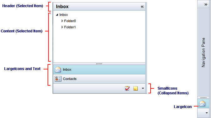
| Header | HeaderTemplate | When the bar is expanded, the Header is shown to the right of the LargeIcon and above the content in the Office 2007 style. |
| Content | ContentTemplate | Gets or sets the content to display in the Item Content section when this item is selected. |
| LargeIcon | LargeIconTemplate | LargeIcon represents the C1OutlookItem image that appears in the vertical stack when C1OutlookBar is collapsed. |
| SmallIcon | SmallIconTemplate | Items above the FirstOverflowIndex or items that do not fit in the Item Buttons list are placed in a single horizontal line below the LargeIcons using SmallIcon. |
type=note
Note: A menu that uses a SmallIcon and Header allows hiding and showing individual items. Because the properties are displayed in several places, do not assign them a UIElement.
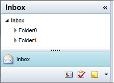
Here's an example of a C1OutlookBar containing a C1OutlookItem that has "Inbox" as the Header and a small and large icon bound through the corresponding templates.
<c1:C1OutlookBar.LargeIconTemplate>
            <DataTemplate>
                <Image Source="{Binding}" Width="24" Height="24" />
            </DataTemplate>
        </c1:C1OutlookBar.LargeIconTemplate>
<c1:C1OutlookBar.SmallIconTemplate>
            <DataTemplate>
                <Grid Height="24">
                    <Image Source="{Binding}" Width="16" Height="16" />
                </Grid>
            </DataTemplate>
        </c1:C1OutlookBar.SmallIconTemplate>
<c1:C1OutlookItemHeader="Inbox"LargeIcon="Resources/Inbox24.png"SmallIcon="Resources/Inbox.png">
            <userControls:Inbox/>
        </c1:C1OutlookItem>
The C1OutlookBar looks like this: