MultiMonthCalendar
The MultiMonthCalendar control enables you to create a highly interactive multi-month calendar UI. It displays multiple months depending on the screen size of the application. Just like Calendar, MultiMonthCalendar also supports orientation, selection, display modes, and much more.
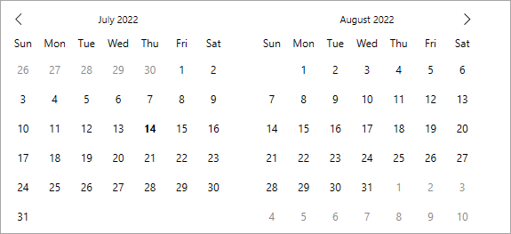
The following image demonstrates how you can display multiple months using the MultiMonthCalendar control.

To display a calendar with multiple months, simply add the MultiMonthCalendar control to your application as demonstrated in the following code.
XAMl
<c1:C1MultiMonthCalendar Name="calendar" HorizontalAlignment="Center" VerticalAlignment="Top" />C1MultiMonthCalendar calendar = new C1MultiMonthCalendar();
grid1.Children.Add(calendar);Let's now explore various features provided by the MultiMonthCalendar control.
Month Count
MultiMonthCalendar displays the number of months depending upon the screen size of your application. However, you can change this behavior by specifying the number of months to be displayed using MonthCount property of the C1MultiMonthCalendar class. By default, the value of the MonthCount property is set to 1.
The following image displays the MultiMonthCalendar control after setting the MonthCount to three.

Use the following code to set MonthCount property of the MultiMonthCalendar.
XAMl
<c1:C1MultiMonthCalendar Name="calendar" MonthCount="3" />calendar.MonthCount = 3;Orientation
Similar to Calendar, the navigation orientation of the MultiMonthCalendar control is in horizontal direction, by default. However, you can change its navigation orientation to vertical direction by using MonthElementOrientation property of the C1MultiMonthCalendar class.
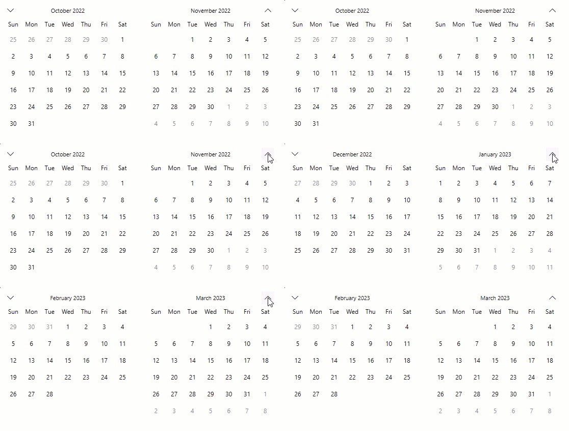
The following GIF demonstrates how the navigation buttons help the user to navigate the calendar up and down, when its orientation is set to vertical.

The following code demonstrates how to set the vertical navigation orientation:
<c1:C1MultiMonthCalendar x:Name="calendar" MonthElementOrientation="Vertical">calendar.MonthElementOrientation = Orientation.Vertical;Besides these, the MultiMonthCalendar offers several properties similar to the Calendar control such as format, calendar types, navigation buttons, and much more, that determines the behavior of the control. For more information, see Behavior.


