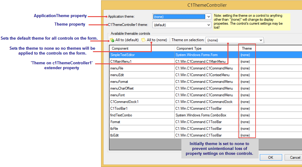
C1ThemeController Dialog Box
Once you drag and drop the C1ThemeController 2.0 component onto the component tray a C1ThemeController dialog box appears. The ThemeController dialog box is used to quickly to apply the theme to all themeable controls in the application, all themeable controls on the form, or different themes on different controls.
The following image illustrates the main properties used to theme your application:

If you have themeable controls on your form before you add the C1ThemeController the dialog box lists all of the components on your form. Each control/component is initially set to none to prevent unintentional loss of property settings on those controls.
The following items in the C1ThemeControllder dialog box function as follows:
- Application theme dropdown listbox - Used to specify the application-wide (default) theme. The name of this theme is stored in the App.config file.
- C1ThemeController1 theme: dropdown listbox - Specifies the default theme for the current C1ThemeController. The value "(default)" indicates that the application-wide theme specified by ApplicationTheme will be used.
- Theme on selection: dropdown listbox - A 'Theme on c1ThemeController1' extender property is added to all supporting controls on the form. When set to a specific theme name, this property will apply that theme to the current control regardless of the theme controller's default theme. This allows to apply different themes to different controls on the same form if needed. This property supports two special values: 'default' and 'none'. The default value implies that the default theme specified for the C1ThemeController on the current form will be used for this control. 'None' implies no theme will be applied to this control.
- All to (default) button - Sets the default theme for all controls on the form.
- Add to (none) button - Sets the theme to none so no themes will be applied to the controls on the form.


