Appearance
MultiSelect allows you to customize the appearance of all the individual elements of the control and manage its overall appearance.
Apply Styles to CheckList
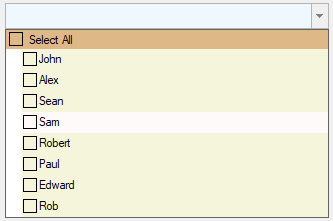
The following image shows styles applied to the CheckList element of MultiSelect.

To apply style to CheckList element of MultiSelect, use the following code. You can also set other attributes of Styles.CheckList property to further customize its appearance.
vbnet
C1MultiSelect1.Styles.CheckList.Hot.BackColor = Color.Snow
C1MultiSelect1.BackColor = Color.AliceBlue
C1MultiSelect1.Styles.CheckList.Default.BackColor = Color.Beige
C1MultiSelect1.Styles.CheckList.Header.BackColor = Color.BurlyWood
csharp
c1MultiSelect1.Styles.CheckList.Hot.BackColor = Color.Snow;
c1MultiSelect1.BackColor = Color.AliceBlue;
c1MultiSelect1.Styles.CheckList.Default.BackColor = Color.Beige;
c1MultiSelect1.Styles.CheckList.Header.BackColor = Color.BurlyWood;
Apply Styles to DropDownButton
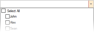
The following image shows styles applied to the DropDownButton element of MultiSelect.

To customize the appearance of DropDownButton element of C1MultiSelect, use the following code. You can also set other attributes of Styles.DropDownButton property for further customization.
vbnet
C1MultiSelect1.Styles.DropDownButton.BackColor = Color.BlanchedAlmond
C1MultiSelect1.Styles.DropDownButton.BorderColor = Color.Brown
csharp
c1MultiSelect1.Styles.DropDownButton.BackColor = Color.BlanchedAlmond;
c1MultiSelect1.Styles.DropDownButton.BorderColor = Color.Brown;
Apply Styles to TagEditor
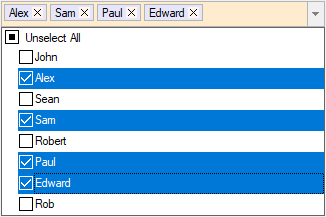
The following image shows styles applied to the TagEditor element of MultiSelect.

TagEditor element styles can be accessed via the Styles.TagEditor.Common property. The styles used to paint the tags can be accessed via the Styles.TagEditor.Tag property and Styles.TagEditor.RemoveButton can be used to access styles to paint Remove button in a tag. To change the appearance of tag editor, tags and Remove button, use the following code. You can also set other attributes of Styles.TagEditor.Common, Styles.TagEditor.Tag and Styles.TagEditor.RemoveButton properties for further customization.
vbnet
C1MultiSelect1.Styles.TagEditor.Common.BackColor = Color.BlanchedAlmond
C1MultiSelect1.Styles.TagEditor.RemoveButton.BackColor = Color.SeaShell
C1MultiSelect1.Styles.TagEditor.Tag.BackColor = Color.Lavender
csharp
c1MultiSelect1.Styles.TagEditor.Common.BackColor = Color.BlanchedAlmond;
c1MultiSelect1.Styles.TagEditor.RemoveButton.BackColor = Color.SeaShell;
c1MultiSelect1.Styles.TagEditor.Tag.BackColor = Color.Lavender;
Apply Theme
You can customize the appearance of the MultiSelect control using built-in themes or by designing your own themes. To apply themes to the control, you can use C1ThemeController which provides many built-in themes and an easy to use theme designer to create your own themes. For more information on themes, see Theming.
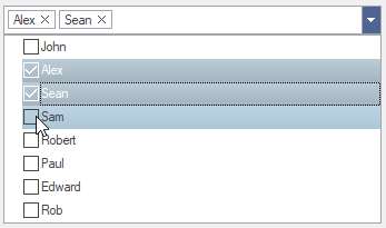
The following image shows the MultiSelect control with MacBlue theme applied to it.


