


Expansion State
Expansion applies at three levels.
Level | Property | Description | |
|---|---|---|---|
Menu | Determines whether the menu uses its expanded or collapsed layout. | ||
Parent item | Determines whether a parent item displays its child items. | ||
Item capability | Determines whether an item can display child items. | ||
ExpandedMode and CollapsedMode define appearance and layout behavior. They don't change the expansion state. Set IsExpanded directly, or let users select the toggle button.
Expanded Modes
ExpandedMode determines how the menu behaves when it's expanded.
Value | Description | Demo |
|---|---|---|
| Displays the expanded menu over application content. |
|
| Repositions application content while the menu is expanded. |
|
| Keeps the menu expanded |
|
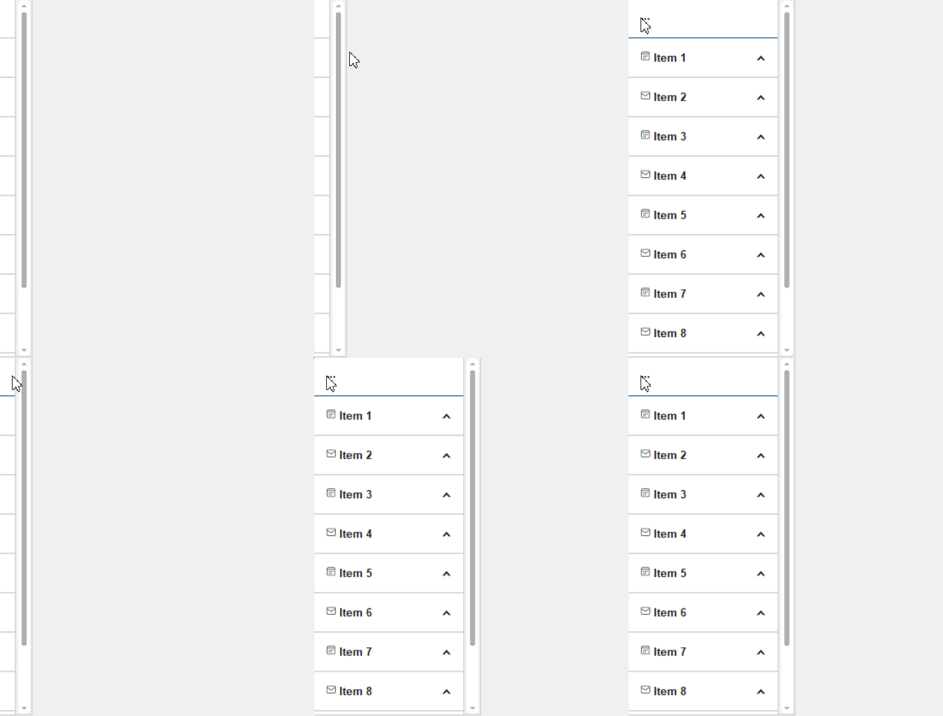


Choose a mode based on how the application uses the space next to the menu:
Use
Overlaywhen the menu can temporarily cover content.Use
PushContentwhen the menu and application content must remain visible together.Use
Alwaysfor permanent navigation, or when a search panel must remain visible with the menu.
Collapsed Modes
CollapsedMode determines how the menu appears when it's collapsed.
Value | Description | Demo |
|---|---|---|
| Displays item icons without text. |
|
| Displays the menu in a reduced layout. |
|
| Hides the menu. |
|



IconsOnly requires visible items to have icons. When you use Hidden, provide another command that sets IsExpanded to true.
Use CollapsedWidth and ExpandedWidth to configure the dimensions for each state.