In This Topic
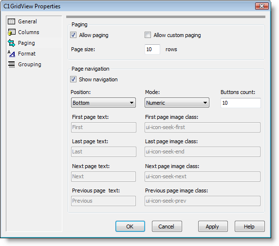
The Paging tab of the Property builder allows you to determine whether paging is used and lets you customize how and where it appears. For more information about paging, see the Paging topic. The Paging tab includes the Paging and Page Navigation sections:

The Paging tab includes the following options:
- Allow paging: When this check box is selected the AllowPaging property is set to True and paging is included in the grid. See the Creating a Pageable Grid topic for an example. By default this check box is unchecked and AllowPagingis False.
- Allow custom paging: When the Allow paging check box is selected, this option is available. When this check box is selected the AllowCustomPaging property is set to True and custom paging is allowed. By default this check box is unchecked and AllowCustomPaging is False.
- Page size: When the Allow paging check box is selected, this option is available. The Page size text box sets the PageSize property and allows you to choose how many items are visible on the grid on each page. By default, PageSize is 10.
- Show navigation: This option is available when the Allow paging check box is selected. When this check box is selected (default) the Visible property is set to True and paging controls appear on the grid.
-
Position: This option is available when the Allow paging and Show navigation check boxes are selected. This option sets the Position property and lets you determine where the pager controls will appear in the grid. Options include:
- Bottom: Paging controls will appear at the bottom of the grid. This is the default setting.
- Top: Paging controls will appear at the top of the grid.
- TopAndBottom: Paging controls will appear both at the top and bottom of the grid.
-
Mode: This option is available when the Allow paging and Show navigation check boxes are selected. This option sets the Mode property and lets you determine what kind of pager controls should appear on the grid. Options include:
- NextPrevious: Previous and Next button pager controls will used.
- Numeric: Numbered link button pager controls that allow users to access pages directly will be used . This is the default setting.
- NextPreviousFirstLast: Previous, Next, First, and Last button pager controls will be used.
- NumericFirstLast: Numbered and First, and Last button pager controls will be used.
- Buttons count: This option is only available when the Numeric or NumericFirstLast Mode is selected and it sets PageButtonCount property and determines the number of page buttons to display in the pager control. By default, PageButtonCount is 10.
-
First page text, First page image class, Last page text, and Last page image image class: These options are only available when the NextPreviousFirstLast or NumericFirstLast Modeis selected:
- The First page text option sets the FirstPageText property and determines the text to display for the First page button.
- The First page image class option sets the C1GridViewPagerSettings.FirstPageImageUrl property and determines the image to display for the First page button. Click the button next to the First page image class text box to select an image.
- The Last page text option sets the LastPageText property and determines the text to display for the Last page button.
- The Last page image class option sets the C1GridViewPagerSettings.LastPageImageUrl property and determines the image to display for the Last page button. Click the button next to the Last page image class text box to select an image.
-
Next page text, Next page image class, Previous page text, and Previous page image class: These options are only available when the NextPrevious or NextPreviousFirstLast Modeis selected:
- The Next page text option sets the NextPageText property and determines the text to display for the Next page button.
- The Next page image class option sets the C1GridViewPagerSettings.NextPageImageUrl property and determines the image to display for the Next page button. Click the button next to the Next page image class text box to select an image.
- The Previous page text option sets the PreviousPageText property and determines the text to display for the Previous page button.
- The Previous page image class option sets the C1GridViewPagerSettings.PreviousPageImageUrl property and determines the image to display for the Previous page button. Click the button next to the Previous page image class text box to select an image.
See Also
