In This Topic
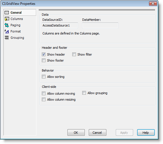
The General tab of the Property builder displays the data source and allows you to set headers, footers, and sorting properties. The General tab consists of Data, Header and Footer, and Behavior settings:

The General tab includes the following options:
- DataSourceID:
Displays the current data source. For information about data binding, see Binding the Grid to a Data Source.
- DataMember:
Displays the current data member.
- Show header:
When this check box is selected (default) the ShowHeader property is set to True and the grid's header is visible.
- Show footer:
When this check box is selected the ShowFooter property is set to True and the grid's header is visible. For an example, see Setting the Footer Text. By default, this check box is not selected and ShowFooter is False.
- Show filter:
Shows a filter row at the top of the grid. By default, this check box is not selected and ShowFilter is False.
- Allow sorting:
When this check box is selected the AllowSorting property is set to True and users can sort the grid at run time. By default, this check box is not selected and AllowSorting is False. For more information about sorting, see the Sorting topic.
- Allow column moving:
When this check box is selected the AllowColMoving property is set to True and columns can be moved and reordered in the grid at run time. By default this check box is unchecked and AllowPaging is False.
- Allow column resizing:
When this check box is selected the AllowColSizing property is set to True and columns can be resized in the grid at run time. See the Creating a Pageable Grid topic for an example. By default this check box is unchecked and AllowColSizing is False.
- Allow grouping:
When this check box is selected the grouping area appears at the top of the grid. By default this check box is unchecked and grouping is not included.
See Also
