You can easily customize C1Expander's appearance and behavior with C1Expander's built-in design-time support. In the following steps you'll set the control's initial state as collapsed and customize the expand direction of each control. The following steps assume you've completed Step 2 of 3: Adding Content to the C1Expander Control topic.
Complete the following steps:
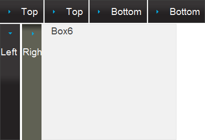
For example the ExpandDirection of the first two C1Expander controls in the first row should be set to Top and the last two C1Expander controls in the first row should remain set to Bottom. The first control in the second row should be set to Left and the last control in the second row should be set to Right.
Run the application and observe that the C1Expander controls now initially appear collapsed and that, on clicking the header of each control, they expand in the direction indicated in the header of each control.
For example, in the following image only the last control is expanded and all the rest are collapsed:

In this step you customized the appearance and behavior of the controls. Congratulations, you've completed this quick start guide!