Calendar for ASP.NET Web Forms provides the following unique key features:
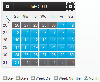
Calendar supports single and multiple date selection. Through the week day and week number selectors you can select groups of days, such as all of the days that fall in Tuesday or all of the days in a specific week. Using the month selector, you can select the days of the entire month.

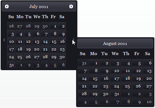
Calendar has optional preview panes, showing the previous and next calendar months. This enables you to view date periods at the beginning or end of a give month without navigating. Just set one property to enable this functionality.

Calendar includes built-in animation effects for the calendar's slide style while month swapping from the top, bottom, right, or left direction. You can specify the type of animation for the C1Calendar by setting one property.
Calendar includes a Property Builder that organizes all of Calendar's elements into logical groups so you can easily locate the specific element you want to modify rather than scrolling through the list of properties in the Properties window. This feature is designed to help you program without performing repetitive tasks.
Calendar supports full localization on weekdays and the calendar title. The string displayed on the weekdays and title depends on the language you specify.
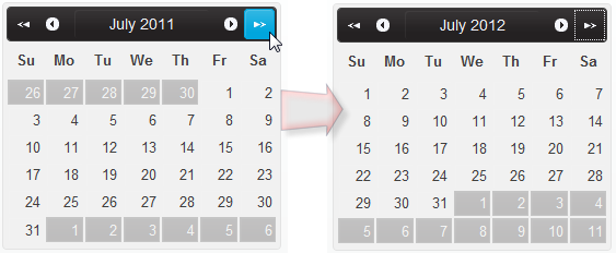
Calendar includes three methods for navigating through the calendar months. Previous and Next navigation buttons allow you to go to the previous or next month. Quick Previous and Quick Next allow you to jump several months ahead or several months behind. And the Popup Calendar Month and Year Selector enable you to select the month and year from the popup calendar.

When displaying multiple calendars, you may need to change the orientation of the calendar. Calendar enables you to display the calendar horizontally or vertically.
You can display calendars in any of these views - day, month, year, or decade. In addition to this, you can also specify one of these views as default or initial view of the calendar.
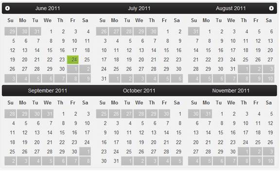
You can display more than one month in the calendar area by simply indicating the number of month columns/rows in the multiple calendar view.

With just a click of the SmartTag, change the calendar's look by selecting one of the ten premium themes (Arctic, Lucid, Metro, Metro-Dark, Midnight, Aristo, Rocket, Cobalt, Stafford, and Sterling). Optionally, use ThemeRoller from jQuery UI to create a customized theme!
Use a cascading style sheet (CSS) style to define custom skins. CSS support allows you to match the calendar control to your organization's standards.