InputDate Customization
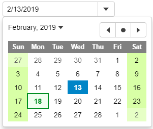
You can customize the appearance of the InputDate and its drop-down calendar using CSS. You can also use the calendar's formatItem event to customize the appearance of specific dates in the drop-down calendar.
In the example below, InputDate applies custom styles to weekends and holidays:

HTML
<input id="theInputDate">
CSS
.wj-calendar {
  max-width: 21em;
}

.wj-calendar .wj-header {
  color: white;
  background: #808080;
}

.wj-calendar .date-holiday:not(.wj-state-selected) {
  font-weight: bold;
  color: #008f22;
  background: #f0fff0;
  outline: 2pt solid #008f22;
}

.wj-calendar .date-weekend:not(.wj-state-selected) {
  background-color: #d8ffa6;
}
Javascript
import * as wijmo from '@mescius/wijmo';
import * as input from '@mescius/wijmo.input';
import { getHoliday } from './data';

function init() {
    // change InpuDate icon to a calendar instead of a down arrow (applies to all InputDate controls)
    input.InputDate.controlTemplate = '<div style="position:relative" class="wj-template">' +
        '<div class="wj-input">' +
        '<div class="wj-input-group wj-input-btn-visible">' +
        '<input wj-part="input" type="text" class="wj-form-control" />' +
        '<span wj-part="btn" class="wj-input-group-btn" tabindex="-1">' +
        '<button class="wj-btn wj-btn-default" type="button" tabindex="-1">' +
        '<span class="wj-glyph-calendar"></span>' +
        '</button>' +
        '</span>' +
        '</div>' +
        '</div>' +
        '<div wj-part="dropdown" class="wj-content wj-dropdown-panel" ' +
        'style="display:none;position:absolute;z-index:100">' +
        '</div>' +
        '</div>';

    // change the format used to show current month/year (affects all InputDate and Calendar controls)
    wijmo.culture.Globalize.calendar.patterns['y'] = 'MMMM yyyy';

    // the InputDate
    let theInputDate = new input.InputDate('#theInputDate');

    // format items in the InputDate's calendar (apply styles to weekends and holidays)
    theInputDate.calendar.formatItem.addHandler((sender, e) => {
        let weekday = e.data.getDay(), holiday = getHoliday(e.data);

        wijmo.toggleClass(e.item, 'date-weekend', weekday == 0 || weekday == 6);
        wijmo.toggleClass(e.item, 'date-holiday', holiday != null);
        e.item.title = holiday;
    });
}
Further, you can customize the icon shown in the drop-down button either by changing the InputDate's controlTemplate property, or by using code to change the control content. The first option would affect all InputDate controls in the application; the second would affect only a single control.
You can also customize the format used to display the current month/year in the drop-down Calendar by changing the Globalization's standard 'y' format, or by using code to change the control content. Again, the first option would affect all InputDate and Calendar controls in the application; the second would affect only a single control.
For detailed implementation, see the InputDate Customization demo.


