
InputColor Overview
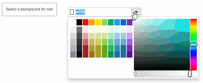
The InputColor control allows users to select colors by typing in HTML-supported color strings, or to pick colors from a drop-down that shows a ColorPicker control. You can use the value property to get or set the currently selected color.
HTML
<h1>InputColor</h1>
<div id="output">
  Select a background for me!
</div>
<div id="theInputColor"></div>
Javascript
import * as input from '@mescius/wijmo.input';

function init() {
    // InputColor
    let theInputColor = new input.InputColor('#theInputColor', {
        placeholder: 'Select the color',
        valueChanged: (sender) => setBackground(sender.value)
    });
    // show the color that was selected
    function setBackground(color) {
        document.getElementById('output').style.background = color;
    }
}
Further, you can customize the InputColor using the colorPicker property, which exposes the color picker drop-down. For detailed implementation, see LearnWijmo sample.
If you wish to control the color values of the pop-up ColorPicker using the Tab key and Up/Down/Left/Right arrow keys on the keyboard, please refer to the following sample code:
import * as wjInput from '@mescius/wijmo.input';

new wjInput.InputColor('#theInputColor', {
    colorPickerKeyActionTab: wjInput.ColorPickerTabKeyAction.All
});