
-
Spread Windows Forms 18 Product Documentation
- Getting Started
-
Developer's Guide
- Understanding the Product
- Working with the Component
- Spreadsheet Objects
- Ribbon Control
- Sheets
- Rows and Columns
- Headers
- Cells
-
Cell Types
- Understanding Cell Type Basics
- Understanding How Cell Types Work
- Understanding How Cell Types Display and Format Data
- Understanding How Cell Type Affects Model Data
-
Working with Editable Cell Types
- Setting a General Cell
- Setting a Text Cell
- Setting a Date-Time Cell
- Setting a GcCharMask Cell
- Setting a GcDateTime Cell
- Setting a GcMask Cell
- Setting a GcNumber Cell
- Setting a GcTextBox Cell
- Setting a GcComboBox Cell
- Setting a GcTimeSpan Cell
- Setting a Number Cell
- Setting a Currency Cell
- Setting a Mask Cell
- Setting a Percent Cell
- Setting a Regular Expression Cell
- Setting a Rich Text Cell
- Working with Graphical Cell Types
- Understanding Additional Features of Cell Types
- Data Binding
- Customizing the Sheet Appearance
- Customizing Interaction in Cells
- Tables
- Understanding the Underlying Models
- Customizing Row or Column Interaction
- Formulas in Cells
- Sparklines
- Keyboard Interaction
- Events from User Actions
- File Operations
- Storing Excel Summary and View
- Printing
- Chart Control
- Customizing Drawing
- Touch Support with the Component
- Spread Designer Guide
- Assembly Reference
- Import and Export Reference
- Version Comparison Reference
Setting a GcCharMask Cell
The GcCharMask cell uses character boxes for the mask. The user can customize the appearance of the boxes and the input value.
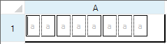
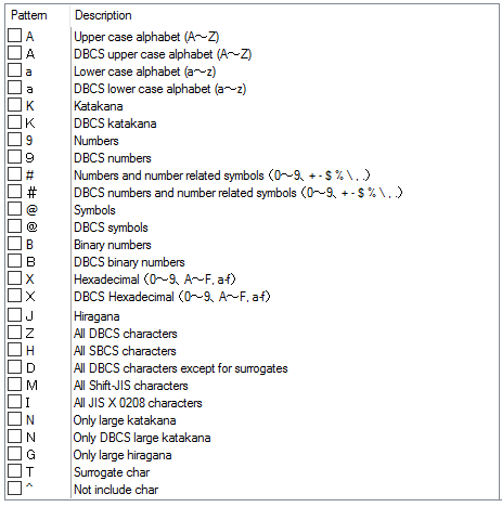
The following image displays the characters you can use for the mask (FormatString property).
You can specify a built-in collection of character boxes with the CharBoxInfoCollection class or you can customize the number and layout of the boxes with the LiteralBoxInfo, InputBoxInfo, and SeparatorBoxInfo classes. Use the AddRange method to add the built-in boxes or the custom boxes in the preferred order.
For a complete list of properties and methods for the GcCharMask cell, refer to the GcCharMaskCellType class.
Using Code
Define the GcCharMask cell by creating an instance of the GcCharMaskCellType class.
Set properties for the class.
Assign the cell type to a cell or range of cells by setting the CellType property for a cell, column, row, or style to the GcCharMaskCellType object.
Example
This example creates a GcCharMask cell.
GrapeCity.Win.Spread.InputMan.CellType.GcCharMaskCellType gc = new
GrapeCity.Win.Spread.InputMan.CellType.GcCharMaskCellType();
gc.AcceptsArrowKeys = FarPoint.Win.SuperEdit.AcceptsArrowKeys.CtrlArrows;
gc.AcceptsCrLf = GrapeCity.Win.Spread.InputMan.CellType.CrLfMode.Filter;
gc.AllowSpace = GrapeCity.Win.Spread.InputMan.CellType.AllowSpace.Wide;

gc.CharBoxes.AddRange(GrapeCity.Win.Spread.InputMan.CellType.CharBoxInfoCollection.Number1);
gc.CharBoxSpacing = 2;
gc.ClipContent = GrapeCity.Win.Spread.InputMan.CellType.ClipContent.ExcludeLiterals;

gc.ExitOnLastChar = true;
gc.FocusPosition = GrapeCity.Win.Spread.InputMan.CellType.EditorBaseFocusCursorPosition.FirstInputPosition;
gc.FormatString = "a";
gc.PaintByControl = true;
gc.RecommendedValue = "aaaaaaaaaa";
gc.ShowRecommendedValue = true;
gc.UseSpreadDropDownButtonRender = true;
fpSpread1.ActiveSheet.Cells[0, 0].CellType = gc;
fpSpread1.ActiveSheet.Columns[0].Width = 200;
fpSpread1.ActiveSheet.Rows[0].Height = 40;
Dim GC As New GrapeCity.Win.Spread.InputMan.CellType.GcCharMaskCellType()
GC.AcceptsArrowKeys = FarPoint.Win.SuperEdit.AcceptsArrowKeys.CtrlArrows
GC.AcceptsCrLf = GrapeCity.Win.Spread.InputMan.CellType.CrLfMode.Filter
GC.AllowSpace = GrapeCity.Win.Spread.InputMan.CellType.AllowSpace.Wide
GC.CharBoxes.AddRange(GrapeCity.Win.Spread.InputMan.CellType.CharBoxInfoCollection.Number1)
GC.CharBoxSpacing = 2
GC.ClipContent = GrapeCity.Win.Spread.InputMan.CellType.ClipContent.ExcludeLiterals
GC.ExitOnLastChar = True
GC.FocusPosition = GrapeCity.Win.Spread.InputMan.CellType.EditorBaseFocusCursorPosition.FirstInputPosition
GC.FormatString = "a"
GC.PaintByControl = True
GC.RecommendedValue = "aaaaaaaaaa"
GC.ShowRecommendedValue = True
GC.UseSpreadDropDownButtonRender = True
fpSpread1.ActiveSheet.Cells(0, 0).CellType = GC
fpSpread1.ActiveSheet.Columns(0).Width = 200
fpSpread1.ActiveSheet.Rows(0).Height = 40Using the Spread Designer
Select the cell or cells in the work area.
In the property list, in the Misc category, select CellType. From the drop-down list, choose the GcCharMask cell type. Now expand the CellType property and various properties are available that are specific to this cell type. Select and set those properties as needed.
Or right-click on the cell or cells and select Cell Type. From the list, select GcCharMask. In the CellType editor, set the properties you need. Click Apply.
From the File menu choose Apply and Exit to apply your changes to the component and exit Spread Designer.