
- SpreadJS Overview
- Getting Started
- JavaScript Frameworks
- Best Practices
- Features
- SpreadJS Designer
- SpreadJS Designer VSCode Plugin
- Tutorials
-
SpreadJS Designer Component
- Getting Started
- Quick Start
- Theme
- Designer Interface
- JavaScript Frameworks
- Template-Based Workbook Initialization
-
Customizations
- Add a Tab
- Add Elements to a Tab
- Set Active Ribbon Tab
- Enable/Disable Ribbon Elements
- Create/Customize Page Themes
- Add Context Menu Item
- Add New Dialog
- Bind File Import Events
- Customize Status Bar
- Add a Custom Component
- Customize Designer Localization
- Customize File Menu
- Customize Format Culture Dialog
- Customize Save File Dialog
- Work in Designer Component
- Toolbar Ribbon
- API Documentation
- SpreadJS Collaboration Server
- Touch Support
- Formula Reference
- Import and Export Reference
- Events
- API Documentation
- Release Notes
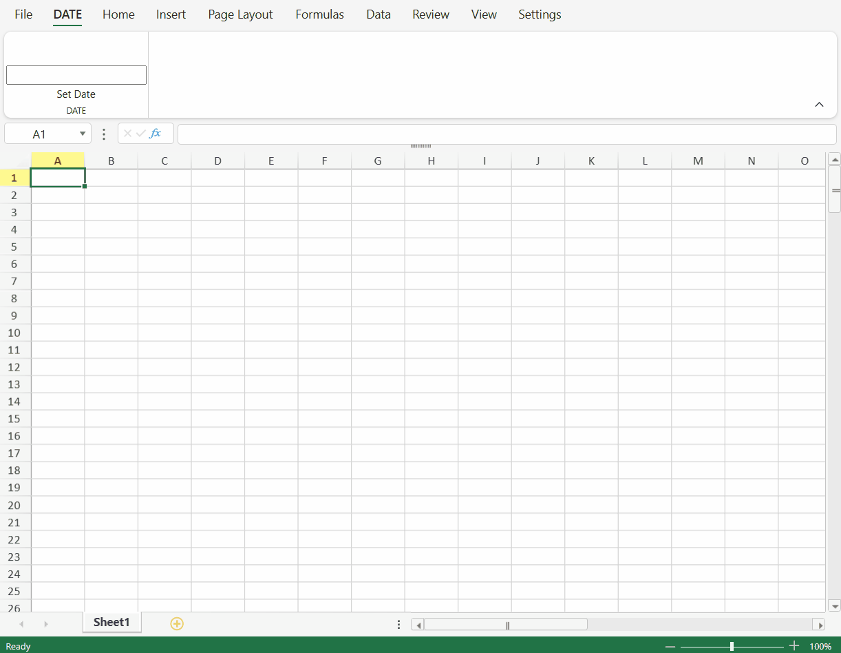
Add a Custom Component
You can add custom components to the Designer. For example, the following sample adds a jQuery UI 'Date Picker' component to the SpreadJS Designer Component.
To ensure the following demo runs properly, please first include the correct version of jQuery UI in the page context.
Define a custom component class in your project.
// Add Custom Component
var DatePicker = defineCustomComponent();

//Build Component Class Structure
function defineCustomComponent() {
    function DatePicker() {
        GC.Spread.Sheets.Designer.AtomicComponentBase.call(this, ...arguments)
    };
    DatePicker.prototype = new GC.Spread.Sheets.Designer.AtomicComponentBase();
    // This function is used to define innerHTML of component
    DatePicker.prototype.getTemplate = function () {
        return `
            <div class="input-append date" style="margin-top: 35px;">
              <input size="20" class ='form_date' type="text">
            </div>
            `;
    }
    // Now the host element has been append to DOM, and you can add event listeners to it
    DatePicker.prototype.onMounted = function (host) {
        $(".form_date", host).datepicker();

        // When the datepicker changed, raise value changed event
        $(".form_date", host).change((e) => {
            this.raiseValueChanged()
        })
    }
    DatePicker.prototype.onValueChanged = function (prevValue, nextValue, host) {
        $(".form_date", host).datepicker('setDate', (nextValue && nextValue.toLocaleString) ? nextValue.toLocaleString('en-us', { year: 'numeric', month: 'numeric', day: 'numeric' }) : "");
    }
    // This function will be called after raiseValueChanged()
    DatePicker.prototype.updateValue = function (host) {
        var value = $(".form_date", host).datepicker('getDate')
        if (value) {
            return new Date(value);
        }
        return null;
    }
    // Remove the BootStrap datepicker and unbind the change event
    DatePicker.prototype.onDestroy = function (host) {
        $(".form_date", host).datepicker("destroy");
        $(".form_date", host).unbind("change");
    }

    return DatePicker;
}
Register the custom component to Designer using the Designer.RegisterComponent method.
// Register Custom Component to Designer
GC.Spread.Sheets.Designer.Designer.RegisterComponent("DatePicker", DatePicker);
Define the custom component command in the project.
// Custom Component Command Usage - implement a command
var date = initCommand();

//Implement a Command
function initCommand() {
    return {
        title: "Set Date",
        text: "Set Date",
        commandName: "date",
        type: 'DatePicker',
        execute: (designer, propertyName, value) => {
            let sheet = designer.getWorkbook().getActiveSheet();
            if (sheet) {
                var row = sheet.getActiveRowIndex();
                var col = sheet.getActiveColumnIndex();
                sheet.setValue(row, col, value);
            }
        },
        getState: (designer) => {
            var spread = designer.getWorkbook();
            var sheet = spread.getActiveSheet();
            var row = sheet.getActiveRowIndex();
            var col = sheet.getActiveColumnIndex();
            var value = sheet.getValue(row, col);
            return value;
        }
    };
}
Set the above command in the commandMap and add the custom component in the designer config.
// Custom Designer Config
var config = initConfig(date);

//Customize Designer Config
function initConfig(date) {
    var config = GC.Spread.Sheets.Designer.DefaultConfig;
    // Set command in commandMap
    config.commandMap = {
        cmdDatePicker: date
    }
    // Add custom component button in config
    var command = {
        text: "DATE",
        id: "date",
        buttonGroups: [
            {
                label: "DATE",
                commandGroup: {
                    direction: "horizontal",
                    commands: ["cmdDatePicker"]
                }
            }
        ]
    };
    config.ribbon.unshift(command);
    return config;
}
Initialize the designer instance by passing the relevant config parameter for customizable configuration.
// Create Designer With Config
designer = new GC.Spread.Sheets.Designer.Designer("designerHost", config);
The below output will be generated: