
- SpreadJS Overview
- Getting Started
- JavaScript Frameworks
- Best Practices
-
Features
- Workbook
- Worksheet
- Rows and Columns
- Headers
-
Cells
- Work with Cells
- Cell Types
- Cell Format
- Cell States
- Cell Range
- Get Dirty Status
- Cell Buttons
- Cell Dropdowns
- Cell Comments
- Hyperlink
- Auto Merge Cells
- AutoFit
- Auto Fill Data
- Mask Input
- Shrink to Fit
- Cell Overflow
- Ellipsis or Tips for Cell Overflow
- Cell Alignment and Indentation
- Cell Padding and Label Styles
- Cell Span
- Cell Tags
- Styles
- Cell Decoration
- Cell Colors
- Cell Background Image
- Borders, Gridlines and Diagonal Lines
- Quote Prefix
- Insert Cut or Copied Cells
- Rotate Text In Cells
- Text Direction
- Text Decoration
- Rich Text
- Wrap Text
- Drag and Drop
- Drag and Merge
- Editing
- Watermark
- Display Zero as Blank
- IME Mode
- Pattern Fill and Gradient Fill
- Paste Options
- Data Binding
- TableSheet
- GanttSheet
- ReportSheet
- Data Charts
- JSON Schema with SpreadJS
- SpreadJS File Format
- Data Validation
- Conditional Formatting
- Sort
- Group
- Formulas
- Serialization
- Keyboard Actions
- Shapes
- Floating Objects
- Barcodes
- Charts
- Sparklines
- Tables
- Pivot Table
- Slicer
- Theme
- Culture
- AI Assistant
- SpreadJS Designer
- Tutorials
- SpreadJS Designer Component
- SpreadJS Collaboration Server
- Touch Support
- Formula Reference
- Import and Export Reference
- Frequently Used Events
- API Documentation
- Release Notes
Check Box Cell
The SpreadJS CheckBox is an interactive cell-embedded control that enables users to toggle binary states (checked/unchecked) or tri-state modes (including an indeterminate state) within spreadsheet applications. Designed to streamline data validation workflows and enhance user interaction, it replaces traditional dropdowns or radio buttons with intuitive visual markers.
Basic Use
You can create and fully customize SpreadJS CheckBox cells using the GC.Spread.Sheets.CellTypes.CheckBox class. This allows you to define appearance, manage state transitions (checked/unchecked/indeterminate), defining layout (textAlign) and adjust interactive behaviors through key properties like textTrue, textFalse, isThreeState, and boxSize.
Below is a practical example demonstrating how to instantiate and configure a CheckBox cell type with custom properties:
//This example creates a check box cell.
var activeSheet = spread.getSheet(0);
var cellType = new GC.Spread.Sheets.CellTypes.CheckBox();
cellType.caption("caption");
cellType.textTrue("true");
cellType.textFalse("false");
cellType.textIndeterminate("indeterminate");
cellType.textAlign(GC.Spread.Sheets.CellTypes.CheckBoxTextAlign.bottom);
cellType.boxSize(20);
activeSheet.getCell(1, 1).cellType(cellType);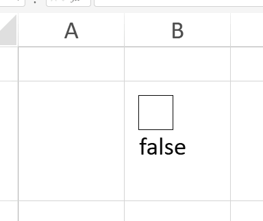
Indeterminate State
SpreadJS CheckBox lets you enable tri-state functionality to represent checked, unchecked, and indeterminate states. Just use isThreeState() to configure checkboxes for scenarios needing partial or undefined states.
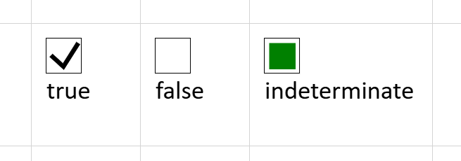
You can set the state of the check box in code with the value method as shown in the following table:
Value | State |
|---|---|
| Indeterminate |
| Unchecked |
| Checked |
Using Code
This example creates a check box cell with three states.
// Get the activesheet
var activeSheet = spread.getSheet(0);
var cellType = new GC.Spread.Sheets.CellTypes.CheckBox();
cellType.caption("caption");
cellType.textTrue("True");
cellType.textFalse("False");
cellType.textIndeterminate("Indeterminate");
cellType.textAlign(GC.Spread.Sheets.CellTypes.CheckBoxTextAlign.bottom);
cellType.isThreeState(true);
cellType.boxSize(20);
activeSheet.getCell(1, 1).cellType(cellType);
//activeSheet.getCell(1, 1).value(1);
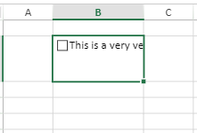
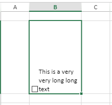
Wrap Text
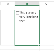
In the scenarios where the check box captions are too long to fit in a cell then to wrap the displayed text, you need to set the cell style wordWrap property to true. The wordWrap property is set to false by default.
// set the long caption
cellType.caption("This is a very very long long text");
activeSheet.getCell(1, 1).cellType(cellType);
activeSheet.setRowHeight(1, 120);
activeSheet.setColumnWidth(1, 110);
// set the wordwrap property to true
activeSheet.getCell(1, 1).wordWrap(true);
wordWrap property | Output |
|---|---|
wordWrap = false |
|
wordWrap = true |
|

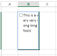
Line Break Rule
The line break rule followed in the check box cell is such that it initially breaks the content by words and, if necessary, further breaks the inner word to fit the available space.
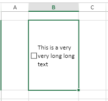
Vertical Alignment
If wordWrap in check box cell is enabled and the vertical alignment of the cell is set, then the check box will be displayed as below:
Vertical alignment | Output |
|---|---|
If cell vAlign is top, then the check box will align at the top with the text. |
|
If cell vAlign is middle, then the check box will align in the middle with the text. |
|
If cell vAlign is bottom, then the check box will align at the bottom with the text. |
|
However, you can change the horizontal alignment of the wrapped text based on the cell’s hAlign value. For example, if the cell's hAlign is set to right, only the caption text will align to the right of the cell. Similarly, if cell's hAlign is set to left or center, only the caption text alignment is changed to left or center.
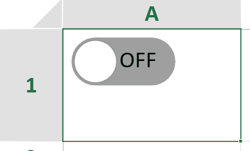
Toggle Mode
You can transform standard checkboxes into interactive toggle switches via the CheckBox.mode('toggle') method.
Key Features
Customizable Appearance
Configure visual properties through the IToggleOptions interface:
Dimensions: Set fixed
width/heightor enableautoSizefor dynamic text scaling.Colors: Define active (
sliderColorOn,trackColorOn) and inactive (sliderColorOff,trackColorOff) states.Animation: Control transition smoothness with
animationDuration(milliseconds).Layout: Adjust
sliderMargin(spacing between slider and track) andtrackRadius(corner rounding).
Text Alignment
The CheckBoxTextAlign.inside option allows embedding text directly within the toggle button for space-efficient layouts, complementing the existing alignment options (top, bottom, left, right).
Usage Constraints
Disabled Properties: In Toggle Mode, properties like
boxSize,isThreeState, andtextIndeterminateare unavailable and cannot be configured.Interaction Limits: Double-click editing is disabled; state changes occur only via toggle button clicks (not cell area clicks).
Text Alignment: When
autoSize: falseandtextAlign: inside,autoFitWidth/autoFitHeightignore text overflow and only consider the toggle button’s dimensions.
Using Code
This example implements toggle mode in the check box cell.
const spread = new GC.Spread.Sheets.Workbook();
const sheet = spread.getActiveSheet();
const cellType = new GC.Spread.Sheets.CellTypes.CheckBox();
cellType.textTrue('ON');
cellType.textFalse('OFF');
cellType.mode('toggle');
cellType.textAlign(GC.Spread.Sheets.CellTypes.CheckBoxTextAlign.inside);
cellType.toggleOptions({
  width: 65,
  height: 30,
  sliderMargin: 2,
  trackColorOn: '#8cbae8',
  trackColorOff: '#9e9e9e',
  sliderColorOn: '#1565c0',
  sliderColorOff: '#ffffff',
});
sheet.setCellType(0, 0, cellType);