Charts
Excel charts can be added in Template layout which are visible in the Excel report. It is very useful as charts are often used in Excel reports to display graphical data. Along with that, it provides an advantage that the final chart will always be updated with the latest data, when the template is processed.
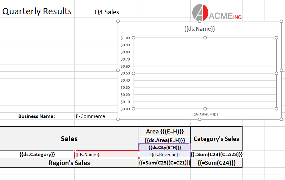
The Excel charts are bound with template cells by specifying the series name, series value and axis labels in the template layout. While processing the template layout, the chart is bound to the data, and the Excel report is generated with the chart displaying final data. A chart can be placed in a worksheet with its data or in another worksheet too.
Follow the steps mentioned below to add chart in a template layout and configure its data to template cells:
Here we are adding a chart to a 'Sales Data' report which displays the sales of fruits and vegetables in different areas of North and South China by various salespersons. The chart in the template configures 'Salespersons' as series name, 'Sales' as series value and 'Products' as axis labels to display the sales of products in a graphical manner.
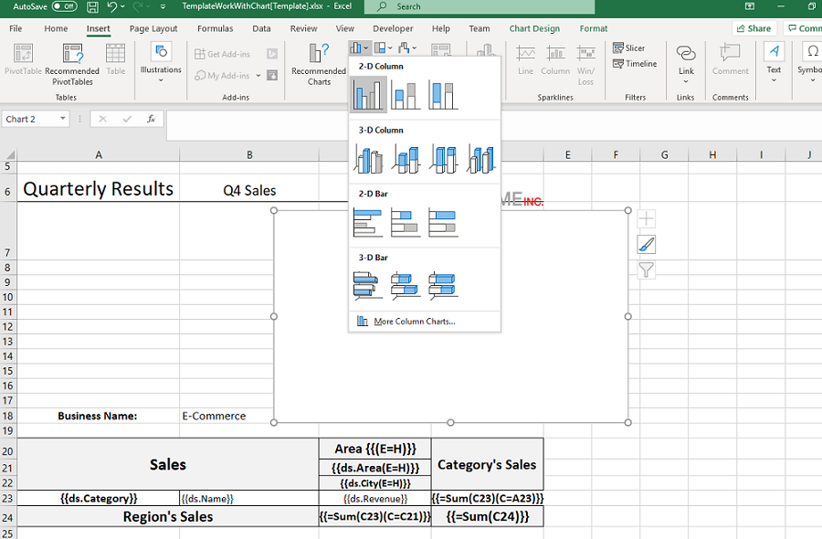
Insert an empty chart in the Template layout in Excel.
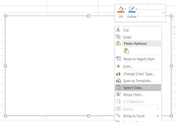
Right click on the chart and choose 'Select Data' from context menu
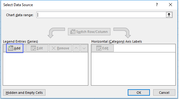
In the 'Select Data Source' dialog box, click 'Add' button to add a series for the chart.
In the 'Edit Series' dialog box, click in 'Series Name' and then select 'ds.Salesman' field of the template layout as salesman field is being used as series for the chart.
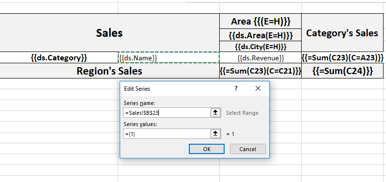
Next, click in 'Series Values' and then select 'ds.Sales' field of the template layout as sales field is being used as the value for the series of the chart.
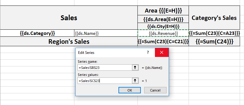
Click on the 'Edit' button highlighted in the below screenshot.
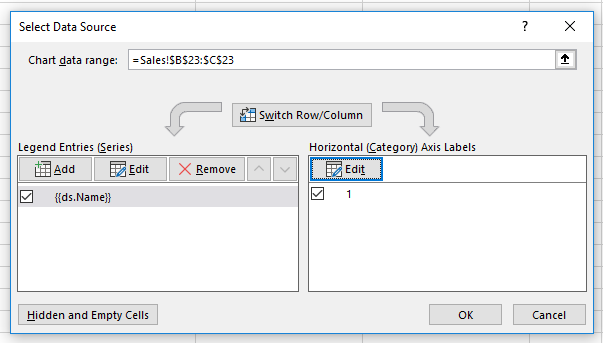
In the 'Axis Labels' dialog box, click in 'Axis Label Range' and then select 'ds.Product' field of the template layout as products field is being used as axis label of the chart.
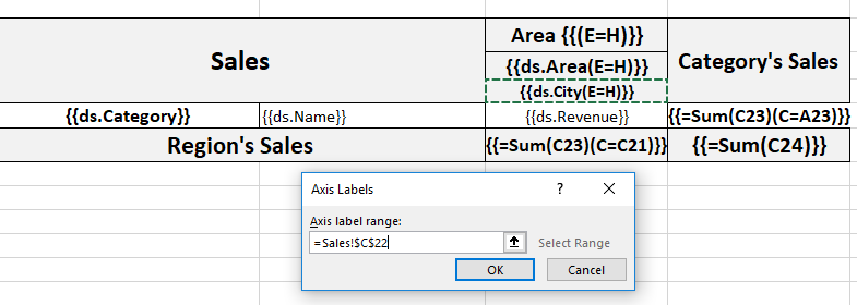
Click Ok to submit the data configuration.
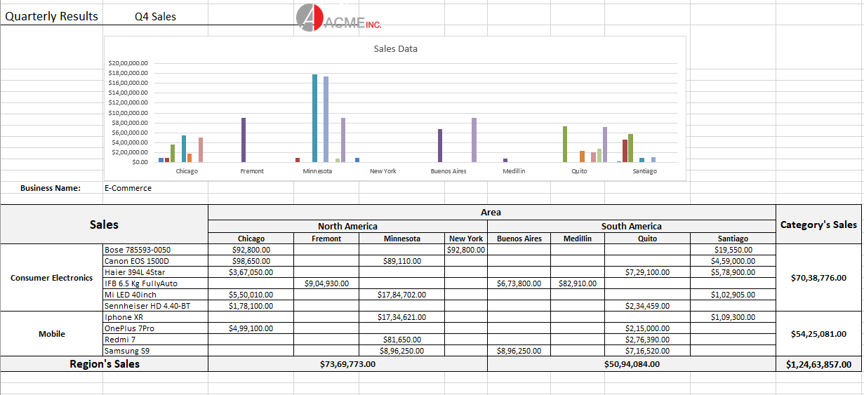
After processing the template layout, the Excel report will look like below: