
Styling and Appearance
ProgressBar provides various options to style the appearance of ProgressBar, so that you can generate ProgressBar as per your requirement and change the look and feel of the application you are creating.
Styling
ProgressBar provides options to style the UI of the ProgressBar control, which is covered in the following section.
Custom Foreground
You can create a custom foreground by applying linear gradient brush. This paints a gradient along the background of the ProgressBar control. The StartPoint and EndPoint properties of the LinearGradientBrush are used to define the line's start and end points.
Here is how the ProgressBar control looks after applying the custom foreground:
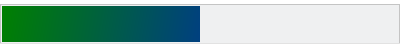
The code snippet below depicts the implementation of the linear gradient brush in ProgressBar.
<!--Create linear gradient brush for styling the ProgressBar indicator-->
    <Window.Resources>
        <LinearGradientBrush StartPoint="0,0" EndPoint="1,1" x:Key="gradientBrush">
            <GradientStop Color="Green" Offset="0" />
            <GradientStop Color="Blue" Offset="2.0" />
        </LinearGradientBrush>
    </Window.Resources>
    <Grid>
        <!--Set the Foreground of ProgressBar to the linear gradient brush-->
        <c1:C1ProgressBar Grid.Row="5" Height="40" Width="400" Value="50" HorizontalAlignment="Left" Margin="3" Name="c1ProgressBar1"
                          VerticalAlignment="Stretch"  BorderThickness="1" Foreground="{StaticResource gradientBrush}" />
    </Grid>
Custom Background
You can create a custom background by applying the Background property.
Here is how the ProgressBar control looks before and after applying the custom background:

In the code snippet below we have set the Background property to LightGray color.
<c1:C1ProgressBar Minimum="0" Maximum="100" Value="50" Background="LightGray"/>
Indeterminate Foreground
You can also set the foreground to highlight the dots when the ProgressBar is in indeterminate state using the IndeterminateForeground property.
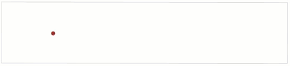
In the code snippet below we have set the IndeterminateForeground property to Brown color.
<c1:C1ProgressBar IsIndeterminate="True" IndeterminateForeground="Brown" />
Appearance
ProgressBar provides options to change the appearance of the ProgressBar control, which is covered in the following section.
Corner radius
You can use the CornerRadius property to set a value that represents the degree to which the corners of the element are rounded.

The code snippet below depicts the use of the CornerRadius property.
<c1:C1ProgressBar BorderThickness="1" CornerRadius="25" Minimum="0" Maximum="100" Value="50" />